Home >Web Front-end >CSS Tutorial >How to use css transform-origin attribute
How to use css transform-origin attribute
- silencementOriginal
- 2019-05-27 13:56:293370browse

Definition and Usage
The transform-origin attribute allows you to change the position of the element being transformed.
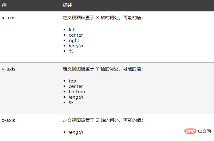
2D transform elements can change the x and y axes of the element. 3D transform elements can also change their Z-axis.
Note: This attribute must be used together with the transform attribute.
Example
Set the base point position of the rotated element:
div
{
transform: rotate(45deg);
transform-origin:20% 40%;

-ms-transform: rotate(45deg); 		/* IE 9 */
-ms-transform-origin:20% 40%; 		/* IE 9 */

-webkit-transform: rotate(45deg);	/* Safari 和 Chrome */
-webkit-transform-origin:20% 40%;	/* Safari 和 Chrome */

-moz-transform: rotate(45deg);		/* Firefox */
-moz-transform-origin:20% 40%;		/* Firefox */

-o-transform: rotate(45deg);		/* Opera */
-o-transform-origin:20% 40%;		/* Opera */
}
Syntax
transform-origin: x-axis y-axis z-axis;

The above is the detailed content of How to use css transform-origin attribute. For more information, please follow other related articles on the PHP Chinese website!
Statement:
The content of this article is voluntarily contributed by netizens, and the copyright belongs to the original author. This site does not assume corresponding legal responsibility. If you find any content suspected of plagiarism or infringement, please contact admin@php.cn
Previous article:How to use css display attributeNext article:How to use css display attribute

