Home >Web Front-end >CSS Tutorial >A brief discussion on the background property of CSS
A brief discussion on the background property of CSS
- little bottleforward
- 2019-04-30 09:19:043258browse
Each element in the document tree is just a rectangular box. These boxes have a background layer. The background layer can be completely transparent or other colors, or it can be a picture. This background layer is controlled by 8 CSS properties (plus 1 abbreviated property).
background-color
The background-color property sets the background color of the element. Its value can be any legal color value or the transparent keyword.
.left { background-color: #ffdb3a; }
.middle { background-color: #67b3dd; }
.right { background-color: transparent; }
Related tutorials: CSS Video Tutorial
The background color is drawn when specified by the [background-clip] (#backgroundclip) attribute within the area of the box model. If any background images are also set, the color layer is drawn behind them. Unlike image layers, which can have multiple, we can only have one color layer for an element.
background-image
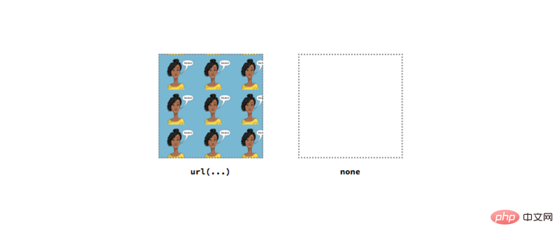
The background-image attribute defines one or more background images for the element. Its value is usually the url of the image defined with url() notation. You can also use none as its value, but this will generate an empty background layer
.left { background-image: url('ire.png'); }
.right { background-image: none; }
We can also specify multiple background images separated by commas. Subsequent pictures will be drawn behind the previous picture in the Z-axis direction.
.middle {
  background-image: url('khaled.png'), url('ire.png');
  /* Other styles */
  background-repeat: no-repeat;
  background-size: 100px;
}
background-repeat
The background-repeat attribute controls the size of the background image when it is changed by the [background-size] (#backgroundsize) attribute and [ background-position] (#backgroundposition) property how to tile after positioning.
The value of this attribute can be repeat-x, repeat-y, repeat, space, round, no-repeat keywords. In addition to repeat-x and repeat-y, other values can be x-axis and y-axis. Define it once, or you can define each dimension individually.
.top-outer-left { background-repeat: repeat-x; }
.top-inner-left { background-repeat: repeat-y; }
.top-inner-right { background-repeat: repeat; }
.top-outer-right { background-repeat: space; }
.bottom-outer-left { background-repeat: round; }
.bottom-inner-left { background-repeat: no-repeat; }
.bottom-inner-right { background-repeat: space repeat; }
.bottom-outer-right { background-repeat: round space; }
background-size
The background-size attribute defines the size of the background image. Its value can be a keyword, length or percentage.
The keywords available for this attribute are "contains" and "cover". contain will scale the image proportionally to its maximum size. Cover, on the other hand, will scale the image to the smallest possible size, where the entire background area is still covered.
.left {
  background-size: contain;
  background-image: url('ire.png');
  background-repeat: no-repeat;
}
.right { background-size: cover; /* Other styles same as .left */ }
For length and percentage, we can specify the width and height of the background image at the same time, and the percentage value is calculated based on the size of the element.
.left { background-size: 50px; /* Other styles same as .left */ }
.right { background-size: 50% 80%; /* Other styles same as .left */ }
background-attachment
The background-attachment property controls how the background image scrolls relative to the viewport and element. It has three potential values.
fixed means that the background image is fixed to the viewport and will not move, even if the user is scrolling along the viewport. local means that the background image is fixed at its location within the element. If the element is scrollable and the background image is positioned at the top, then when the user scrolls down the element, the background image will scroll out of view. Finally, scroll means that the background image is fixed and will not scroll as the element content scrolls.
.left {
  background-attachment: fixed;
  background-size: 50%;
  background-image: url('ire.png');
  background-repeat: no-repeat;
  overflow: scroll;
}
.middle { background-attachment: local; /* Other styles same as .left */ }
.right { background-attachment: scroll; /* Other styles same as .left */ }
background-position
This attribute is combined with the background-origin attribute to define where the starting position of the background image should be. Its value can be a keyword, length or percentage, and we can specify the position along the x- and y-axis.
The keywords that can be used for this attribute are top, right, bottom, left, and center. We can combine these keywords in any way. If only one keyword is explicitly specified, the other default is center.
.top-left {
  background-position: top;
  background-size: 50%;
  background-image: url('ire.png');
  background-repeat: no-repeat;
}
.top-middle { background-position: right;  /* Other styles same as .top-left */ }
.top-right { background-position: bottom;  /* Other styles same as .top-left */ }
.bottom-left { background-position: left;  /* Other styles same as .top-left */ }
.bottom-right { background-position: center;  /* Other styles same as .top-left */ }
For length and percentage, we can also specify the position along the x- and y-axis. Percentage values are calculated based on the size of the element.
.left { background-position: 20px 70px; /* Others same as .top-left */ }
.right { background-position: 50%; /* Others same as .top-left */ }
background-origin
The background-origin property specifies which area of the box model the background image should be positioned against.
When the value is border-box, the background image is positioned based on the border area. When it is padding-box, its position is positioned based on the margin area. When it is content-box, its position is positioned based on the content area.
.left {
  background-origin: border-box;
  background-size: 50%;
  background-image: url('ire.png');
  background-repeat: no-repeat;
  background-position: top left;
  border: 10px dotted black;
  padding: 20px;
}
.middle { background-origin: padding-box;  /* Other styles same as .left*/ }
.right { background-origin: content-box;  /* Other styles same as .left*/ }
background-clip
The background-clip property determines the background drawing area, which is the area where the background can be drawn. Like the background-origin attribute, it is also based on the area of the box model.
.left{
  background-clip: border-box;
  background-size: 50%;
  background-color: #ffdb3a;
  background-repeat: no-repeat;
  background-position: top left;
  border: 10px dotted black;
  padding: 20px;
}
.middle { background-clip: padding-box;  /* Other styles same as .left*/ }
.right { background-clip: content-box;  /* Other styles same as .left*/ }
background
最后,background属性是其他背景相关属性的简写。子属性的顺序无关紧要,因为每个属性的数据类型不同。然而对于background-origin 和 background-clip,如果只指定了一个盒模型区域,那么这两个属性都会应用这个值。如果指定了两个,那么第一个值将用于background-origin属性。
The above is the detailed content of A brief discussion on the background property of CSS. For more information, please follow other related articles on the PHP Chinese website!


