Home >Web Front-end >CSS Tutorial >Should I use px or rem for web development?
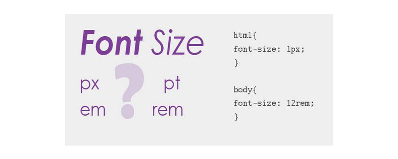
Should I use px or rem for web development?
- 清浅Original
- 2019-04-09 10:19:503177browse
px is a unit used for fixed size, mostly used for PC-side pages; while rem is a unit relative to the HTML root element, suitable for simple mobile-side pages. In the project, you still need to choose the most suitable length unit according to the specific development requirements
In front-end development, the length unit in CSS is essential, because many attributes in CSS need to rely on the length unit to display various page elements and effects. Next, we will introduce two commonly used length units, rem and px, in the article. I hope it will be helpful to everyone.

[Recommended course: CSS Tutorial】
px
px means pixels, which is relative to the monitor screen resolution. When setting the font size with px, the effect will be more stable and precise. However, there are some problems with using px, such as: IE browser cannot adjust the font size that uses px as the unit, so the page effect will change due to the device screen size
rem
rem is a new relative unit in CSS3. When using rem to set the font size for an element, it will be relative to the HTML root element. Through rem, we only need to modify the root element to adjust the size of all fonts proportionally, and at the same time, we can avoid the chain reaction of compounding font sizes layer by layer.
Example:
!DOCTYPE html>
<html>
<head>
<meta charset="UTF-8">
<title>Document</title>
</head>
<body>
<!-- 用px单位-->
px:<p style="font-size:14px; text-indent:28px">
我是一段文字,我是一段文字,我是一段文字,我是一段文字,我是一段文字,我是一段文字,我是一段文字</p>

<!-- 用rem单位,当前html的字体大小是16px-->
rem:<p style="font-size:14px; text-indent:1.75rem">
我是一段文字,我是一段文字,我是一段文字,我是一段文字,我是一段文字,我是一段文字,我是一段文字</p>
</body>
</html>
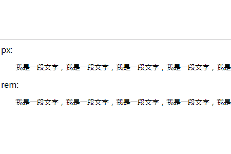
The rendering is as follows:

##How to choose px and rem
Reference for this article: https://www.html.cn/book/css/values/length/index.htm
The above is the detailed content of Should I use px or rem for web development?. For more information, please follow other related articles on the PHP Chinese website!

