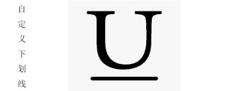
Methods to customize the underline style: 1. Use border-bottom to implement text underline; 2. Set the underline by using a linear gradient in the background-image method.

The operating environment of this article: Windows7 system, HTML5&&CSS3 version, Dell G3 computer.
The underline is generally a black straight line in the text, so how to change the underline style? Next, in the article, we will introduce in detail how to customize the underline style. It has certain reference value and I hope it will be helpful to everyone.
text-decoration attribute
Specifies the decorations added to the text.
none: Represents standard text, no format.
underline: Represents the underline of the text.
overline: Represents a line on the text.
line-through: Represents a line that passes through the text, generally represents a strikethrough
blink: Represents blinking text.
Example:
<div style="text-decoration: underline;">PHP中文网</div>
<div style="text-decoration:line-through;">PHP中文网</div>
<div style="text-decoration:overline;">PHP中文网</div>
Rendering:

The underline defined by text-decoration cannot change the color, nor can it set its thickness. Therefore, we can use other methods to customize the underline
Customization of the underline:
(1) border- bottom method
When using border-bottom to realize text underline, you can change the color, thickness and style of the underline
But it should be noted that when the element is a block-level element, the underline is not only is the length of the text content, which will fill a line. In this case, you need to convert the block-level elements into line-level elements through display: inline. In this case, the length of the text will be the same as the length of the underline
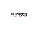
Example: Make the underline pink 2px thick
<h1 id="PHP中文网">PHP中文网</h1>
Rendering:

(2) background-image method
In the background-image method, the underline is set by using a linear gradient. Here you still have to remember that when the element is a block-level element Pay attention to changing it to a row-level element
Example:
h1{
			display: inline;
			background-image:linear-gradient(to right,pink 60%,transparent 10%);
			background-position: 0 100%;
			background-repeat: repeat-x;
			background-size: 8px 3px;
			padding-bottom: 10px;
		}
Rendering:

background-image method is OK Use pictures instead of underlines
h1{
			display: inline;
			background-image:url("images/xing.jpg");
			background-position: 0 100%;
			background-repeat: repeat-x;
			background-size:13px;
			padding-bottom: 10px;
		}
Effect picture:

Summary: The above is the entire content of this article, I hope it will be helpful to everyone .
【Recommended course: CSS Tutorial】
The above is the detailed content of How to customize the underline style. For more information, please follow other related articles on the PHP Chinese website!
 @keyframes vs CSS Transitions: What is the difference?May 14, 2025 am 12:01 AM
@keyframesandCSSTransitionsdifferincomplexity:@keyframesallowsfordetailedanimationsequences,whileCSSTransitionshandlesimplestatechanges.UseCSSTransitionsforhovereffectslikebuttoncolorchanges,and@keyframesforintricateanimationslikerotatingspinners.
 Using Pages CMS for Static Site Content ManagementMay 13, 2025 am 09:24 AM
I know, I know: there are a ton of content management system options available, and while I've tested several, none have really been the one, y'know? Weird pricing models, difficult customization, some even end up becoming a whole &
 The Ultimate Guide to Linking CSS Files in HTMLMay 13, 2025 am 12:02 AM
Linking CSS files to HTML can be achieved by using elements in part of HTML. 1) Use tags to link local CSS files. 2) Multiple CSS files can be implemented by adding multiple tags. 3) External CSS files use absolute URL links, such as. 4) Ensure the correct use of file paths and CSS file loading order, and optimize performance can use CSS preprocessor to merge files.
 CSS Flexbox vs Grid: a comprehensive reviewMay 12, 2025 am 12:01 AM
Choosing Flexbox or Grid depends on the layout requirements: 1) Flexbox is suitable for one-dimensional layouts, such as navigation bar; 2) Grid is suitable for two-dimensional layouts, such as magazine layouts. The two can be used in the project to improve the layout effect.
 How to Include CSS Files: Methods and Best PracticesMay 11, 2025 am 12:02 AM
The best way to include CSS files is to use tags to introduce external CSS files in the HTML part. 1. Use tags to introduce external CSS files, such as. 2. For small adjustments, inline CSS can be used, but should be used with caution. 3. Large projects can use CSS preprocessors such as Sass or Less to import other CSS files through @import. 4. For performance, CSS files should be merged and CDN should be used, and compressed using tools such as CSSNano.
 Flexbox vs Grid: should I learn them both?May 10, 2025 am 12:01 AM
Yes,youshouldlearnbothFlexboxandGrid.1)Flexboxisidealforone-dimensional,flexiblelayoutslikenavigationmenus.2)Gridexcelsintwo-dimensional,complexdesignssuchasmagazinelayouts.3)Combiningbothenhanceslayoutflexibilityandresponsiveness,allowingforstructur
 Orbital Mechanics (or How I Optimized a CSS Keyframes Animation)May 09, 2025 am 09:57 AM
What does it look like to refactor your own code? John Rhea picks apart an old CSS animation he wrote and walks through the thought process of optimizing it.
 CSS Animations: Is it hard to create them?May 09, 2025 am 12:03 AM
CSSanimationsarenotinherentlyhardbutrequirepracticeandunderstandingofCSSpropertiesandtimingfunctions.1)Startwithsimpleanimationslikescalingabuttononhoverusingkeyframes.2)Useeasingfunctionslikecubic-bezierfornaturaleffects,suchasabounceanimation.3)For


Hot AI Tools

Undresser.AI Undress
AI-powered app for creating realistic nude photos

AI Clothes Remover
Online AI tool for removing clothes from photos.

Undress AI Tool
Undress images for free

Clothoff.io
AI clothes remover

Video Face Swap
Swap faces in any video effortlessly with our completely free AI face swap tool!

Hot Article

Hot Tools

SublimeText3 Mac version
God-level code editing software (SublimeText3)

SecLists
SecLists is the ultimate security tester's companion. It is a collection of various types of lists that are frequently used during security assessments, all in one place. SecLists helps make security testing more efficient and productive by conveniently providing all the lists a security tester might need. List types include usernames, passwords, URLs, fuzzing payloads, sensitive data patterns, web shells, and more. The tester can simply pull this repository onto a new test machine and he will have access to every type of list he needs.

SAP NetWeaver Server Adapter for Eclipse
Integrate Eclipse with SAP NetWeaver application server.

DVWA
Damn Vulnerable Web App (DVWA) is a PHP/MySQL web application that is very vulnerable. Its main goals are to be an aid for security professionals to test their skills and tools in a legal environment, to help web developers better understand the process of securing web applications, and to help teachers/students teach/learn in a classroom environment Web application security. The goal of DVWA is to practice some of the most common web vulnerabilities through a simple and straightforward interface, with varying degrees of difficulty. Please note that this software

Dreamweaver CS6
Visual web development tools


