Home >Web Front-end >CSS Tutorial >Introduction to the method of creating multiple grid cells (combined cells) in a grid layout
Introduction to the method of creating multiple grid cells (combined cells) in a grid layout
- 不言Original
- 2018-11-29 17:18:473582browse
If you use grid layout to create cells that span multiple grids, you can specify the starting and ending boundary ranges of the cells in grid-column and grid-row. Let’s take a look at the specific content.

Let’s first take a look at the format of grid-column and grid-row
grid-column :(水平方向起始位置的边界线)/(水平方向单元格结束位置的边界线)
grid-row :(垂直单元格起始位置的边界线)/(单元格在垂直方向上的结束位置的边界线)
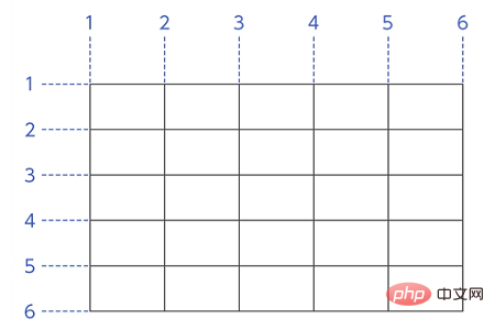
The boundary line distribution is as follows. The horizontal direction is the leftmost side of the grid. The boundary line on the left side of the grid frame is number 1, and the numbers increase one by one to the right. The vertical direction is the top of the grid, the border line above the grid frame is number 1, and the numbers increase toward the bottom.

An example
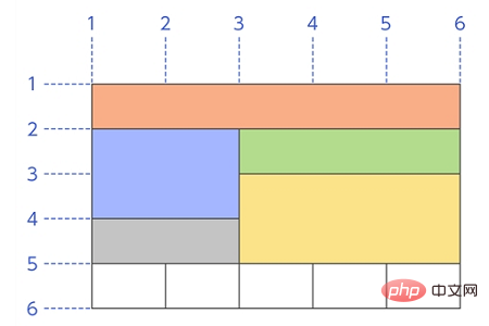
Using grid layout, create a layout like the one shown below.

Explanation:
The orange cell above is grid-column:1/6; grid-row: 1/2;
The blue cell on the left is grid-column:1/3; grid-row:2/4;
The correct green cell is grid-column:3/ 6; grid-row:2/3;
The gray cell in the lower left is grid-column:1/3; grid-row:4/5;
The yellow cell in the lower right The grid is grid-column:3/6; grid-row:3/5;
The white cells below are
grid-column:1/2; grid-row:5/ 6;
grid-column:2/3; grid-row:5/6;
grid-column:3/4; grid-row:5/6;
grid-column:4/5; grid-row:5/6;
grid-column:5/6; grid-row:5/6;
The above layout is as follows Write to the grid cell's class.
The code is as follows
Write the following HTML and CSS.
SimpleGrid.html
<!DOCTYPE html><html><head>
    <meta charset="utf-8" />
    <link rel="stylesheet" href="GridMerge.css" />
    <title></title>
</head>
<body>
  <div class="Container">
    <div class="GridItem1">内容1</div>
    <div class="GridItem2">内容2</div>
    <div class="GridItem3">内容3</div>
    <div class="GridItem4">内容4</div>
    <div class="GridItem5">内容5</div>
    <div class="GridItem6">内容6</div>
    <div class="GridItem7">内容7</div>
    <div class="GridItem8">内容8</div>
    <div class="GridItem9">内容9</div>
    <div class="GridItem10">内容10</div>
  </div>
  </body>
  </html>
SimpleGrid.css
.Container {
    display: grid;
    grid-template-columns: 160px 160px 160px 160px 160px;
    grid-template-rows: 120px 120px 120px 120px 120px;
    border: solid #ff6a00 1px;
}
.GridItem1 {
    grid-column: 1 / 6;
    grid-row: 1 / 2;
    background-color: #ff9c9c;
    }
.GridItem2 {
    grid-column: 1 / 3;
    grid-row: 2 / 4;
    background-color: #ffcb70;
    }
.GridItem3 {
    grid-column: 1 / 3;
    grid-row: 4 / 5;
    background-color: #7ee68d;
    }
.GridItem4 {
    grid-column: 3 / 6;
    grid-row: 2 / 3;
    background-color: #7ee6e2;
    }
.GridItem5 {
    grid-column: 3 / 6;
    grid-row: 3 / 5;
    background-color: #95a7f5;
    }
.GridItem6 {
    grid-column: 1 / 2;
    grid-row: 5 / 6;
    background-color: #d095f5;
    }
.GridItem7 {
    grid-column: 2 / 3;
    grid-row: 5 / 6;
    background-color: #e1bbfa;
    }
.GridItem8 {
    grid-column: 3 / 4;
    grid-row: 5 / 6;
    background-color: #d2b1e4;
    }
.GridItem9 {
    grid-column: 4 / 5;
    grid-row: 5 / 6;
    background-color: #dcd2e1;
    }
.GridItem10 {
    grid-column: 5 / 6;
    grid-row: 5 / 6;
    background-color: #eee8f1;
    }
Running results
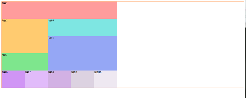
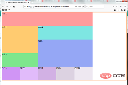
Use a web browser to display the above HTML file. The effect shown below will be displayed. Our layout contains cells that span multiple grids.

The above is the entire content of this article. For more exciting content about grid layout, you can go to the CSS video tutorial## on the php Chinese website. #Column for further study! ! !
The above is the detailed content of Introduction to the method of creating multiple grid cells (combined cells) in a grid layout. For more information, please follow other related articles on the PHP Chinese website!
Related articles
See more- What is CSS Grid grid layout
- Detailed explanation of the usage of CSS grid layout (grid)
- How to set the minimum width of Grid Layout columns
- In grid layout, the width of the grid is specified as the ratio of the area and the width of the entire page.
- Create a grid in the grid layout that responds to the width of the display area (a mixed grid of px and fr)

