Home >Web Front-end >CSS Tutorial >How to remove gaps caused by CSS inline-block line breaks
How to remove gaps caused by CSS inline-block line breaks
- 不言Original
- 2018-11-24 10:39:464098browse
There is a problem with the use of inline elements and inline block elements, that is, a blank will be formed when displaying line breaks that exist in the source code. This article will introduce to you how to eliminate CSS The inline-block newline causes the gap.
The reason for gaps when using inline-block
inline-block can be processed like inline elements, can be simply arranged horizontally, and can give horizontal Width and vertical width etc. This is a very convenient setup, so it can be used in a lot of ways.
But at the same time, we often encounter the so-called gap problem when using inline-block. Let's take a look at an example
HTML
<div class="container">
  <div class="inline-contents"></div>
  <div class="inline-contents"></div>
  <div class="inline-contents"></div>
</div>
CSS
 .container {
  display: block;
  border: 1px #000 solid;
}
.inline-contents {
  width: 33.3333%;
  height: 200px;
  display: inline-block;
  background-color: #66b6d5;
}
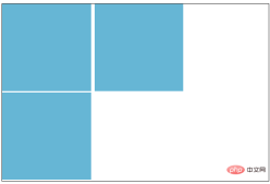
The effect is as follows:

From the above picture we can clearly see that there are no values set on the right and bottom, but there are gaps
Therefore, the three boxes with width: 33.3333% (that is, less than 1 / 3) should be arranged horizontally, but the last box is on a new line.
Even if box-sizing is set this time, margin and padding are set to 0, there is no change.
inline - block as the side of the inline element is not only a matter of "horizontal arrangement", but may also affect values such as font-size and line-height.
How to eliminate the gaps in inline - block
The gaps that can appear below are the default settings for letters, the baseline is as shown, so you can use the properties to try Leave a little gap below.

(So if you apply vertical-align: bottom; to .inline-contents, it will only fix the gap issue below.)
next to The gap is due to the line changes between , so it can be solved by removing them all, but the code will look very complicated. Although you can write comments between , it may be a bit troublesome. In fact, just Writing a "font-size: 0;" value in the parent element (.container) solves the problem.
Why do we say it is a parent element? Because the element itself with inline-block set has the characteristics of "character".
Let’s look at an example
HTML
<div class="container">
  <div class="inline-contents">aaa
  </div>
  <div class="inline-contents">aaa<br>
    aaa
  </div>
  <div class="inline-contents">aaa</div>
</div>
CSS
.container {
  display: block;
  border: 1px #000 solid;
  font-size: 0;
}

.inline-contents {
  width: 33.3333%;
  height: 200px;
  display: inline-block;
  background-color: #66b6d5;
  font-size: 16px;
}
Enter text in inline-block At this time, if the new inlin-block sets font-size, it will be fine.
However, if the number of lines of text in each box is different, this will happen.

In this case, solve it by adding vertical-align: bottom; and font-size to inline-block.
CSS
.container {
  display: block;
  border: 1px #000 solid;
  font-size: 0;
}

.inline-contents {
  width: 33.3333%;
  height: 200px;
  display: inline-block;
  background-color: #66b6d5;
  font-size: 16px;
  vertical-align: bottom;
}
The effect is as follows:

This article ends here, more exciting content for you You can pay attention to the CSS video tutorial column on the php Chinese website! ! !
The above is the detailed content of How to remove gaps caused by CSS inline-block line breaks. For more information, please follow other related articles on the PHP Chinese website!
Related articles
See more- Learn more about float and inline-block
- CSS method to solve the gap caused by display:inline-block; layout
- Detailed explanation of how to solve the gap caused by display:inline-block in CSS layout
- About display under ie7: inline-block example tutorial
- css: block, inline and inline-block usage and differences
- The difference between display:inline-block and float in css when arranging elements in a row
- About the pitfalls encountered by CSS3 inline-block

