Home >Web Front-end >CSS Tutorial >How to use ::before? Drawing geometry using ::before (code example)
How to use ::before? Drawing geometry using ::before (code example)
- 青灯夜游Original
- 2018-11-12 11:53:044418browse
::How to use? This article will give you a detailed introduction to the use of the CSS pseudo-element::before, and let you know how::before draws a geometric figure through sample code. It has certain reference value. Friends in need can refer to it. I hope it will be helpful to you.
First we need to understand that the ::before pseudo-element is usually used together with the content attribute. Use ::before to select the first child element of the element before inserting the value of the content attribute into the first child element. .
Let’s learn more about the use of ::before pseudo-element:
1. The content of ::before pseudo-element can be of almost any type , including characters (as above) ), text strings and images. This is mentioned in the previous article [::What is the role of before? What is the difference between ::before and :before? 】There is an introduction inside, you can refer to it.
Let’s take a look at the example:
html code:
<p class="note">
    使用::before伪元素插入的图像无法调整大小,它们会按原样插入,因此你必须在使用前调整图像大小。
</p>
<p class="note">
    使用::before伪元素插入的图像无法调整大小,它们会按原样插入,因此你必须在使用前调整图像大小。
</p>
<p class="note">
    使用::before伪元素插入的图像无法调整大小,它们会按原样插入,因此你必须在使用前调整图像大小。
</p>
css code:
p.note {
    font-style: italic;
    color: grey;
}

p.note::before {
    content: "注意: ";
    color: red;
}
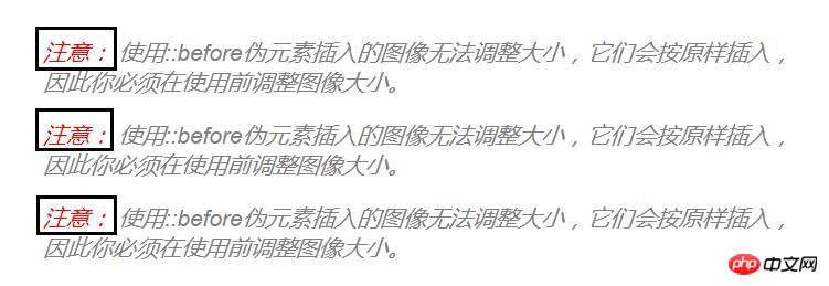
Rendering:

In the above code snippet, we use the class .note to set the style of the text paragraph. Using the ::before pseudo-element, the string "Note:" is inserted for each paragraph. In this case all you have to do is give a paragraph of any text defined as .note class and style it using CSS and the paragraph will automatically be prefixed with "Note:".
2. content:counter()
::before content can also be counter(). Takes the form of a counter function, counter() or counters() for style lists.
3. content: ""
::before content can be left blank. Empty pseudo-elements can be used to clear floats from elements. For example, use ::before and ::after together to clear floats.
4, ::before pseudo-element setting style
::before pseudo-element can be styled like any other content, for example: it can be floated, positioned and even animated . (Note: Animated pseudo-elements are not available in all browsers. See the Browser Support section below for details.)
Comprehensive Example: Creating Geometry --- Eight-Point Star
The rendering is as follows:

html code:
<div class="container">
  <div class="element"></div>
</div>
css code:
.container {
  margin: 40px auto;
  max-width: 700px;
}

.element {
  width: 200px;
  height: 200px;
  background-color: #009966;
  opacity: .8;
  position: relative;
  margin: 100px auto;
}
Define a square with a background color of #009966 in the .element class and provide the first four points for the geometry.
Use the `opacity` attribute to make both the element and its pseudo-element semi-transparent to better visualize the position of both in the presentation. By removing the opacity value, we can see the fully opaque eight-point star
.element:before {
  position: absolute;
  content: "";
  display: block;
  width: 100%;
  height: 100%;
  background-color: #009966;
  opacity: .8;
  -webkit-transform: rotateZ(45deg);
  transform: rotateZ(45deg);
}
Styling the pseudo-element of this element to have the same height and width as its parent element (.element) , position it absolutely on top of its parent element, and then rotate it 45 degrees, forming an eight-point star.
Summary: The above is the entire content of this article. We can also use the ::after pseudo-element to create the geometric shape of the eight-point star in a similar way. You can try it. I hope It can be helpful to everyone’s study.
The above is the detailed content of How to use ::before? Drawing geometry using ::before (code example). For more information, please follow other related articles on the PHP Chinese website!

