Home >Web Front-end >CSS Tutorial >css uses relative units for media queries (example introduction)
css uses relative units for media queries (example introduction)
- 青灯夜游Original
- 2018-11-09 14:26:213382browse
This article brings you the use of relative units for media queries in CSS (example introduction), so that everyone can understand why you can use relative units for media queries and what are the benefits. It has certain reference value. Friends in need can refer to it. I hope it will be helpful to you.
Use relative units for media queries
The width defined in the media query is called a breakpoint. This point is adjusted by your selection in a way that best fits the available space. While this was a common approach based on target widths for popular devices, today, with the large number of screen sizes available, this is no longer a viable solution.
Ideally we should let the content determine what the breakpoint will be. The advantages of designing for the smallest screen size first force us to consciously identify what the most important information is and how to present it to your users in the clearest and most accessible way.
Under normal circumstances, it doesn't make much difference which CSS unit you choose for a height or width media query. However, we cannot control when users modify their browsing environment by zooming or changing font settings. If they do, then we start to encounter some unexpected behavior.
Given that we let the content determine our breakpoint values, if the user changes the browser's "font size" setting, we want the media query to adapt to that change accordingly. However, if we use an absolute unit like pixels, the media query will remain fixed at a value that may no longer fit the content. At this time, you need to use relative units.
Avoid the problem of double breakpoints
Due to the evaluation logic of these queries, problems will occur when we use min-width and max-width queries. At this point we can include the use of a comparison operator, which means that the condition becomes true once the width of the window matches the value of the declared breakpoint.
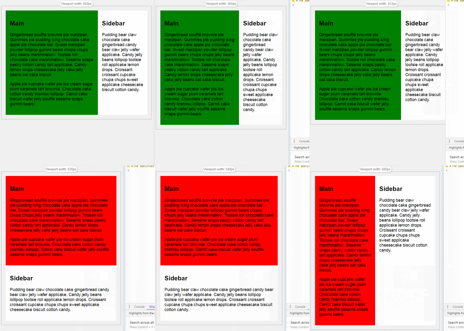
Suppose we have a min-width query and max-width query using 35em as a breakpoint. Since every major browser uses a different rendering engine, sites may not work as expected at 35em, and the severity of the impact will depend on the type of styles in each media query. Let's take a look at an example:
In the example, the expected behavior is that the content in the main element has a green background when displayed in one row and two columns, and a red background when displayed in one row and one column. At width '35em', min-width' and 'max-width' are active at the same time, 'min-width' query sets flex-wrap to nowrap, 'max-width' query sets 'background-color' to ' red', 'flex-basis' is set to '100%', thus 'breaking' our demo. (Online demonstration address: https://tympanus.net/codrops-playground/huijing/4jANYmn0/editor)
.flex-wrapper {
  display: -webkit-box;
  display: -ms-flexbox;
  display: flex;
  -ms-flex-wrap: wrap;
  flex-wrap: wrap
}

@media (min-width: 35em) {
  .flex-wrapper {
    -ms-flex-wrap: nowrap;
    flex-wrap: nowrap;
  }

  .main {
    -webkit-box-flex: 1;
    -ms-flex: 1 1 67%;
    flex: 1 1 67%;
    background-color: green;
  }
  .sidebar {
    -webkit-box-flex: 1;
    -ms-flex: 1 1 33%;
    flex: 1 1 33%;
  }
}

@media (max-width: 35em) {
  .main {
    -webkit-box-flex: 1;
    -ms-flex: 1 1 100%;
    flex: 1 1 100%;
    background-color: red;
  }

  .sidebar {
    -webkit-box-flex: 1;
    -ms-flex: 1 1 100%;
    flex: 1 1 100%;
  }
}
The key point in this example is to ensure that when using adjacent When querying "min-width" and "max-width", do not use the same width for both. A common approach is to separate them using 0.01em to get around this overlap.
Summary: The above is the entire content of this article, I hope it will be helpful to everyone's study.
The above is the detailed content of css uses relative units for media queries (example introduction). For more information, please follow other related articles on the PHP Chinese website!

