Home >Web Front-end >CSS Tutorial >What are media queries in css? how to use?
What are media queries in css? how to use?
- 青灯夜游Original
- 2018-11-09 10:38:207307browse
This article introduces what is media query? how to use? Let everyone know how to use media queries. It has certain reference value. Friends in need can refer to it. I hope it will be helpful to you.
What is a media query? What is the use?
Media queries limit the scope of CSS styles so that they only apply when certain media conditions are met.
Simply put: Media queries allow us to set CSS styles for the device display based on its characteristics (such as viewport width, screen ratio, device orientation: landscape or portrait).
Media queries can be used to detect media properties such as: width , height and color (etc.). Using media queries, you can customize the display effect for specific output devices without changing the page content. [Recommended related video tutorials: css3 tutorial]
How to use media queries?
We can explain media queries as if-else statements for browsers. Media queries are logical expressions that evaluate to true or false. A media query consists of an optional media type, zero or more media attributes, and logical keywords that allow the construction of more complex expressions.
1. Basic syntax:
@media [not | only] <media-type> [and] (<media-condition>);
Instructions:
media-type
Media types are broad categories of user agent devices that can display HTML documents. The list of media types has been revised in the Media Query Level 4 specification. Deprecated media types are recognized as valid but will not be matched to any device, i.e. your media query will still apply but on all devices as if no media type was specified.
You can set the following media types:
all: Match all devices.
print: Matches the printer and the device used to reproduce the print display, such as a web browser that displays the document in Preview.
screen: Matches all devices that do not match print or speech.
speech: Matches screen readers and similar devices that "read" pages.
media-condition (media-condition)
Media-condition is more granular than media type because it sets a single specific function for the device in question. The syntax for media features is the same as CSS properties, including the feature name, colon, and value to test.
The list of media features has also been changed from media query level 3 to media query level 4; deprecated features have been retained in the specification for backward compatibility, but it is emphasized that they must not be used in new style sheets. User agents will continue to support them as specified.
You can set the following media functions:
Screen/device size:
width
Height
aspect-ratio
Orientation
Display quality:
Resolution
Scan
grid
update
Overflow-block
Overflow-inline
Color:
color
color-index
monochrome
Color-gamut
Interaction:
Pointer
Hover
Any-pointer and any-hover
Script:
scripting:
2. Examples of using media queries:
Implementing CSS responsive media queries
Example:
@media screen and (max-width:720px) and (min-width:320px){
      body{
       background-color:red;
       }
@media screen and (max-width:320px){
      body{
         background-color:blue;
       }
}
Explanation:
The meaning of this media query is: when the device screen width is between 320px~~720px, the media Query setting the background color of the body (background-color: red;) will overlap the previous body background color; when the device screen width is below 320px, the media query can set the background color of the body (background-color: blue;), the same will The body background color before overlapping.
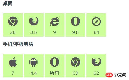
css The browser queried by @media supports the
method of applying styles based on media information, including page and device size.
Can support the following versions:

Summary: The above is the entire content of this article, I hope it can be helpful to everyone’s learning helped.
The above is the detailed content of What are media queries in css? how to use?. For more information, please follow other related articles on the PHP Chinese website!

