Home >Web Front-end >CSS Tutorial >How to create a 3D bar chart with css? Example of creating a 3D bar chart
How to create a 3D bar chart with css? Example of creating a 3D bar chart
- 青灯夜游Original
- 2018-11-03 17:45:022939browse
This article introduces how to create a 3D bar chart using CSS. It has certain reference value. Friends in need can refer to it. I hope it will be helpful to you.
The example of creating a three-dimensional bar chart introduced in this article uses the 3D effect of perspective and rotation, not just tilt transformation. The result is a chart that can be viewed from any direction.
Let’s introduce step by step how to create it. The sample code works best in WebKit browser and also works quite well in Firefox (v13).
1. Set up the grid
First set up a #stage element, where we can define the perspective in which any 3D transformation will be viewed. Basically the position of the viewer in relation to the flat screen. Then, since we are creating a graph, we need to set up the axes and grid (#chart).
While we could easily create a background image and tile it to form a grid pattern, we decided to use CSS linear gradient syntax. In all code below, -moz-styles only copies -webkit-styles.
<style type="text/css">

  #stage {
    -webkit-perspective: 1200px;
    -webkit-perspective-origin: 0% 0%;
    -moz-perspective: 1200px;
    -moz-perspective-origin: 0% 0%;
    background: rgba(0,255,255,0.2);
  }
  #chart {
    position: relative;
    margin: 10em auto;
    width: 400px;
    height: 160px;
    border: 1px solid #000;
    background: -webkit-repeating-linear-gradient(left, rgba(0,0,0,0) 0, rgba(0,0,0,0) 38px, #ccc 40px), -webkit-repeating-linear-gradient(bottom, rgba(0,0,0,0), rgba(0,0,0,0) 38px, #ccc 40px);
    background: -moz-repeating-linear-gradient(left, rgba(0,0,0,0) 0, rgba(0,0,0,0) 38px, #ccc 40px), -moz-repeating-linear-gradient(bottom, rgba(0,0,0,0), rgba(0,0,0,0) 38px, #ccc 40px);
    -webkit-transform-origin: 50% 50%;
    -webkit-transform: rotateX(65deg);
    -webkit-transform-style: preserve-3d;
    -moz-transform-origin: 50% 50%;
    -moz-transform: rotateX(65deg);
    -moz-transform-style: preserve-3d;
  }

</style>
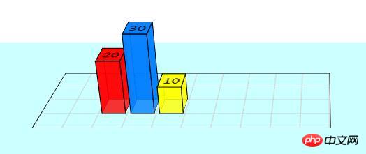
Chart size is 400 x 160 pixels, grid is 40 pixels. As you can see, the background grid consists of two repeating gradients running horizontally and vertically. The chart has been tilted 65 degrees from the screen.
2. Define 3D bar chart
Each bar in the chart is composed of four sides and a cap. The styling here is for the Bar CSS class, which can then be used multiple times in different positions and colors. They are defined in HTML, as you'll see shortly.
To visualize the transformation being applied, think of the vertical cross plane on the page. The four sides are then rotated away from us to form the columns. Simple.
<style type="text/css">

  .bar {
    position: absolute;
    bottom: 40px;
    margin: 0 4px;
    width: 32px;
    height: 40px;
    outline: 1px solid #000;
    text-align: center;
    line-height: 40px;
    -webkit-transform-style: preserve-3d;
    -moz-transform-style: preserve-3d;
    font-size: 20px;
  }
  .barfront, .barback, .barleft, .barright {
    position: absolute;
    outline: inherit;
    background: inherit;
  }
  .barfront {
    width: inherit;
    bottom: 0;
    -webkit-transform: rotateX(90deg);
    -webkit-transform-origin: 50% 100%;
    -moz-transform: rotateX(90deg);
    -moz-transform-origin: 50% 100%;
  }
  .barback {
    width: inherit;
    top: 0;
    -webkit-transform: rotateX(-90deg);
    -webkit-transform-origin: 50% 0;
    -moz-transform: rotateX(-90deg);
    -moz-transform-origin: 50% 0;
  }
  .barright {
    height: inherit;
    right: 0;
    -webkit-transform: rotateY(-90deg);
    -webkit-transform-origin: 100% 50%;
    -moz-transform: rotateY(-90deg);
    -moz-transform-origin: 100% 50%;
  }
  .barleft {
    height: inherit;
    left: 0;
    -webkit-transform: rotateY(90deg);
    -webkit-transform-origin: 0% 50%;
    -moz-transform: rotateY(90deg);
    -moz-transform-origin: 0% 50%;
  }

</style>
In the CSS code, we do not define the position or color of the bars in the chart. This needs to be done individually for each element. But please note that we use the inherit attribute where possible to simplify this process.
3. Bar Chart HTML Markup
Here you can see the code used in practice for the demonstration below. There are three bars on the chart. Each bar is a div with four child divs making up the four sides. You can have as many bars as you want and place them anywhere on the chart.
<div id="stage">
	<div id="chart">

		<div class="bar" style="left: 80px; background: rgba(255,0,0,0.8); -webkit-transform: translateZ(80px); -moz-transform: translateZ(80px);">
			<div class="barfront" style="height: 80px;"></div>
			<div class="barback" style="height: 80px;"></div>
			<div class="barright" style="width: 80px;"></div>
			<div class="barleft" style="width: 80px;"></div>
			20
		</div>

		<div class="bar" style="left: 120px; background: rgba(0,127,255,0.8); -webkit-transform: translateZ(120px); -moz-transform: translateZ(120px);">
			<div class="barfront" style="height: 120px;"></div>
			<div class="barback" style="height: 120px;"></div>
			<div class="barright" style="width: 120px;"></div>
			<div class="barleft" style="width: 120px;"></div>
			30
		</div>

		<div class="bar" style="left: 160px; background: rgba(255,255,0,0.8); -webkit-transform: translateZ(40px); -moz-transform: translateZ(40px);">
			<div class="barfront" style="height: 40px;"></div>
			<div class="barback" style="height: 40px;"></div>
			<div class="barright" style="width: 40px;"></div>
			<div class="barleft" style="width: 40px;"></div>
			10
		</div>

	</div>
</div>
In the code above you can see highlighted the code that sets the x position of the bars in the chart as well as the height of each bar (which needs to be defined for each element that makes up the bar ). There we apply the colors (red, blue, yellow) slightly transparent.
4. Final Result
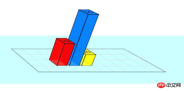
If you are using a WebKit browser (Safari, Chrome, iPhone, iPad), then you should see the 3D bar graph as well Some sliders that can be used to modify certain values. In Firefox, the bar chart has some artifacts and the slider renders as a normal input box, but it still works.

Instructions:
You can change the height of the bar by modifying the value of the .bar box, for example:
<div class="bar" style="left: 120px; background: rgba(0,127,255,0.8); -webkit-transform: translateZ(180px); -moz-transform: translateZ(120px);">
	<div class="barfront" style="height: 180px;"></div>
	<div class="barback" style="height: 180px;"></div>
	<div class="barright" style="width: 180px;"></div>
	<div class="barleft" style="width: 180px;"></div>
	30
</div>

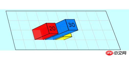
Modify the values in the #stage box and #chart box to view the bar chart from different angles
#stage {
-webkit-perspective: 1200px;
-webkit-perspective-origin: 60% 0%;
-moz-perspective: 1200px;
-moz-perspective-origin: 60% 0%;
background: rgba(0, 255, 255, 0.2);
}
#chart {
	-webkit-transform-origin: 50% 50%;
	-webkit-transform: rotateX(22deg);
	-webkit-transform-style: preserve-3d;
	-moz-transform-origin: 50% 50%;
	-moz-transform: rotateX(22deg);
	-moz-transform-style: preserve-3d;
}
Summary: The above is the entire content of this article, I hope it will be helpful to everyone's study.
The above is the detailed content of How to create a 3D bar chart with css? Example of creating a 3D bar chart. For more information, please follow other related articles on the PHP Chinese website!

