Home >Web Front-end >CSS Tutorial >In-depth understanding of css pseudo-elements: before and :after (with examples)
In-depth understanding of css pseudo-elements: before and :after (with examples)
- 不言Original
- 2018-11-02 14:37:053161browse
Cascading Style Sheets (CSS) are mainly used to apply styles to HTML tags, but in some cases when adding extra tags to the document is redundant or impossible, there is actually a feature in CSS that allows us to add Extra markup without interrupting the actual file, i.e. pseudo-element.
I believe you have heard of this term, especially if you have taken some courses. (Recommended course: css video tutorial)
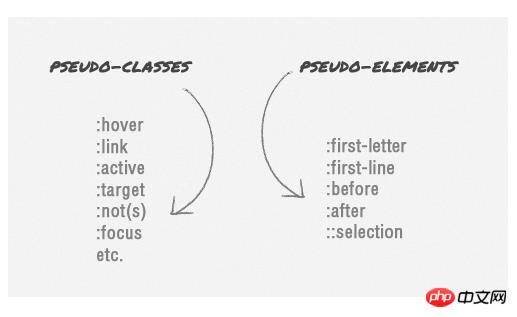
There are actually several CSS pseudo-elements that are classified, such as :first-line, :first-letter, ::selection, :before and :after. However, for this article we are limited to talking about :before and :after, and "pseudo-elements" will specifically refer to them here. We will start with the basics to understand in depth the css pseudo-elements: before and :after.
css pseudo-element syntax and browser support
:before and :after pseudo-elements have actually been around CSS1, but what we are discussing here is released in CSS2 .1’s :before and :after. In the beginning, pseudo-elements used single-colon syntax, but as the web evolved, CSS3 pseudo-elements were modified to use double-colons as ::before & ::after - distinguishing them from pseudo-classes (i.e. :hover, :active, etc.).

However, whether you use single colon or double colon format, the browser will still recognize it. And since Internet Explorer 8 only supports the single-colon format, it's safer to use the single-colon if you want wider browser compatibility.
What is the function of css pseudo-elements?
In short, pseudo-element will insert an extra element before or after the content element, so when we add them both, they are technically equal, with the following markup .
<p>
<span>:before</span>
  This the main content.
<span>:after</span>
</p>
But these elements are not actually generated in the document. They will still be visible on the surface, but they will not be found on the document source, so in effect they are pseudo-elements.
Usage of pseudo-elements
Using pseudo-elements is relatively easy; the following syntax selector:before will add an element before the content's selector, and this syntax selector:after will be added after it and in order to add content in it we can use the content attribute.
For example, the following code snippet adds quotation marks before and after blockquote.
blockquote:before {
  content: open-quote;
}
blockquote:after {
  content: close-quote;
}
Style Pseudo-Element
Although a pseudo-element is a pseudo-element, a pseudo-element actually acts like a "real" element; we can add any style to them Statements such as changing colors, adding backgrounds, adjusting body size, aligning text inside, and more.
blockquote:before {
  content: open-quote;
  font-size: 24pt;
  text-align: center;
  line-height: 42px;
  color: #fff;
  background: #ddd;
  float: left;
  position: relative;
  top: 30px;
  }
blockquote:after {
  content: close-quote;
  font-size: 24pt;
  text-align: center;
  line-height: 42px;
  color: #fff;
  background: #ddd;
  float: right;
  position: relative;
  bottom: 40px;
  }
css pseudo-element specifies size
By default, the generated element is an inline-level element, so when we want to specify the height and width, We must first define it as a block element using the display: block declaration.
blockquote:before {
  content: open-quote;
  font-size: 24pt;
  text-align: center;
  line-height: 42px;
  color: #fff;
  background: #ddd;
  float: left;
  position: relative;
  top: 30px;
  border-radius: 25px;

  /** define it as a block element **/
  display: block;
  height: 25px;
  width: 25px;
}
blockquote:after {
  content: close-quote;
  font-size: 24pt;
  text-align: center;
  line-height: 42px;
  color: #fff;
  background: #ddd;
  float: right;
  position: relative;
  bottom: 40px;
  border-radius: 25px;

  /** define it as a block element **/
  display: block;
  height: 25px;
  width: 25px;
}
Attach background image
We can also replace content with images instead of plain text. While the content attribute provides a url() string into which the image is inserted, in most cases I prefer using the background attribute to have more control over the attached image.
blockquote:before {
  content: " ";
  font-size: 24pt;
  text-align: center;
  line-height: 42px;
  color: #fff;
  float: left;
  position: relative;
  top: 30px;
  border-radius: 25px;
  background: url(images/quotationmark.png) -3px -3px #ddd;
  display: block;
  height: 25px;
  width: 25px;
}
blockquote:after {
  content: " ";
  font-size: 24pt;
  text-align: center;
  line-height: 42px;
  color: #fff;
  float: right;
  position: relative;
  bottom: 40px;
  border-radius: 25px;
  background: url(images/quotationmark.png) -1px -32px #ddd;
  display: block;
  height: 25px;
  width: 25px;
}
However, as you can see from the above code snippet, even if the content in the content attribute is an empty string, we still declare it. content represents a requirement and should always be present; otherwise the pseudo-element will not work properly.
Combining pseudo-classes
Although pseudo-classes and pseudo-elements are different, we can use pseudo-classes with pseudo-elements in a CSS rule. For example, if we To darken the quote background slightly, the code for blockquote to change when we hover the mouse over it is as follows.
blockquote:hover:after, blockquote:hover:before {
  background-color: #555;
}
Add transition effects
We can even apply the transition property to them to create some nice looking transition effects.
transition: all 350ms;
-o-transition: all 350ms;
-moz-transition: all 350ms;
-webkit-transition: all 350ms;
Unfortunately, the conversion effect seems to only apply to the latest version of Firefox. So hopefully more browsers will catch up and allow pseudo-elements to be applied within transition attributes in the future.
The above is the detailed content of In-depth understanding of css pseudo-elements: before and :after (with examples). For more information, please follow other related articles on the PHP Chinese website!

