
Home >Web Front-end >HTML Tutorial >Summary of html+css front-end interview questions at BAT major Internet companies
Summary of html+css front-end interview questions at BAT major Internet companies

- 不言forward
- 2018-10-25 14:04:392960browse
This article brings you a summary of the html css front-end interview questions of major BAT Internet companies. It has certain reference value. Friends in need can refer to it. I hope it will be helpful to you.
Many of the interview questions came from my own experience interviewing BAT. I compiled and shared it in the hope that more front-end ers can make progress together. It is not only suitable for job seekers, but it is also very helpful for consolidating and reviewing the front-end basics.
More questions have been collected by me along the way, as well as from previous years. The answers are not guaranteed to be correct. If there are any mistakes or better solutions, please correct me.
The first few questions will be very basic, and the more you go, the more in-depth they will become.
Html article:
1. In which browsers have the pages you created been tested? What are the kernels of these browsers?
IE: trident kernel
Firefox: gecko kernel
Safari: webkit kernel
Opera: used to be presto kernel, Opera has now switched to Google Chrome's Blink kernel
## Chrome: Blink (based on webkit, jointly developed by Google and Opera Software)
2. There is a very important thing at the beginning of every HTML file, Doctype. Do you know what this is for?
##Answer: The 1a309583e26acea4f04ca31122d8c535 declaration is located at the frontmost position in the document, before the 100db36a723c770d327fc0aef2ce13b1 tag. This tag tells the browser which HTML or XHTML specification the document uses. (Key point: tell the browser according to which specification to parse the page)
3. What is Quirks mode? What is the difference between it and Standards mode##Answer:
Starting from IE6, Standards mode was introduced. In standard mode, browsing The browser attempts to give standard-conforming documents the correct processing to the extent possible in a given browser.
CSS was not mature enough before IE6, so browsers before IE5 and other browsers had poor support for CSS. IE6 will provide better support for CSS, but the problem at this time is Come on, because there are many pages written based on the old layout method, and if IE6 supports CSS, these pages will display abnormally. How to ensure that the existing pages are not destroyed and provide a new rendering mechanism?
We often encounter such problems when writing programs, how to ensure that the original interface remains unchanged and provide more powerful functions, especially when the new functions are not compatible with the old functions . A common approach when encountering this kind of problem is to add parameters and branches, that is, when a certain parameter is true, we use the new function, and if the parameter is not true, we use the old function, so as not to destroy The original program also provides new functions. IE6 does something similar. It treats DTD as this "parameter" because no one would write DTD on previous pages, so IE6 assumes that if DTD is written, it means that this page will use better support for CSS. layout, and if not, the previous layout will be compatible. This is Quirks mode (quirks mode, weird mode, weird mode).
Difference:
Overall there will be three differences in layout, style parsing and script execution.
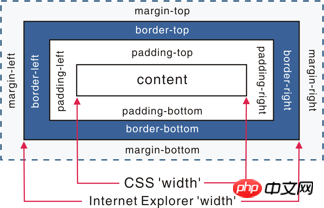
Box model: In the W3C standard, if you set the width and height of an element, it refers to the width and height of the element content. In Quirks mode, the width and height of IE Also includes padding and border.
Set the height and width of inline elements: In Standards mode, setting wdith and height for inline elements such as 45a2772a6b6107b401db3c9b82c049c2 will not take effect. In quirks mode, it will take effect.
Set percentage height: In standards mode, the height of an element is determined by the content it contains. If the parent element does not set a percentage height, the child element sets a percentage. The height is invalid. Use margin:0 auto to set the horizontal centering: Using margin:0 auto can center the element horizontally in standards mode, but it will fail in quirks mode.
(There are many more. It doesn’t matter what he answers. The key is to see whether the answers he gave are from his own experience, or whether he read them from articles, or even completely Don’t know.)
4. What are the advantages of DIV css layout over table layout?
It is more convenient when revising the version. Just change the css file.
#Page loading speed is faster, the structure is clear, and the page display is simple.
#Performance is separated from structure.
#Easy to optimize (seo) search engines are more friendly and it is easier to rank higher.
5.a: What are the similarities and differences between the alt and title of img? b: What are the similarities and differences between strong and em?
Answer:
a:
alt (alt text): For user agents (UA) that cannot display images, forms, or applets, the alt attribute is used to specify alternative text. The language of the replacement text is specified by the lang attribute. (In IE browser, alt will be displayed as tool tip when there is no title)
title(tool tip): This attribute is the element on which this attribute is set. Provide advisory information.
b:
#strong: bold emphasis label, emphasis, indicating content Importance
em: Italic emphasis tags are more strongly emphasized and indicate the emphasis of the content
##6.Can you describe the difference between progressive enhancement and graceful degradation?
Progressive enhancement: Build pages for low-version browsers to ensure the most basic functions, and then improve effects, interactions, and add functions for advanced browsers to achieve a better user experience.
Graceful degradation: Build complete functionality from the beginning, and then make it compatible with lower version browsers.
Difference: Graceful degradation starts from a complex status quo and tries to reduce the supply of user experience, while progressive enhancement starts from a very basic, capable The version of the function started and is continuously expanded to adapt to the needs of future environments. Degradation (functional decay) means looking backward; progressive enhancement means looking forward while keeping its roots in a safe zone.
The "graceful downgrade" view
The "graceful downgrade" view holds that websites should be designed for the most advanced and complete browsers. Arrange the testing of browsers that are considered "outdated" or have missing functions at the last stage of the development cycle, and limit the test objects to the previous version of mainstream browsers (such as IE, Mozilla, etc.).
Under this design paradigm, older browsers are considered to provide only a “poor, but passable” browsing experience. You can make some small adjustments to suit a specific browser. But since they are not the focus of our attention, other differences will be ignored except for fixing larger bugs.
"Progressive Enhancement" Viewpoint
"Progressive Enhancement" Viewpoint believes that the focus should be on the content itself.
Content is the reason why we build a website. Some websites display it, some collect it, some seek it, some operate it, and some websites even include all of the above, but the same thing is that they all involve content. This makes "progressive enhancement" a more reasonable design paradigm. This is why it was immediately adopted by Yahoo! and used to build its "Graded Browser Support (Graded Browser Support)" strategy.
Then the question comes. Now the product manager sees that the web page effects of IE6, 7, and 8 are much less rounded corners and shadows (CSS3) than modern browsers of higher versions, and they require compatibility (use image backgrounds and abandon CSS3). How will you convince him?
(Free play)
## 7.Why use multiple domain names Would it be more efficient to store website resources?
- ##CDN caching is more convenient
- Breakthrough Browser concurrency limit
- Save cookie bandwidth
- Save Number of connections to the main domain name, optimize page response speed
- Prevent unnecessary security issues
8.Please talk about your understanding of the importance of web standards and standards-setting organizations.
(No standard answer) Web standards and standard-setting organizations are all intended to make the development of the web more 'healthy'. Developers follow unified standards and reduce Development difficulty, development cost, SEO will also be easier, and various bugs and security issues will not be caused by misuse of code, ultimately improving the usability of the website.
9.Please describe the difference between cookies, sessionStorage and localStorage?
sessionStorage is used to locally store data in a session. These data can only be accessed by pages in the same session and the data will be lost when the session ends. destroy. Therefore sessionStorage is not a persistent local storage, only session-level storage. LocalStorage is used for persistent local storage. Unless the data is actively deleted, the data will never expire.
The difference between web storage and cookies
The concept of Web Storage is similar to that of cookies. The difference is that it is designed for larger capacity storage. The size of the cookie is limited, and the cookie will be sent every time you request a new page, which wastes bandwidth. In addition, the cookie needs to specify a scope and cannot be called across domains.
In addition, Web Storage has setItem, getItem, removeItem, clear and other methods. Unlike cookies, front-end developers need to encapsulate setCookie and getCookie themselves. But Cookies are also indispensable: Cookies are used to interact with the server and exist as part of the HTTP specification, while Web Storage is only created to "store" data locally.
10. Briefly describe the difference between src and href.
Answer:
src is used to replace the current element, and href is used to establish a link between the current document and the referenced resource.
src is the abbreviation of source, pointing to the location of the external resource. The pointed content will be embedded in the document at the location of the current tag; when the src resource is requested, the resource pointed to will be downloaded. And applied to documents, such as js scripts, img pictures, frames and other elements.
<script src ="js.js"></script>
When the browser parses this element, it will suspend the downloading and processing of other resources until the resource is loaded, compiled, and executed. The same is true for elements such as pictures and frames. Similar to embedding the pointed resource into the current tag. This is also why the js script is placed at the bottom instead of the head.
href is the abbreviation of Hypertext Reference, which points to the location of the network resource and establishes a link to the current element (anchor) or current document (link). If we add it to the document
<link href="common.css" rel="stylesheet"/>
Then the browser will recognize the document as a css file, download the resources in parallel and will not stop processing the current document. This is why it is recommended to use the link method to load css instead of using the @import method.
11. What image formats do you know will be used in web page production?
Answer:
png-8, png-24, jpeg, gif, svg.
But none of the above are the final answers the interviewer wants. The interviewer wants to hear Webp,Apng. (Are you paying attention to new technologies and new things)
Popular scienceWebp: WebP format, a format developed by Google to speed up image loading Image Format. The image compression volume is only about 2/3 of JPEG, and can save a lot of server bandwidth resources and data space. Well-known websites such as Facebook Ebay have begun testing and using the WebP format.
With the same quality, the volume of WebP format images is 40% smaller than that of JPEG format images.
Apng: The full name is "Animated Portable Network Graphics", which is a bitmap animation extension of PNG and can realize dynamic pictures in png format. Effect. It was born in 2004, but has not been supported by major browser manufacturers. Until it was recently supported by iOS Safari 8, it is expected to replace GIF and become the next generation dynamic graphics standard.
12. Do you know what microformats are? Talk about understanding. Should microformats be considered in front-end builds?
Answer:
Microformats are a collection of machine-readable semantic XHTML vocabulary. Open standards for structured data. It is a special format developed for special applications.
Advantages: Add intelligent data to web pages so that website content can display additional tips in the search engine results interface. (Application example: Douban, google it if you are interested) Where are requests generally cached?
Answer: dns cache, cdn cache, browser cache, server cache.
14. There are a large number of pictures on one page (large e-commerce website), and the loading is very slow. What methods do you have to optimize the loading of these pictures and give users a better experience? experience.
Images are loaded lazily. You can add a scroll bar event to the unvisible area on the page to determine the distance between the image position and the top of the browser and the page. If the former is smaller than the latter , loaded first.
If it is a slideshow, photo album, etc., you can use image preloading technology to download the previous and next pictures of the current display first.
#If the image is a css image, you can use CSSsprite, SVGsprite, Iconfont, Base64 and other technologies.
#If the image is too large, you can use a specially encoded image. When loading, a particularly compressed thumbnail will be loaded first to improve the user experience.
#If the image display area is smaller than the actual size of the image, the image will be compressed first on the server side according to business needs, and the compressed image size will be consistent with the display.
15. How do you understand the semantics of HTML structure?
#When removed or the style is lost, the page can present a clear structure:
html itself has no performance. We see that for example 4a249f0d628e2318394fd9b75b4636b1 is bold, font size 2em, bold; 8e99a69fbe029cd4e2b854e244eab143 is bold, don’t think it is html. Performance, these are actually the default CSS styles of HTML. Therefore, when the styles are removed or lost, the page can present a clear structure. This is not the advantage of the semantic HTML structure. However, browsers have default styles, and the purpose of the default styles is also In order to better express the semantics of HTML, it can be said that the browser's default style and the semantic HTML structure are inseparable.
Screen readers (if the visitor is visually impaired) will "read" your page based entirely on your markup.
For example, if you use semantic tags, screen readers will "spell out" your word instead of trying to pronounce it in full.
PDA, mobile phones and other devices may not be able to render web pages like ordinary computer browsers (usually because these devices have weak support for CSS)
Using semantic markup can ensure that these devices render the web page in a meaningful way. Ideally, the task of the viewing device is to render the web page in accordance with the conditions of the device itself.
Semantic markup provides the relevant information required by the device, saving you the need to consider all possible display situations (including existing or new devices in the future). For example , a mobile phone may choose to display a section of text marked with a title in bold. A handheld computer may display it in a larger font. Either way, once you mark the text as a title, you can be sure that the device will read it. The page will be displayed appropriately based on its own criteria.
#Search engine crawlers also rely on markup to determine context and weight of individual keywords
In the past, you may not have considered that search engine crawlers are also "visitors" to the website, but now they are actually extremely valuable users. Without them, search engines would Your website will not be indexed, and it will be difficult for general users to visit.
It is very important whether your page is easy to understand for crawlers, because crawlers are very will ignore the markup used for presentation and only focus on the semantic markup.
Therefore, if the title of the page file is tagged instead, then the page is The position of search results may be relatively low. In addition to improving ease of use, semantic markup is conducive to the correct use of CSS and JavaScript, because it itself provides many "hooks" to apply the style and behavior of the page.
SEO mainly depends on the content of your website and external links.
Facilitates team development and maintenance
W3C has set a very good standard for us, and everyone in the team All following this standard can reduce many differences, facilitate development and maintenance, improve development efficiency, and even achieve modular development.
16. Talk about what needs to be considered to do SEO well from the front-end perspective?
Understand how search engines crawl and index web pages
You need to know the basic working principles of some search engines, the differences between search engines, how search robots (SE robots or web crawlers) work, how search engines sort search results, etc.
Meta tag optimization
## Mainly includes theme (Title), website description (Description) ), and keywords (Keywords). There are other hidden texts such as Author (author), Category (directory), Language (encoding language), etc.
How to select keywords and place them on the web page
Search Use keywords. Keyword analysis and selection is one of the most important tasks of SEO. First, determine the main keywords for the website (usually around 5), and then optimize these keywords, including keyword density (Density), relevance (Relavancy), prominence (Prominency), etc.
Understand the major search engines
Although there are many search engines, but for the website There are only a few factors where traffic plays a decisive role. For example, the English ones mainly include Google, Yahoo, Bing, etc.; the Chinese ones include Baidu, Sogou, Youdao, etc. Different search engines have different rules for crawling, indexing, and sorting pages. You also need to understand the relationship between search portals and search engines. For example, AOL uses Google's search technology for web search, and MSN uses Bing's technology.
Main Internet Directory
- Pay-per-click search engine
- Search engine login
- Link exchange and link popularity (Link Popularity)
网页内容都是以超文本(Hypertext)的方式来互相链接的,网站之间也是如此。除了搜索引擎以外,人们也每天通过不同网站之间的链接来Surfing(“冲浪”)。其它网站到你的网站的链接越多,你也就会获得更多的访问量。更重要的是,你的网站的外部链接数越多,会被搜索引擎认为它的重要性越大,从而给你更高的排名。
合理的标签使用
Css篇:
1.有哪项方式可以对一个DOM设置它的CSS样式?
外部样式表,引入一个外部css文件
内部样式表,将css代码放在 93f0f5c25f18dab9d176bd4f6de5d30e 标签内部
内联样式,将css样式直接定义在 HTML 元素内部
2.CSS都有哪些选择器?
派生选择器(用HTML标签申明)
id选择器(用DOM的ID申明)
类选择器(用一个样式类名申明)
属性选择器(用DOM的属性申明,属于CSS2,IE6不支持,不常用,不知道就算了)
除了前3种基本选择器,还有一些扩展选择器,包括
后代选择器(利用空格间隔,比如p .a{ })
群组选择器(利用逗号间隔,比如p,p,#a{ })
那么问题来了,CSS选择器的优先级是怎么样定义的?
基本原则:
一般而言,选择器越特殊,它的优先级越高。也就是选择器指向的越准确,它的优先级就越高。
复杂的计算方法:
用1表示派生选择器的优先级
用10表示类选择器的优先级
用100标示ID选择器的优先级
div.test1 .span var 优先级 1+10 +10 +1
span#xxx .songs li 优先级1+100 + 10 + 1
#xxx li 优先级 100 +1
那么问题来了,看下列代码,e388a4556c0f65e1904146cc1a846bee标签内的文字是什么颜色的?。
<style>
.classA{ color:blue;}
.classB{ color:red;}
</style>
<body>
<p class='classB classA'> 123 </p>
</body>
答案:red。与样式定义在文件中的先后顺序有关,即是后面的覆盖前面的,与在c3e8143656b721cd975052a63f331fd5中的先后关系无关。
3.CSS中可以通过哪些属性定义,使得一个DOM元素不显示在浏览器可视范围内?
最基本的:
设置display属性为none,或者设置visibility属性为hidden
技巧性:
设置宽高为0,设置透明度为0,设置z-index位置在-1000
4.超链接访问过后hover样式就不出现的问题是什么?如何解决?
答案:被点击访问过的超链接样式不在具有hover和active了,解决方法是改变CSS属性的排列顺序: L-V-H-A(link,visited,hover,active)
5.什么是Css Hack?ie6,7,8的hack分别是什么?
答案:针对不同的浏览器写不同的CSS code的过程,就是CSS hack。
示例如下:
#test       {
        width:300px;
        height:300px;

        background-color:blue;      /*firefox*/
        background-color:red\9;      /*all ie*/
        background-color:yellow\0;    /*ie8*/
        +background-color:pink;        /*ie7*/
        _background-color:orange;       /*ie6*/    }
        :root #test { background-color:purple\9; }  /*ie9*/
    @media all and (min-width:0px){ #test {background-color:black\0;} }  /*opera*/
    @media screen and (-webkit-min-device-pixel-ratio:0){ #test {background-color:gray;} }       /*chrome and safari*/
6.请用Css写一个简单的幻灯片效果页面
答案:知道是要用css3。使用animation动画实现一个简单的幻灯片效果。
/**HTML**/
        div.ani

        /**css**/
        .ani{
          width:480px;
          height:320px;
          margin:50px auto;
          overflow: hidden;
          box-shadow:0 0 5px rgba(0,0,0,1);
          background-size: cover;
          background-position: center;
          -webkit-animation-name: "loops";
          -webkit-animation-duration: 20s;
          -webkit-animation-iteration-count: infinite;
        }
        @-webkit-keyframes "loops" {
            0% {
                background:url(http://d.hiphotos.baidu.com/image/w%3D400/sign=c01e6adca964034f0fcdc3069fc27980/e824b899a9014c08e5e38ca4087b02087af4f4d3.jpg) no-repeat;
            }
            25% {
                background:url(http://b.hiphotos.baidu.com/image/w%3D400/sign=edee1572e9f81a4c2632edc9e72b6029/30adcbef76094b364d72bceba1cc7cd98c109dd0.jpg) no-repeat;
            }
            50% {
                background:url(http://b.hiphotos.baidu.com/image/w%3D400/sign=937dace2552c11dfded1be2353266255/d8f9d72a6059252d258e7605369b033b5bb5b912.jpg) no-repeat;
            }
            75% {
                background:url(http://g.hiphotos.baidu.com/image/w%3D400/sign=7d37500b8544ebf86d71653fe9f9d736/0df431adcbef76095d61f0972cdda3cc7cd99e4b.jpg) no-repeat;
            }
            100% {
                background:url(http://c.hiphotos.baidu.com/image/w%3D400/sign=cfb239ceb0fb43161a1f7b7a10a54642/3b87e950352ac65ce2e73f76f9f2b21192138ad1.jpg) no-repeat;
            }
        }
7.行内元素和块级元素的具体区别是什么?行内元素的padding和margin可设置吗?
块级元素(block)特性:
总是独占一行,表现为另起一行开始,而且其后的元素也必须另起一行显示;
宽度(width)、高度(height)、内边距(padding)和外边距(margin)都可控制;
内联元素(inline)特性:
和相邻的内联元素在同一行;
宽度(width)、高度(height)、内边距的top/bottom(padding-top/padding-bottom)和外边距的top/bottom(margin-top/margin-bottom)都不可改变(也就是padding和margin的left和right是可以设置的),就是里面文字或图片的大小。
那么问题来了,浏览器还有默认的天生inline-block元素(拥有内在尺寸,可设置高宽,但不会自动换行),有哪些?
答案:d5fd7aea971a85678ba271703566ebfd 、a1f02c36ba31691bcfe87b2722de723b 、bb9345e55eb71822850ff156dfde57c8 、4750256ae76b6b9d804861d8f69e79d3 、2e1cf0710519d5598b1f0f14c36ba674。
8.什么是外边距重叠?重叠的结果是什么?
答案:
外边距重叠就是margin-collapse。
在CSS当中,相邻的两个盒子(可能是兄弟关系也可能是祖先关系)的外边距可以结合成一个单独的外边距。这种合并外边距的方式被称为折叠,并且因而所结合成的外边距称为折叠外边距。
折叠结果遵循下列计算规则:
两个相邻的外边距都是正数时,折叠结果是它们两者之间较大的值。
两个相邻的外边距都是负数时,折叠结果是两者绝对值的较大值。
两个外边距一正一负时,折叠结果是两者的相加的和。
9.rgba()和opacity的透明效果有什么不同?
答案:
rgba()和opacity都能实现透明效果,但最大的不同是opacity作用于元素,以及元素内的所有内容的透明度,
而rgba()只作用于元素的颜色或其背景色。(设置rgba透明的元素的子元素不会继承透明效果!)
10.css中可以让文字在垂直和水平方向上重叠的两个属性是什么?
答案:
垂直方向:line-height
水平方向:letter-spacing
那么问题来了,关于letter-spacing的妙用知道有哪些么?
答案:可以用于消除inline-block元素间的换行符空格间隙问题。
11.如何垂直居中一个浮动元素?
// 方法一:已知元素的高宽

#div1{
    background-color:#6699FF;
    width:200px;
    height:200px;

    position: absolute;        //父元素需要相对定位
    top: 50%;
    left: 50%;
    margin-top:-100px ;   //二分之一的height,width
    margin-left: -100px;
    }

//方法二:

  #div1{
    width: 200px;
    height: 200px;
    background-color: #6699FF;

    margin:auto;
    position: absolute;        //父元素需要相对定位
    left: 0;
    top: 0;
    right: 0;
    bottom: 0;
    }
那么问题来了,如何垂直居中一个a1f02c36ba31691bcfe87b2722de723b?(用更简便的方法。)
#container     //a1f02c36ba31691bcfe87b2722de723b的容器设置如下
{
    display:table-cell;
    text-align:center;
    vertical-align:middle;
}
12.px和em的区别。
px和em都是长度单位,区别是,px的值是固定的,指定是多少就是多少,计算比较容易。em得值不是固定的,并且em会继承父级元素的字体大小。
浏览器的默认字体高都是16px。所以未经调整的浏览器都符合: 1em=16px。那么12px=0.75em, 10px=0.625em。
13.描述一个"reset"的CSS文件并如何使用它。知道normalize.css吗?你了解他们的不同之处?
重置样式非常多,凡是一个前端开发人员肯定有一个常用的重置CSS文件并知道如何使用它们。他们是盲目的在做还是知道为什么这么做呢?原因是不同的浏览器对一些元素有不同的默认样式,如果你不处理,在不同的浏览器下会存在必要的风险,或者更有戏剧性的性发生。
你可能会用Normalize来代替你的重置样式文件。它没有重置所有的样式风格,但仅提供了一套合理的默认样式值。既能让众多浏览器达到一致和合理,但又不扰乱其他的东西(如粗体的标题)。
在这一方面,无法做每一个复位重置。它也确实有些超过一个重置,它处理了你永远都不用考虑的怪癖,像HTML的audio元素不一致或line-height不一致。
14.Sass、LESS是什么?大家为什么要使用他们?
他们是CSS预处理器。他是CSS上的一种抽象层。他们是一种特殊的语法/语言编译成CSS。
例如Less是一种动态样式语言. 将CSS赋予了动态语言的特性,如变量,继承,运算, 函数. LESS 既可以在客户端上运行 (支持IE 6+, Webkit, Firefox),也可一在服务端运行 (借助 Node.js)。
为什么要使用它们?
结构清晰,便于扩展。
可以方便地屏蔽浏览器私有语法差异。这个不用多说,封装对浏览器语法差异的重复处理,减少无意义的机械劳动。
可以轻松实现多重继承。
完全兼容 CSS 代码,可以方便地应用到老项目中。LESS 只是在 CSS 语法上做了扩展,所以老的 CSS 代码也可以与 LESS 代码一同编译。
15.display:none与visibility:hidden的区别是什么?
display : 隐藏对应的元素但不挤占该元素原来的空间。
visibility: 隐藏对应的元素并且挤占该元素原来的空间。
即是,使用CSS display:none属性后,HTML元素(对象)的宽度、高度等各种属性值都将“丢失”;而使用visibility:hidden属性后,HTML元素(对象)仅仅是在视觉上看不见(完全透明),而它所占据的空间位置仍然存在。
16.知道css有个content属性吗?有什么作用?有什么应用?
答案:
知道。css的content属性专门应用在 before/after 伪元素上,用于来插入生成内容。
最常见的应用是利用伪类清除浮动。
//一种常见利用伪类清除浮动的代码
 .clearfix:after {
    content:".";       //这里利用到了content属性
    display:block;
    height:0;
    visibility:hidden;
    clear:both; }

.clearfix {
    *zoom:1;
}
after伪元素通过 content 在元素的后面生成了内容为一个点的块级元素,再利用clear:both清除浮动。
那么问题继续还有,知道css计数器(序列数字字符自动递增)吗?如何通过css content属性实现css计数器?
答案:css计数器是通过设置counter-reset 、counter-increment 两个属性 、及 counter()/counters()一个方法配合after / before 伪类实现。
具体实现方案:请戳张鑫旭大大的博文CSS计数器(序列数字字符自动递增)详解 。
觉得题目还ok的亲点个推荐哦,题量会不断增加。
暂且贴出做出答案的部分。针对文中各题,如有更好的解决方法或者错误之处,各位亲务必告知。
The above is the detailed content of Summary of html+css front-end interview questions at BAT major Internet companies. For more information, please follow other related articles on the PHP Chinese website!