
 Web Front-endJS TutorialComprehensive analysis of how to use Bootstrap forms (form styles)_javascript skills
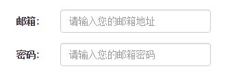
1. Basic form
 <form >
 <div class="form-group">
 <label>邮箱:</label>
 <input type="email" class="form-control" placeholder="请输入您的邮箱地址">
 </div>
 <div class="form-group">
 <label >密码</label>
 <input type="password" class="form-control" placeholder="请输入您的邮箱密码">
 </div>
 <div class="checkbox">
 <label>
 <input type="checkbox"> 记住密码
 </label>
 </div>
 <button type="submit" class="btn btn-default">进入邮箱</button>
 </form>

In addition to these elements, the form also has input, select, textarea and other elements. In the Bootstrap framework, a class name `form-control` is customized. That is to say, if these elements use The class name "form-control" will achieve some design customization effects.
1. The width becomes 100%
2. Set a light gray (#ccc) border
3. Rounded corners with 4px
4. Set the shadow effect, and when the element gets focus, the shadow and border effects will change
5. Set the placeholder color to #999
2. Horizontal Form
The default form of the Bootstrap framework is a vertical display style, but many times we need a horizontal form style (labels on the left, form controls on the right).
<form class="form-horizontal" role="form">
 <div class="form-group">
 <label for="inputEmail3" class="col-sm-2 control-label">邮箱:</label>
 <div class="col-sm-4">
 <input type="email" class="form-control" id="inputEmail3" placeholder="请输入您的邮箱地址">
 </div>
 </div>
 <div class="form-group">
 <label for="inputPassword3" class="col-sm-2 control-label">密码:</label>
 <div class="col-sm-4">
 <input type="password" class="form-control" id="inputPassword3" placeholder="请输入您的邮箱密码">
 </div>
 </div>
 </form>
To achieve horizontal form effects in the Bootstrap framework, the following two conditions must be met:
1. In the

 10款好看又实用的Bootstrap后台管理系统模板(快来下载)Aug 06, 2021 pm 01:55 PM
一个好的网站,不能只看外表,网站后台同样很重要。本篇文章给大家分享10款好看又实用的Bootstrap后台管理系统模板,可以帮助大家快速建立强大有美观的网站后台,欢迎下载使用!如果想要获取更多后端模板,请关注php中文网后端模板栏目!
 bootstrap与jquery是什么关系Aug 01, 2022 pm 06:02 PM
bootstrap与jquery的关系是:bootstrap是基于jquery结合了其他技术的前端框架。bootstrap用于快速开发Web应用程序和网站,jquery是一个兼容多浏览器的javascript库,bootstrap是基于HTML、CSS、JAVASCRIPT的。
 7款实用响应式Bootstrap电商源码模板(快来下载)Aug 31, 2021 pm 02:13 PM
好看又实用的Bootstrap电商源码模板可以提高建站效率,下面本文给大家分享7款实用响应式Bootstrap电商源码,均可免费下载,欢迎大家使用!更多电商源码模板,请关注php中文网电商源码栏目!
 8款Bootstrap企业公司网站模板(源码免费下载)Aug 24, 2021 pm 04:35 PM
好看又实用的企业公司网站模板可以提高您的建站效率,下面PHP中文网为大家分享8款Bootstrap企业公司网站模板,均可免费下载,欢迎大家使用!更多企业站源码模板,请关注php中文网企业站源码栏目!
 bootstrap中sm是什么意思May 06, 2022 pm 06:35 PM
在bootstrap中,sm是“小”的意思,是small的缩写;sm常用于表示栅格类“.col-sm-*”,是小屏幕设备类的意思,表示显示大小大于等于768px并且小于992px的屏幕设备,类似平板设备。
 bootstrap默认字体大小是多少Aug 22, 2022 pm 04:34 PM
bootstrap默认字体大小是“14px”;Bootstrap是一个基于HTML、CSS、JavaScript的开源框架,用于快速构建基于PC端和移动端设备的响应式web页面,并且默认的行高为“20px”,p元素行高为“10px”。
 bootstrap modal 如何关闭Dec 07, 2020 am 09:41 AM
bootstrap modal关闭的方法:1、连接好bootstrap的插件;2、给按钮绑定模态框事件;3、通过“ $('#myModal').modal('hide');”方法手动关闭模态框即可。
 bootstrap是免费的吗Jun 21, 2022 pm 05:31 PM
bootstrap是免费的;bootstrap是美国Twitter公司的设计师“Mark Otto”和“Jacob Thornton”合作基于HTML、CSS、JavaScript 开发的简洁、直观、强悍的前端开发框架,开发完成后在2011年8月就在GitHub上发布了,并且开源免费。


Hot AI Tools

Undresser.AI Undress
AI-powered app for creating realistic nude photos

AI Clothes Remover
Online AI tool for removing clothes from photos.

Undress AI Tool
Undress images for free

Clothoff.io
AI clothes remover

AI Hentai Generator
Generate AI Hentai for free.

Hot Article
Hot Tools

Safe Exam Browser
Safe Exam Browser is a secure browser environment for taking online exams securely. This software turns any computer into a secure workstation. It controls access to any utility and prevents students from using unauthorized resources.

SublimeText3 Mac version
God-level code editing software (SublimeText3)

Atom editor mac version download
The most popular open source editor

PhpStorm Mac version
The latest (2018.2.1) professional PHP integrated development tool

VSCode Windows 64-bit Download
A free and powerful IDE editor launched by Microsoft

