

 Web Front-endHTML TutorialWhat is the difference between adaptive and responsive? Introduction to the difference between adaptive and responsive
The content of this article is about what is the difference between adaptive and responsive? The introduction to the difference between adaptive and responsive has certain reference value. Friends in need can refer to it. I hope it will be helpful to you.
Preface
"The difference between adaptive design and responsive design" is a common question. Here we will introduce the difference between them more straightforwardly. The difference.
Viewport
Let’s first understand a concept (which often appears below):
Viewport: the size of the user’s screen for browsing information (each viewport is followed by a real one) User)
Concept:
Responsive design:
[Encyclopedia]: Responsive design was introduced by Ethan Marcotte in May 2010 A concept proposed in January, in a nutshell, is that a website can be compatible with multiple terminals - rather than making a specific version for each terminal. This concept was born to solve mobile Internet browsing.
Adaptive Design
[Encyclopedia]: Adaptive design refers to new web design methods and methods that enable web pages to be adaptively displayed on terminal devices of different sizes. technology. 
Differences
The more intuitive differences are: Adaptive: multiple sets of interfaces need to be developed; responsive development of one interface
Adaptive design By detecting the viewport resolution, we can determine whether the currently accessed device is: PC, tablet, or mobile phone, thereby requesting the service layer and returning different The page;Responsive design displays different layouts and content by detecting the viewport resolution and doing code processing on the client side for different clients.
Adaptive The screen adaptation made to the page is within a certain range: for example, a set of adaptations for PC (>1024), tablet (768-1024) ) One set of adaptations, one set of adaptations for the mobile phone ( Responsive One set of pages is all adapted. (As you can imagine: responsive design needs to be considered much more complex than adaptive design)
Adaptive design (adaptive design implementation principle): It is to establish different design elements for different types of devices. The web page will call the corresponding web page after detecting the device resolution size. In the current era where apps are rampant, domestic adaptive layout applications are mainly concentrated on the web side where the viewport is already very stable. (Web-side Viewport Big Data [2016]) optimizes the experience for notebooks and desktops.
Responsive design (Responsive design) is a set of interfaces that run simultaneously on different viewports on PC, tablet, and mobile phones. By detecting the resolution of the device, you can make different layouts and content for the page.
Common ground
Both are technologies that optimize and adapt to the increasingly differentiated viewport browsing experience on the Internet, and have emerged to provide a better experience for the viewport. Design using techniques to adapt pages to viewports of different resolutions.
Responsive Pros, Cons and Flags
Flags
Breadcrumb Menu
Changing the browser width will display different layouts at different resolutions
Advantages:
Face Strong flexibility for different resolution devices
Can quickly solve the problem of multi-device display adaptation
Disadvantages:
Only suitable for department-type websites with uncomplicated layout, information, and framework
Compatible with various devices Large workload and low efficiency
The code is cumbersome, hidden useless elements will appear, and the loading time will be lengthened
In fact, this is a compromise design solution, which is affected by many factors. Not achieving the best results
changes the original layout structure of the website to a certain extent, which may cause user confusion
Adaptive Website advantages, disadvantages and logos
Logo
mostly just adapt to the mainstream N mainstream viewports (2-3) of a single terminal
When the viewport size is lower than the set minimum viewport, the interface will appear incompletely displayed, overflow, and a horizontal sliding indicator will appear (mainly on the PC side, and never allowed on the mobile side) When this happens)
The overall framework remains unchanged, and most of the horizontal layout sections will be reduced
Advantages
More compatible with the complexity of the website
It is cheaper to implement,
Code is more efficient
Testing is easier and operation is relatively more accurate (pictures are more controllable)
Disadvantages:
#With the popularity of mobile design, the same website often needs to develop different designs for different devices. page, increasing development costs
When requirements change, multiple sets of codes may be changed. The process is cumbersome.
Serves design and development
Theoretically, responsive layout is better than adaptive layout in any case, but in There are situations where adaptive layout is more practical.
Adaptive layout can make your design more controllable, because you only need to consider a few states and everything will be fine.
But in responsive layout you may need to face a lot of states - yes, the difference between most states is small, but they are indeed different, so it is difficult to figure out exactly what you are What will the design be like.
At the same time, this also brings about testing problems. It is difficult for you to predict with absolute certainty what it will do.
Put another way, this is also the charm of responsive layout. Adaptive layouts have their own advantages in comparison, as they are cheaper to implement and easier to test, which often makes them a more practical solution.
In fact, no matter which design concept is used, each has its own advantages and disadvantages. The specific choice should be based on the actual needs of the team/project.
The above is the detailed content of What is the difference between adaptive and responsive? Introduction to the difference between adaptive and responsive. For more information, please follow other related articles on the PHP Chinese website!

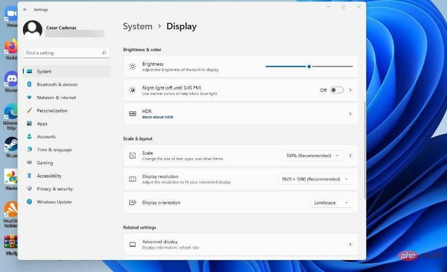 如何在 Windows 11 上配置内容自适应亮度Apr 14, 2023 pm 12:37 PM
自适应亮度是 Windows 11 计算机上的一项功能,可根据显示的内容或照明条件调整屏幕的亮度级别。由于部分用户还在习惯 Windows 11 的新界面,因此无法轻松找到自适应亮度,甚至有人说 Windows 11 上的自适应亮度功能缺失,所以本教程将把所有内容都弄清楚。例如,如果您正在观看 YouTube 视频并且视频突然显示黑暗场景,自适应亮度将使屏幕更亮并增加对比度级别。这与自动亮度不同,自动亮度是一种屏幕设置,可让计算机、智能手机或设备根据环境照明调整亮度级别。前置摄像头中有一个特殊的
 7款实用响应式Bootstrap电商源码模板(快来下载)Aug 31, 2021 pm 02:13 PM
好看又实用的Bootstrap电商源码模板可以提高建站效率,下面本文给大家分享7款实用响应式Bootstrap电商源码,均可免费下载,欢迎大家使用!更多电商源码模板,请关注php中文网电商源码栏目!
 如何在Java 9中使用JavaFX来构建响应式UI界面Jul 30, 2023 pm 06:36 PM
如何在Java9中使用JavaFX来构建响应式UI界面引言:在计算机应用程序的开发过程中,用户界面(UI)是非常重要的一部分。一个好的UI能够提升用户体验,使应用程序更具吸引力。JavaFX是Java平台上的一个图形用户界面(GUI)框架,它提供了一套丰富的工具和API来快速构建富有交互性的UI界面。在Java9中,JavaFX已经成为了JavaSE的
 手把手带你了解VUE响应式原理Aug 26, 2022 pm 08:41 PM
本篇文章我们来了解 Vue2.X 响应式原理,然后我们来实现一个 vue 响应式原理(写的内容简单)实现步骤和注释写的很清晰,大家有兴趣可以耐心观看,希望对大家有所帮助!
 使用Webman进行响应式网站开发的秘诀Aug 14, 2023 pm 12:27 PM
使用Webman进行响应式网站开发的秘诀在当今数字化时代,人们越来越依赖于移动设备来访问互联网。为了提供更好的用户体验和适配不同尺寸的屏幕,响应式网站开发已经成为了一个重要的趋势。而Webman作为一个功能强大的框架,为我们提供了许多工具和技术来实现响应式网站的开发。在这篇文章中,我们将分享一些使用Webman进行响应式网站开发的秘诀,包括如何设置媒体查询、
 如何使用Vue和Element-UI实现移动端响应式设计Jul 21, 2023 am 10:49 AM
如何使用Vue和Element-UI实现移动端响应式设计随着移动设备的普及,移动端响应式设计变得越来越重要。Vue和Element-UI是两个非常流行的前端开发工具,可以帮助我们快速实现移动端响应式设计。本文将带领大家学习如何使用Vue和Element-UI来开发移动端响应式设计,并提供代码示例。一、搭建项目环境在开始之前,我们需要先搭建一个使用Vue和El
 如何用Vue实现响应式UI设计?Jun 27, 2023 pm 02:35 PM
随着当今Web前端开发技术的快速发展,许多前端框架也随之迅速崛起。而Vue.js作为其中的一员,因其轻量、易上手、灵活、高效、响应式等特点,越来越被广大前端开发者所青睐。在Vue的帮助下,我们可以很方便地实现响应式UI设计,提升用户交互体验,下面我们来详细介绍一下。一、什么是响应式UI设计?响应式UI设计是一种页面设计方法,其主要目的是根据不同设备的屏幕大小
 详解Vue3响应式的两大利器:ref与reactiveJan 09, 2023 pm 06:32 PM
相对于Vue2的defineProperty实现的数据响应式,Vue3对数据响应的处理分工更加明确,通过组合式api中ref与reactive两个暴露给开发者的函数对数据进行包装,从而实现了数据响应式


Hot AI Tools

Undresser.AI Undress
AI-powered app for creating realistic nude photos

AI Clothes Remover
Online AI tool for removing clothes from photos.

Undress AI Tool
Undress images for free

Clothoff.io
AI clothes remover

AI Hentai Generator
Generate AI Hentai for free.

Hot Article
Hot Tools

Dreamweaver Mac version
Visual web development tools

MantisBT
Mantis is an easy-to-deploy web-based defect tracking tool designed to aid in product defect tracking. It requires PHP, MySQL and a web server. Check out our demo and hosting services.

Notepad++7.3.1
Easy-to-use and free code editor

SAP NetWeaver Server Adapter for Eclipse
Integrate Eclipse with SAP NetWeaver application server.

SublimeText3 Mac version
God-level code editing software (SublimeText3)

