Home >Web Front-end >CSS Tutorial >CSS3 realizes the effect of dynamically opening the door (code example)
CSS3 realizes the effect of dynamically opening the door (code example)
- 青灯夜游Original
- 2018-09-21 14:47:243585browse
This chapter introduces CSS3 to dynamically open the door effect (code example). It has a certain reference value. Friends in need can refer to it. I hope it will be helpful to you.
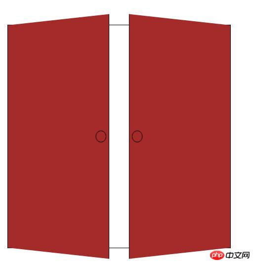
Let’s take a look at the renderings first:

Open the door dynamically The effect mainly uses 3D rotation and positioning technology. The specific steps are as follows:
1. First, add three very simple div tags to the main body of the page:
<div class="door">
     <div class="door-l"></div>
     <div class="door-r"></div>
</div>
2. Add basic attributes, background, and View distance and relative positioning (the child box needs to use absolute positioning, so it is best to add relative positioning to the parent box).
.door {
            width: 450px;
            height: 450px;
            border: 1px solid #000000;
            margin: 100px auto;
            background: url(Images/men.png) no-repeat;
            background-size: 100% 100%;
            position: relative;
            perspective: 1000px;
        }
3. Set related attributes for the left and right doors. Here are the related attributes of the left box. The right box only needs to change the positioning to the right distance to 0, and the rotation axis to the right.
.door-l {
            width: 50%;
            height: 100%;
            background-color: brown;
            position: absolute;
            top: 0;
            transition: all 0.5s;
            left: 0;
            border-right: 1px solid #000000;
            transform-origin: left;
        }
4. Add the small ring on the door, here it is added using the pseudo class before.
(1), Set the size and border
(2), Set the border-radius to 50% to make it circular.
(3). Set the positioning to be vertically centered and a certain distance away from the inside.
.door-l::before {
            content: "";
            border: 1px solid #000000;
            width: 20px;
            height: 20px;
            position: absolute;
            top: 50%;
            border-radius: 50%;
            transform: translateY(-50%);
            right: 5px;
        }
5. Finally, set the degree of rotation. I have set 120 degrees here (note that the positive and negative degrees represent the direction of rotation)
.door:hover .door-l {
            transform: rotateY(-120deg);
        }
The complete code is given below for your reference.
<!DOCTYPE html>
<html>
    <head>
	<meta charset="UTF-8">
	<title>动态打开大门</title>
	<style>
	.door {
            width: 450px;
            height: 450px;
            border: 1px solid #000000;
            margin: 100px auto;
            background: url(Images/men.png) no-repeat;
            background-size: 100% 100%;
            position: relative;
            perspective: 1000px;
        }
        .door-l,.door-r {
            width: 50%;
            height: 100%;
            background-color: brown;
            position: absolute;
            top: 0;
            transition: all 0.5s;
        }
        .door-l {
            left: 0;
            border-right: 1px solid #000000;
            transform-origin: left;
        }
        .door-r {
            right: 0;
            border-left: 1px solid #000000;
            transform-origin: right;
        }
        .door-l::before, .door-r::before {
            content: "";
            border: 1px solid #000000;
            width: 20px;
            height: 20px;
            position: absolute;
            top: 50%;
            border-radius: 50%;
            transform: translateY(-50%);
        }

        .door-l::before {
            right: 5px;
        }
        .door-r::before {
            left: 5px;
        }
        .door:hover .door-l {
            transform: rotateY(-120deg);
        }
        .door:hover .door-r {
            transform: rotateY(120deg);
        }
		</style>
	</head>
	<body>
		<div class="door">
			<div class="door-l"></div>
			<div class="door-r"></div>
		</div>
	</body>
</html>
The renderings given above are static. You can compile the above code yourself to see the effect. Hope it helps you
The above is the detailed content of CSS3 realizes the effect of dynamically opening the door (code example). For more information, please follow other related articles on the PHP Chinese website!

