Home >Web Front-end >CSS Tutorial >How to use CSS and D3 to achieve the effect of light spots and particles complementing each other (source code attached)
How to use CSS and D3 to achieve the effect of light spots and particles complementing each other (source code attached)
- 不言Original
- 2018-09-20 16:28:543365browse
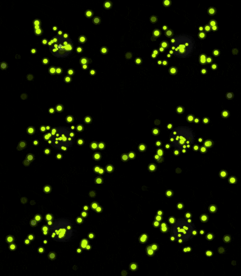
The content of this article is about how to use CSS and D3 to achieve the effect of spot particles complementing each other (source code attached). It has certain reference value. Friends in need can refer to it. I hope it will be useful to you. Helps.
Effect preview

Source code download
All source codes of the daily front-end combat series Please download from github:
https://github.com/comehope/front-end-daily-challenges
Code interpretation
Define dom, the container contains 3 children Element:
<div>
    <span></span>
    <span></span>
    <span></span>
</div>
Set the page background:
body {
    margin: 0;
    width: 100vw;
    height: 100vh;
    background: radial-gradient(circle at center, #222, black 20%);
}
Define the container size:
.container {
    width: 100%;
    height: 100%;
}
Set the style of the light spot, which defines two color variables: brighter and darker:
.container {
    position: relative;
}

.container span {
    --bright-color: #d4ff00;
    --dark-color: #e1ff4d;
    position: absolute;
    width: 30px;
    height: 30px;
    margin-left: -15px;
    margin-top: -15px;
    background: radial-gradient(var(--bright-color), var(--dark-color));
    border-radius: 50%;
    box-shadow: 0 0 25px 3px var(--dark-color);
}
Position the light spot to the center of the page:
.container span {
    transform: translateX(50vw) translateY(50vh);
}
Increase the animation effect of the light spot spreading and shrinking from the center to the surroundings:
.container span {
    animation: animate 1.5s infinite alternate;
    animation-delay: calc(var(--n) * 0.015s);
}

@keyframes animate {
    80% {
        filter: opacity(1);
    }

    100% {
        transform: translateX(calc(var(--x) * 1vw)) translateY(calc(var(--y) * 1vh));
        filter: opacity(0);
    }
}
Define the variables used in the animation--x, --y and --n:
.container span:nth-child(1) {
    --x: 20;
    --y: 30;
    --n: 1;

}

.container span:nth-child(2) {
    --x: 60;
    --y: 80;
    --n: 2;
}

.container span:nth-child(3) {
    --x: 10;
    --y: 90;
    --n: 3;
}
Set the depth of field of the container so that the movement of the light spot feels like it is from far to near. :
.container {
    perspective: 500px;
}

.container span {
    transform: translateX(50vw) translateY(50vh) translateZ(-1000px);
}
At this point, the animation effects of a small number of elements are completed. Next, use d3 to create dom elements and css variables in batches.
Introduce the d3 library and delete the sub-elements in the html file and the sub-element variables in the css file at the same time:
<script></script>
Define the number of spot particles:
const COUNT = 3;
Create dom elements in batches:
d3.select('.container')
    .selectAll('span')
    .data(d3.range(COUNT))
    .enter()
    .append('span');
Set the values --x, --y and --n for the dom element, where --x and --y is a random number from 1 to 99:
d3.select('.container')
    /* 略 */
    .style('--x', () => d3.randomUniform(1, 99)())
    .style('--y', () => d3.randomUniform(1, 99)())
    .style('--n', d => d);
Then set --bright-color and --dark-color# for the dom element The value of ##:
d3.select('.container')
    /* 略 */
    .style('--dark-color', (d) => d3.color(`hsl(${70 + d * 0.1}, 100%, 50%)`))
    .style('--bright-color', (d) => d3.color(`hsl(${70 + d * 0.1}, 100%, 50%)`).brighter(0.15));
Finally, set the number of spot particles to 200:
const COUNT = 200;You’re done!
The above is the detailed content of How to use CSS and D3 to achieve the effect of light spots and particles complementing each other (source code attached). For more information, please follow other related articles on the PHP Chinese website!
Related articles
See more- How to use CSS and D3 to achieve the effect of endless hexagonal space
- How to use CSS and D3 to achieve a heart-shaped animation effect composed of text (with code)
- How to use CSS and D3 to implement a set of lanterns (with code)
- How to use CSS and D3 to implement interactive animation of small fish swimming (with code)
- How to use CSS, D3 and GSAP to implement horizontal bar loader (source code attached)

