 Web Front-end
 CSS Tutorial
 How to set rounded borders in css? How to set rounded borders in css (image and text)
How to set rounded borders in css? How to set rounded borders in css (image and text)
How to set the border in css? Many times when developing the front-end of a web page, in order to make the things on the web page look more comfortable, we may need to set some rounded borders such as buttons. So, how do we set rounded borders? This article will introduce to you how to set rounded borders in CSS.
The most common and simplest way to set a rounded border in css is to use the border-radius attribute.
CSS rounded corners only need to set one property: border-radius (meaning "border radius"). You provide a value for this property to set the radii of all four corners at the same time. All legal CSS measurements can be used: em, ex, pt, px, percentage, etc.
Let’s take a look at a css code example to set a rounded border:
<!DOCTYPE html>
<html>
<head>
<style>
div
{
text-align:center;
border:2px solid #a1a1a1;
padding:80px 40px;
background:pink;
width:150px;
border-radius:25px;
-moz-border-radius:25px; /* 老的 Firefox */
}
</style>
</head>
<body>
<div>圆角边框</div>
</body>
</html>
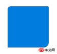
The effect is as follows:

border-radius can be set to 1 at the same time to 4 values.
If you set a value, it means that all four fillets use this value.
css rounded border code: border-radius: 15px;


border-top-right-radius
border-bottom-right-radius
border -bottom-left-radius
css manual.
The above is the detailed content of How to set rounded borders in css? How to set rounded borders in css (image and text). For more information, please follow other related articles on the PHP Chinese website!
 Using Pages CMS for Static Site Content ManagementMay 13, 2025 am 09:24 AM
I know, I know: there are a ton of content management system options available, and while I've tested several, none have really been the one, y'know? Weird pricing models, difficult customization, some even end up becoming a whole &
 The Ultimate Guide to Linking CSS Files in HTMLMay 13, 2025 am 12:02 AM
Linking CSS files to HTML can be achieved by using elements in part of HTML. 1) Use tags to link local CSS files. 2) Multiple CSS files can be implemented by adding multiple tags. 3) External CSS files use absolute URL links, such as. 4) Ensure the correct use of file paths and CSS file loading order, and optimize performance can use CSS preprocessor to merge files.
 CSS Flexbox vs Grid: a comprehensive reviewMay 12, 2025 am 12:01 AM
Choosing Flexbox or Grid depends on the layout requirements: 1) Flexbox is suitable for one-dimensional layouts, such as navigation bar; 2) Grid is suitable for two-dimensional layouts, such as magazine layouts. The two can be used in the project to improve the layout effect.
 How to Include CSS Files: Methods and Best PracticesMay 11, 2025 am 12:02 AM
The best way to include CSS files is to use tags to introduce external CSS files in the HTML part. 1. Use tags to introduce external CSS files, such as. 2. For small adjustments, inline CSS can be used, but should be used with caution. 3. Large projects can use CSS preprocessors such as Sass or Less to import other CSS files through @import. 4. For performance, CSS files should be merged and CDN should be used, and compressed using tools such as CSSNano.
 Flexbox vs Grid: should I learn them both?May 10, 2025 am 12:01 AM
Yes,youshouldlearnbothFlexboxandGrid.1)Flexboxisidealforone-dimensional,flexiblelayoutslikenavigationmenus.2)Gridexcelsintwo-dimensional,complexdesignssuchasmagazinelayouts.3)Combiningbothenhanceslayoutflexibilityandresponsiveness,allowingforstructur
 Orbital Mechanics (or How I Optimized a CSS Keyframes Animation)May 09, 2025 am 09:57 AM
What does it look like to refactor your own code? John Rhea picks apart an old CSS animation he wrote and walks through the thought process of optimizing it.
 CSS Animations: Is it hard to create them?May 09, 2025 am 12:03 AM
CSSanimationsarenotinherentlyhardbutrequirepracticeandunderstandingofCSSpropertiesandtimingfunctions.1)Startwithsimpleanimationslikescalingabuttononhoverusingkeyframes.2)Useeasingfunctionslikecubic-bezierfornaturaleffects,suchasabounceanimation.3)For
 @keyframes CSS: The most used tricksMay 08, 2025 am 12:13 AM
@keyframesispopularduetoitsversatilityandpowerincreatingsmoothCSSanimations.Keytricksinclude:1)Definingsmoothtransitionsbetweenstates,2)Animatingmultiplepropertiessimultaneously,3)Usingvendorprefixesforbrowsercompatibility,4)CombiningwithJavaScriptfo


Hot AI Tools

Undresser.AI Undress
AI-powered app for creating realistic nude photos

AI Clothes Remover
Online AI tool for removing clothes from photos.

Undress AI Tool
Undress images for free

Clothoff.io
AI clothes remover

Video Face Swap
Swap faces in any video effortlessly with our completely free AI face swap tool!

Hot Article

Hot Tools

MinGW - Minimalist GNU for Windows
This project is in the process of being migrated to osdn.net/projects/mingw, you can continue to follow us there. MinGW: A native Windows port of the GNU Compiler Collection (GCC), freely distributable import libraries and header files for building native Windows applications; includes extensions to the MSVC runtime to support C99 functionality. All MinGW software can run on 64-bit Windows platforms.

Dreamweaver Mac version
Visual web development tools

MantisBT
Mantis is an easy-to-deploy web-based defect tracking tool designed to aid in product defect tracking. It requires PHP, MySQL and a web server. Check out our demo and hosting services.

WebStorm Mac version
Useful JavaScript development tools

Zend Studio 13.0.1
Powerful PHP integrated development environment


