Home >Web Front-end >CSS Tutorial >How to use pure CSS to achieve an overhead view of a football field (source code attached)
How to use pure CSS to achieve an overhead view of a football field (source code attached)
- 不言Original
- 2018-09-04 11:45:103734browse
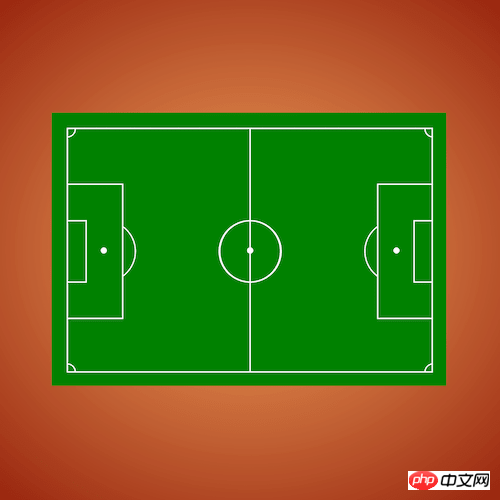
The content of this article is about how to use pure CSS to realize an overhead view of a football field (source code attached). It has certain reference value. Friends in need can refer to it. I hope it will be helpful to you. helped.
Effect preview

Source code download
https://github.com/comehope/front-end-daily-challenges
Code Interpretation
Define dom, the container contains the field, and the field contains elements such as the center line, midpoint, center circle, penalty area, penalty kick point, penalty kick arc, goal area, corner kick area, etc.:
<div>
    <div>
        <span></span>
        <span></span>
        <span></span>
        <span></span>
        <span></span>
        <span></span>
        <span></span>
        <span></span>
    </div>
</div>
Centered display:
body {
    margin: 0;
    height: 100vh;
    display: flex;
    align-items: center;
    justify-content: center;
    background: radial-gradient(sandybrown, maroon);
}
Define container size:
.container {
    width: 120em;
    height: 80em;
    background-color: green;
    font-size: 5px;
}

.container span {
    display: block;
}
Define line type:
.container {
    --line: 0.3em solid white;
}
Draw the sideline of the field:
.container {
    padding: 5em;
}

.field {
    width: inherit;
    height: inherit;
    border: var(--line);
}
Draw the center line :
.halfway-line {
    width: calc(120em / 2);
    height: 80em;
    border-right: var(--line);
}
Draw the center circle:
.field {
    position: relative;
}

.centre-circle {
    width: 20em;
    height: 20em;
    border: var(--line);
    border-radius: 50%;
    position: absolute;
    top: calc((80em - 20em) / 2);
    left: calc((120em - 20em - 0.3em) / 2);
}
Draw the midpoint:
.centre-mark {
    width: 2em;
    height: 2em;
    background-color: white;
    border-radius: 50%;
    position: absolute;
    top: calc(80em / 2 - 1em);
    left: calc(120em / 2 - 1em + 0.3em / 2);
}
Draw the penalty area:
.penalty-area {
    width: 18em;
    height: 44em;
    border: var(--line);
    position: absolute;
    top: calc((80em - 44em) / 2);
    left: -0.3em;
}
Draw the penalty spot:
.penalty-mark {
    width: 2em;
    height: 2em;
    background-color: white;
    border-radius: 50%;
    position: absolute;
    top: calc(80em / 2 - 1em);
    left: calc(12em - 1em);
}
Draw the penalty arc:
.penalty-arc {
    width: 20em;
    height: 20em;
    border: var(--line);
    border-radius: 50%;
    position: absolute;
    top: calc((80em - 20em) / 2);
    left: calc(12em - 20em / 2);
}
Hide the left arc of the penalty arc, leaving only the right arc:
.field {
    z-index: 1;
}

.penalty-area {
    background-color: green;
}

.penalty-arc {
    z-index: -1;
}
Draw the goal area:
.goal-area {
    width: 6em;
    height: 20em;
    border: var(--line);
    position: absolute;
    top: calc((80em - 20em) / 2);
    left: -0.3em;
}
Draw the corner area:
.field {
    overflow: hidden;
}

.corner-arc::before,
.corner-arc::after {
    content: '';
    position: absolute;
    width: 5em;
    height: 5em;
    border: 0.3em solid white;
    border-radius: 50%;
    --offset: calc(-5em / 2 - 0.3em);
    left: var(--offset);
}

.corner-arc::before {
    top: var(--offset);
}

.corner-arc::after {
    bottom: var(--offset);
}
Copy the sub-elements in the dom, one copy on each side:
<div>
    <div>
        <div>
            <span></span>
            <span></span>
            <span></span>
            <span></span>
            <span></span>
            <span></span>
            <span></span>
            <span></span>
        </div>
        <div>
            <span></span>
            <span></span>
            <span></span>
            <span></span>
            <span></span>
            <span></span>
            <span></span>
            <span></span>
        </div>
    </div>
</div>
The style on the right side is the same as the left side, only horizontal Just flip it over:
.right {
    position: absolute;
    top: 0;
    left: 50%;
    transform: rotateY(180deg);
}
You're done!
Related recommendations:
How to use pure CSS to realize the display box effect of butterfly specimens
How to use pure CSS to realize the animation effect of Windows startup interfaceThe above is the detailed content of How to use pure CSS to achieve an overhead view of a football field (source code attached). For more information, please follow other related articles on the PHP Chinese website!
Related articles
See more- How to use pure CSS to achieve the effect of a coffee machine
- How to use pure CSS to achieve the effect of rainbow striped text (with code)
- How to use pure CSS to achieve an hourglass animation effect
- How to use pure CSS to achieve animation effects on the Windows startup interface
- How to use pure CSS to achieve the display frame effect of butterfly specimens

