


A brief introduction to Flex layout of display attribute in CSS3

This article brings you a brief introduction to the Flex layout of the display attribute in CSS3. It has certain reference value. Friends in need can refer to it. I hope it will be helpful to you.
Recently I am learning WeChat applet. When designing the layout of the homepage, I came across a new layout method display:flex
 .container {
   display: flex;
   flex-direction: column;
   align-items: center;
   background-color: #b3d4db;
 }
The effect after compilation is very obvious, and the layout of the interface is also very reasonable. , looks very clear. So what is this attribute used for?
Flex is the abbreviation of Flexible Box, which means "flexible layout" and is used to provide maximum flexibility for box-shaped models. After setting to Flex layout, the float, clear and vertical-align attributes of the child elements will be invalid.
It can be applied to containers or inline elements. (The above description is combined with the WeChat developer tool description) In 2009, W3C proposed a new solution-Flex layout, which can implement various page layouts simply, completely, and responsively. Currently, it is supported by all browsers, which means it is now safe to use this feature.
Basic concepts
Elements that adopt Flex layout are called Flex containers (flex containers), or "containers" for short. All its child elements automatically become container members, called Flex items (flex items), referred to as "items". The container has two axes by default: the horizontal main axis and the vertical cross axis. The starting position of the main axis (the intersection with the border) is called main start, and the ending position is called main end; the starting position of the cross axis is called cross start, and the ending position It’s called cross end. Items are arranged along the main axis by default. The main axis space occupied by a single project is called main size, and the cross axis space occupied by a single item is called cross size.

The following 6 properties are set on the container:
flex-direction The arrangement direction of the items in the container (default horizontal arrangement)
flex-wrap The wrapping method of items in the container
flex-flow The abbreviation of the above two properties
justify-content The alignment of items on the main axis
align-items Item How to align on the cross axis
align-content Defines the alignment of multiple axes. This property has no effect if the project has only one axis.
flex-direction
## 1 .box { 2 flex-direction: row | row-reverse | column | column-reverse; 3 }
The optional value range of the attribute is row (default) arranged from left to right along the horizontal main axis, row-reverse arranged from right to left along the horizontal main axis, column from top right to bottom along the vertical main axis, and column-reverse.flex-wrap 1 .box{ 2 flex-wrap: nowrap | wrap | wrap-reverse; 3 }
The optional value range of the attribute is nowrap (default ) no line wrapping, wrap wrapping (the first line is at the top) and wrap-reverse (you know~)flex-flow
1 .box { 2 flex -flow:justify-content
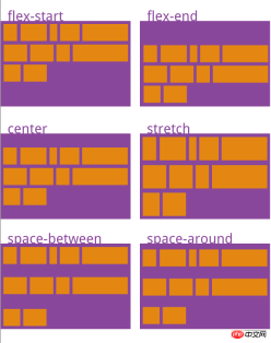
1 .box { 2 justify-content: flex-start | flex-end | center | space-between | space-around; 3 }
The alignment of the items on the main axis (which axis the main axis is depends on the setting of the attribute flex-direction)flex-start: Arrange from left or top on the main axisflex-end: Arrange from the right or bottom on the main axis center: Arrange in the center on the main axis space-between: Start from the left and right ends or the upper and lower ends of the main axis Arrangespace-around: Each item is equally spaced on both sides. Therefore, the space between items is twice as large as the space between items and the border. align-items 1 .box { 2 align-items: flex-start | flex-end | center | baseline | stretch; 3 } Go directly here The picture illustrates it more clearly

flex-basis 在分配多余空间之前,项目占据的主轴空间(main size)。浏览器根据这个属性,计算主轴是否有多余空间。它的默认值为auto,项目的本来大小。
flex 是flex-grow, flex-shrink 和 flex-basis的简写,默认值为0 1 auto。后两个属性可选。
align-self 允许单个项目有与其他项目不一样的对齐方式,可覆盖align-items属性。默认值为auto,表示继承父元素的align-items属性,如果没有父元素,则等同于stretch。
order
1     .item {
2       order: <integer>;
3     }
flex-grow
1     .item {
2       flex-grow: <number>; /* default 0 */
3     }
flex-shrink
1     .item {
2       flex-shrink: <number>; /* default 1 */
3     }
flex-basis
1     .item {
2       flex-basis: <length> | auto; /* default auto */
3     }</length>
flex
1 .item {
2 flex: none | [ <'flex-grow'> <'flex-shrink'>? || <'flex-basis'> ]
3 }align-self
1     .item {
2       align-self: auto | flex-start | flex-end | center | baseline | stretch;
3     }
容器属性和项目属性是可以配合使用的,用法类似于CSS的行内式和嵌入式的道理一样。希望你可以在实际应用中熟练使用。
相关推荐:
CSS选择器的代码实例以及css优先级的代码实例The above is the detailed content of A brief introduction to Flex layout of display attribute in CSS3. For more information, please follow other related articles on the PHP Chinese website!

 What is CSS Grid?Apr 30, 2025 pm 03:21 PM
CSS Grid is a powerful tool for creating complex, responsive web layouts. It simplifies design, improves accessibility, and offers more control than older methods.
 What is CSS flexbox?Apr 30, 2025 pm 03:20 PM
Article discusses CSS Flexbox, a layout method for efficient alignment and distribution of space in responsive designs. It explains Flexbox usage, compares it with CSS Grid, and details browser support.
 How can we make our website responsive using CSS?Apr 30, 2025 pm 03:19 PM
The article discusses techniques for creating responsive websites using CSS, including viewport meta tags, flexible grids, fluid media, media queries, and relative units. It also covers using CSS Grid and Flexbox together and recommends CSS framework
 What does the CSS box-sizing property do?Apr 30, 2025 pm 03:18 PM
The article discusses the CSS box-sizing property, which controls how element dimensions are calculated. It explains values like content-box, border-box, and padding-box, and their impact on layout design and form alignment.
 How can we animate using CSS?Apr 30, 2025 pm 03:17 PM
Article discusses creating animations using CSS, key properties, and combining with JavaScript. Main issue is browser compatibility.
 Can we add 3D transformations to our project using CSS?Apr 30, 2025 pm 03:16 PM
Article discusses using CSS for 3D transformations, key properties, browser compatibility, and performance considerations for web projects.(Character count: 159)
 How can we add gradients in CSS?Apr 30, 2025 pm 03:15 PM
The article discusses using CSS gradients (linear, radial, repeating) to enhance website visuals, adding depth, focus, and modern aesthetics.
 What are pseudo-elements in CSS?Apr 30, 2025 pm 03:14 PM
Article discusses pseudo-elements in CSS, their use in enhancing HTML styling, and differences from pseudo-classes. Provides practical examples.


Hot AI Tools

Undresser.AI Undress
AI-powered app for creating realistic nude photos

AI Clothes Remover
Online AI tool for removing clothes from photos.

Undress AI Tool
Undress images for free

Clothoff.io
AI clothes remover

Video Face Swap
Swap faces in any video effortlessly with our completely free AI face swap tool!

Hot Article
Hot Tools

Dreamweaver CS6
Visual web development tools

EditPlus Chinese cracked version
Small size, syntax highlighting, does not support code prompt function

DVWA
Damn Vulnerable Web App (DVWA) is a PHP/MySQL web application that is very vulnerable. Its main goals are to be an aid for security professionals to test their skills and tools in a legal environment, to help web developers better understand the process of securing web applications, and to help teachers/students teach/learn in a classroom environment Web application security. The goal of DVWA is to practice some of the most common web vulnerabilities through a simple and straightforward interface, with varying degrees of difficulty. Please note that this software

MantisBT
Mantis is an easy-to-deploy web-based defect tracking tool designed to aid in product defect tracking. It requires PHP, MySQL and a web server. Check out our demo and hosting services.

Safe Exam Browser
Safe Exam Browser is a secure browser environment for taking online exams securely. This software turns any computer into a secure workstation. It controls access to any utility and prevents students from using unauthorized resources.

