
Home >Web Front-end >CSS Tutorial >Introduction to the four properties in the CSS box model (with code)
Introduction to the four properties in the CSS box model (with code)

- 不言Original
- 2018-08-07 14:20:097485browse
This article brings you an introduction to the four attributes in the CSS box model (with code). It has certain reference value. Friends in need can refer to it. I hope it will be helpful to you.
1. Replacement elements and non-replacement elements
Depending on whether the "outer box" is inline or block level We can divide elements into inline elements and block-level elements, and depending on whether
has replaceable content, we can also divide elements into replaced elements and non-replaced elements
1.1 Replacement elements Definition
Elements that can be replaced by modifying the content presented by a certain attribute value are called "replacement elements". Common replacement elements are: 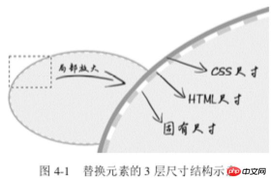 ,
,
1.2 Features of replacement elements
1. The appearance of the content is not affected by the CSS on the page ; Such as the inner spacing, background color and other styles of the single check box
2, have their own size; such as
3, Many CSS properties have their own set of performance rules; in vertical-align, the replacement element defaults to baseline (the lower edge of the letter x), and the baseline of the replacement element is abruptly defined as the lower edge of the element
1.3 Size calculation rules for replaced elements
The sizes of replaced elements are divided into 3 categories from the inside out: intrinsic size, HTML size and CSS size
Inherent size refers to the original size of the replacement content; for example, when pictures, videos, and input exist as an independent file, they all have their own width and height;
-
HTML size, "HTML size" can only be changed through
HTMLnative properties. TheseHTMLnative properties include<img src="/static/imghwm/default1.png" data-src="https://img.php.cn//upload/image/282/617/572/1533622417101890.jpg" class="lazy" alt="Introduction to the four properties in the CSS box model (with code)" >## Thewidthandheightproperties of #, thesizeproperty of, the CSS size specifically refers to the width
and The size set byheightormax-width/min-widthandmax-height/min-heightcorresponds to thecontent box# in the box size.
2. Content attribute
Note that the
content attribute can be used not only in ::before/::after, but also in elements, but there is some compatibility. sex. Under the Chrome browser, all elements support the content attribute, while other browsers only support the ::before/::after pseudo-element
Case 1: Based on pseudo-elements Image content generation technology for elements
HTML:
<img src="/static/imghwm/default1.png"  data-src="1.jpg"  class="lazy"  alt="美女沉思图" data->
<p><button>设置src属性显示图片</button></p>
var eleButton = document.querySelector('button'),
    eleImg = document.querySelector('img');if (eleButton && eleImg) {
    var initValueButton = eleButton.innerHTML;    // 图片地址
    var srcImage = eleImg.getAttribute('data-src');    // 移除该属性
    eleImg.removeAttribute('data-src');    // 按钮点击事件
    eleButton.addEventListener('click', function() {
        if (this.innerHTML == initValueButton) {
            this.innerHTML = '移除src属性';            // 图片显示
            eleImg.setAttribute('src', srcImage);        } else {
            this.innerHTML = initValueButton;            // src属性移除
            eleImg.removeAttribute('src');        }
    });}
CSS:
img {
    display: inline-block;    width: 256px; height: 192px;    /* 隐藏Firefox alt文字 */
    color: transparent;    position: relative;    overflow: hidden;}img:not([src]) {
    /* 隐藏Chrome alt文字以及银色边框 */
    visibility: hidden;}img::before {
    /* 淡蓝色占位背景 */
    content: "";    position: absolute; left: 0;    width: 100%; height: 100%;    background-color: #f0f3f9;    visibility: visible;}img::after {
    /* 黑色alt信息条 */
    content: attr(alt);    position: absolute;    left: 0; bottom: 0;    width: 100%;    line-height: 30px;    background-color: rgba(0,0,0,.5);    color: white;    font-size: 14px;    transform: translateY(100%);    /* 来点过渡动画效果 */
    transition: transform .2s;    visibility: visible;}img:hover::after {
    transform: translateY(0);}
<p></p>

: When the picture does not have src, ::before and ::after can take effect; when adding a src address to the picture, the picture changes from ordinary The element becomes a replacement element. ::before and ::after, which were originally supported, are all invalid at this time. Case 2: Content introduces images
img { content: url(1.jpg); } Case 3: Hover image replacement
<img  src="/static/imghwm/default1.png" data-src="laugh.png" class="lazy" alt="Introduction to the four properties in the CSS box model (with code)" >

img:hover {
content: url(laugh-tear.png);
}
Case 4: Elegant implementation of h1 SEO
<h1>《CSS 世界》</h1>
h1 {
    width: 180px;
    height: 36px;
    background: url(logo.png); /* 隐藏文字 */
    text-indent: -999px;
}
Case 5: Loading animation
正在加载中<dot>...</dot>

dot {
    display: inline-block;
    height: 1em;
    line-height: 1;
    text-align: left;
    vertical-align: -.25em;
    overflow: hidden;
}
dot::before {
    display: block;
    content: '...\A..\A.';
    white-space: pre-wrap;
    animation: dot 3s infinite step-start both;
}
@keyframes dot {
    33% { transform: translateY(-2em); }
    66% { transform: translateY(-1em); }
}
Case 6: Counter ( Understand)
<div class="reset">
    <div class="counter">我是王小二        <div class="reset">
            <div class="counter">我是王小二的大儿子</div>
            <div class="counter">我是王小二的二儿子                <div class="reset">
                    <div class="counter">我是王小二的二儿子的大孙子</div>
                    <div class="counter">我是王小二的二儿子的二孙子</div>
                    <div class="counter">我是王小二的二儿子的小孙子</div>
                </div>
            </div>
            <div class="counter">我是王小二的三儿子</div>
        </div>
    </div>
    <div class="counter">我是王小三</div>
    <div class="counter">我是王小四        <div class="reset">
            <div class="counter">我是王小四的大儿子</div>
        </div>
</div></div>rrree3. Padding attribute
- #padding affects both the horizontal and vertical directions of inline elements
- padding width and height percentages are calculated based on the width of the parent element
Case 1: Increase the click area
CSS:
.reset {
  padding-left: 20px;
  counter-reset: wangxiaoer;}.counter:before {
  content: counters(wangxiaoer, '-') '. ';
  counter-increment: wangxiaoer;}
Case 2: Separator of any height
a { padding: .25em 0; }
Case 3: Equal proportion box
is used for implementation Adaptive layout, such as web page banner proportional size pictures
<a>登录</a><a>注册</a>

a + a:before {
    content: "";
    font-size: 0;
    padding: 10px 3px 1px;
    margin-left: 6px;
    border-left: 1px solid gray;
}
Case 4: Graphic drawing
/* 矩形 */
div { padding: 50%; }
/* 正方形 */
div { padding: 25% 50%; }
4. Margin attribute
margin features:
<p></p>- Unlike padding, margin can be negative;
- <p></p> Same as padding, the percentage of margin is also relative to the width of its parent element
- <p></p> 4.1 Application of negative margin value
(1) Increase the box size
<p></p>Only when the element is in the "full use of available space" state, the margin can change the element Visual size/* 菜单 */
.icon-menu {
display: inline-block;
width: 140px; height: 10px;
padding: 35px 0;
/* 默认border-color:currentColor; */
border-top: 10px solid;
border-bottom: 10px solid;
/* 核心 */
background-color: currentColor;
background-clip: content-box;
} (2) Classic non-compatible two-column layout
/* 无法改变尺寸 */
.father {
    width: 300px;
    margin: 0 -20px;
}

/* .son 尺寸变化 */
<div>
    <div></div>
</div>

.father { width: 300px; }
.son { margin: 0 -20px; }
Layout principle:
By default, the top and bottom distance of vertical block-level elements is 0, once margin-bottom:-9999px means all following elements and the above element The spatial distance of the element becomes -9999px, which means that all subsequent elements have moved upward by 9999px. At this point, make a stroke of God padding-bottom:9999px Increasing the height of the element, which is plus or minus, has no effect on the layout layer, but it brings what we need - the visual layer has an additional 9999px height available for the background color.
4.2 Margin merging
The top margin (margin-top) and bottom margin (margin-bottom) of block-level elements are sometimes merged into a single margin. This phenomenon Called "margin merging". Two conditions: block-level elements and three scenarios where margin merging occurs only in the vertical direction
(1) Margin merging of adjacent sibling elements . This is the most common and basic
.column-box {
    overflow: hidden;
}
.column-left,
.column-right {
    margin-bottom: -9999px;
    padding-bottom: 9999px;
}
(2) Parent and first/last child element
<p>第一行</p>
<p>第二行</p>

p { margin: 1em 0; }
(3) Margin merging of empty block-level elements
.father { overflow: hidden; }
.son { margin: 1em 0; }

<div>
    <div></div>
</div>
此时.father 所在的这个父级<p></p>元素高度仅仅是 1em,因为.son 这个空
元 素的 margin-top 和 margin-bottom 合并在一起了
如何阻止margin发生合并?
对于 margin-top 合并,可以进行如下操作(满足一个条件即可):
父元素设置为块状格式化上下文元素;
父元素设置 border-top 值;
父元素设置 padding-top 值;
父元素和第一个子元素之间添加内联元素进行分隔。
对于 margin-bottom 合并,可以进行如下操作(满足一个条件即可):
父元素设置为块状格式化上下文元素;
父元素设置 border-bottom 值;
父元素设置 padding-bottom 值;
父元素和最后一个子元素之间添加内联元素进行分隔;
父元素设置 height、min-height 或 max-height。
margin 合并的计算规则:
“正正取大值”“正负值相加”“负负最负值”
4.3 margin:auto深入
margin:auto 的填充规则如下
(1)如果一侧定值,一侧 auto,则 auto 为剩余空间大小。
(2)如果两侧均是 auto,则平分剩余空间。
一侧auto应用
<div>
    <div></div>
</div>

.father {
    width: 300px;
}
.son {
    width: 200px;
    margin-right: 80px;
    margin-left: auto;
}
两侧auto,水平垂直居中
.father {
    width: 300px; height: 150px;
    background-color: #f0f3f9;
    position:relative;
}
.son {
    position: absolute;
    top: 0; right: 0; bottom: 0; left: 0;
    width: 200px; height: 100px;
    background-color: #cd0000;
    margin: auto;
}
注意:
display 计算值 inline 的非替换元素的垂直 margin 是无效的。对于内联替换元素, 垂直 margin 有效,并且没有 margin 合并的问题,所以图片永远不会发生 margin 合并。
五、border属性
几个特点:
border属性值不支持百分比
border-style 默认值为none
border-color 默认值为currentColor
应用1:图片上传hover变色
.add {
    color: #ccc;
    border: 2px dashed;
}
.add:before {
    border-top: 10px solid;
}
.add:after {
    border-left: 10px solid;
}
/* hover变色 */
.add:hover {
    color: #06C;
}
应用2:优雅增加点击区域
/* box-sizing非border-box时 */
.icon-clear {
    width: 16px;
    height: 16px;
    border: 11px solid transparent;
}
应用3:三角形绘制
div {
    width: 0;
    border: 10px solid;
    border-color: #f30 transparent transparent;
}
border能构成三角形和梯形的原理如下:

通过改变width/height以及border-width在不同方位的尺寸,可以改变三角形的倾角方位和尺寸
应用4:border等高布局
.box {
    border-left: 150px solid #333;
    background-color: #f0f3f9;
}
.box > nav {
    width: 150px;
    margin-left: -150px;
    float: left;
}
.box > section {
    overflow: hidden;
}
border等高布局的局限性:
由于 border 不支持百分比宽度,因此,适合至少一栏是定宽的布局
等高布局的栏目有限制。基本上,border 等 高布局只能满足 2~3 栏的情况,除非正好是等比例的,那还可以使用 border-style:double 实现最多 7 栏布局
相关文章推荐:
The above is the detailed content of Introduction to the four properties in the CSS box model (with code). For more information, please follow other related articles on the PHP Chinese website!
Related articles
See more- How Can I Override Inline Styles in HTML with External CSS?
- Why Doesn't My SVG Background-Image Display in Firefox's Pseudo-Element?
- Introductory tutorial on CSS elements: 10 recommended zero-based introductory tutorials on CSS elements
- Let's explore the benefits of responsive layout
- How to set css style in web design and production