

Bootstrap must learn drop-down menu every day_javascript skills

1. Drop-down menu (basic usage)
Friends, please note that the drop-down menu component in the Bootstrap framework is an independent component. According to different versions, its corresponding file:
☑ LESS version: The corresponding source code file is dropdowns.less
☑ Sass version: The corresponding source code file is _dropdowns.sass
☑ Compiled Bootstrap version: View lines 3004 to 3130 of the bootstrap.css file
When using the drop-down menu of the Bootstrap framework, you must call the bootstrap.js file provided by the Bootstrap framework. Of course, if you are using the uncompiled version, you can find a file named "dropdown.js" in the js folder. You can also call this js file. However, in our tutorial, we uniformly call the compressed "bootstrap.min.js" file:
Special statement: Because Bootstrap’s component interaction effects all rely on plug-ins written by the jQuery library, jquery.min must be loaded before using bootstrap.min.js .js will produce the effect.
Let’s first look at a simple example on the official website:
<div class="dropdown">
<button class="btn btn-default dropdown-toggle" type="button" id="dropdownMenu1" data-toggle="dropdown">
下拉菜单
<span class="caret"></span>
</button>
<ul class="dropdown-menu" role="menu" aria-labelledby="dropdownMenu1">
 <li role="presentation"><a role="menuitem" tabindex="-1" href="#">下拉菜单项</a></li>
 …
 <li role="presentation" class="divider"></li>
 <li role="presentation"><a role="menuitem" tabindex="-1" href="#">下拉菜单项</a></li>
</ul>
</div>
Usage:
When using the drop-down menu component in the Bootstrap framework, it is very important to use the correct structure. If the structure and class name are not used correctly, it will directly affect whether the component can be used normally. Let’s take a quick look:
1. Use a container named "dropdown" to wrap the entire drop-down menu element. In the example:
2. Use a
data-toggle="dropdown"
3. The drop-down menu item uses a ul list and defines a class name "dropdown-menu". This example is:
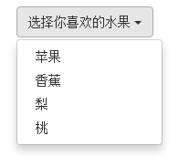
Example
<!DOCTYPE HTML>
<html>
<head>
<meta http-equiv="Content-Type" content="text/html; charset=utf-8">
<title>下拉菜单</title>
<link rel="stylesheet" href="//maxcdn.bootstrapcdn.com/bootstrap/3.2.0/css/bootstrap.min.css">
</head>
<body>

<div class="dropdown">
 <button class="btn btn-default dropdown-toggle" type="button" id="dropdownMenu1" data-toggle="dropdown">
 选择你喜欢的水果
 <span class="caret"></span>
 </button>
 <ul class="dropdown-menu" role="menu" aria-labelledby="dropdownMenu1">
 <li role="presentation"><a role="menuitem" tabindex="-1" href="#">苹果</a></li>
 <li role="presentation"><a role="menuitem" tabindex="-1" href="#">香蕉</a></li>
 <li role="presentation"><a role="menuitem" tabindex="-1" href="#">梨</a></li>
 <li role="presentation"><a role="menuitem" tabindex="-1" href="#">桃</a></li>
 </ul>
</div>
 <script src="http://libs.baidu.com/jquery/1.9.0/jquery.js"></script>
 <script src="//maxcdn.bootstrapcdn.com/bootstrap/3.2.0/js/bootstrap.min.js"></script>
</body>
</html>
2. Drop-down menu (principle analysis)
The drop-down menu component in the Bootstrap framework, its drop-down menu items are hidden by default, as shown below:

Because the default style of "dropdown-menu" is set to "display:none", please view the detailed source code from lines 3010 to 3029 of the bootstrap.css file:
.dropdown-menu {
 position: absolute;/*设置绝对定位,相对于父元素div.dropdown*/
 top: 100%;/*让下拉菜单项在父菜单项底部,如果父元素不设置相对定位,该元素相对于body元素*/
 left: 0;
 z-index: 1000;/*让下拉菜单项不被其他元素遮盖住*/

 display: none;/*默认隐藏下拉菜单项*/

 float: left;
 min-width: 160px;
 padding: 5px 0;
 margin: 2px 0 0;
 font-size: 14px;
 list-style: none;
 background-color: #fff;
 background-clip: padding-box;
 border: 1px solid #ccc;
 border: 1px solid rgba(0, 0, 0, .15);
 border-radius: 4px;
 -webkit-box-shadow: 0 6px 12px rgba(0, 0, 0, .175);
 box-shadow: 0 6px 12px rgba(0, 0, 0, .175);
}
When the user clicks on the parent menu item, the drop-down menu will be displayed. When the user clicks again, the drop-down menu will continue to be hidden.
Principle analysis:
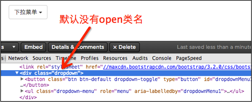
Now let's analyze the implementation principle. It is very simple. Through js technology, add or remove the class name "open" to the parent container "div.dropdown" to control the display or hiding of the drop-down menu. That is to say, by default, "div.dropdown" does not have the class name "open". When the user clicks for the first time, "div.dropdown" will add the class name "open"; when the user clicks again, "div.dropdown" "The class name "open" in the container will be removed again. We can view the entire process through the browser's firebug:
Default:
User’s first click:

User clicks again:

In lines 3076 to 3078 of the bootstrap.css file, we can easily find:
.open > .dropdown-menu {
 display: block;
}
三、下拉菜单(下拉分隔线)
在Bootstrap框架中的下拉菜单还提供了下拉分隔线,假设下拉菜单有两个组,那么组与组之间可以通过添加一个空的
/源码bootstrap.css文件第3034行~第3039行/

.dropdown-menu .divider {
 height: 1px;
 margin: 9px 0;
 overflow: hidden;
 background-color: #e5e5e5;
}
示例:
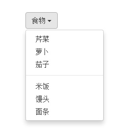
<!DOCTYPE HTML>
<html>
<head>
<meta http-equiv="Content-Type" content="text/html; charset=utf-8">
<title>下拉分隔线</title>
<link rel="stylesheet" href="//maxcdn.bootstrapcdn.com/bootstrap/3.2.0/css/bootstrap.min.css">
<link rel="stylesheet" href="style.css">
</head>

<body>
 <div class="dropdown">
 <button class="btn btn-default dropdown-toggle" type="button" id="dropdownMenu1" data-toggle="dropdown">
 食物
 <span class="caret"></span>
 </button>
 <ul class="dropdown-menu" role="menu" aria-labelledby="dropdownMenu1">

 <li role="presentation"><a role="menuitem" tabindex="-1" href="#">芹菜</a></li>
 <li role="presentation"><a role="menuitem" tabindex="-1" href="#">萝卜</a></li>
 <li role="presentation"><a role="menuitem" tabindex="-1" href="#">茄子</a></li>
  <li role="presentation" class ="divider"></li>
 <li role="presentation"><a role="menuitem" tabindex="-1" href="#">米饭</a></li>
 <li role="presentation"><a role="menuitem" tabindex="-1" href="#">馒头</a></li>
 <li role="presentation"><a role="menuitem" tabindex="-1" href="#">面条</a></li>
 </ul>
</div>
 <script src="http://libs.baidu.com/jquery/1.9.0/jquery.js"></script>
 <script src="//maxcdn.bootstrapcdn.com/bootstrap/3.2.0/js/bootstrap.min.js"></script>
</body>
</html>
效果如下:
四、下拉菜单(菜单标题)
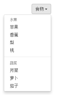
上一小节讲解通过添加“divider”可以将下拉菜单分组,为了让这个分组更明显,还可以给每个组添加一个头部(标题)。如下:
对应的样式如下:
/查看bootstrap.css文件第3090行~第3096行/
.dropdown-header {
 display: block;
 padding: 3px 20px;
 font-size: 12px;
 line-height: 1.42857143;
 color: #999;
}
示例
<div class="dropdown">
 <button class="btn btn-default dropdown-toggle" type="button" id="dropdownMenu1" data-toggle="dropdown">
 食物
 <span class="caret"></span>
 </button>
 <ul class="dropdown-menu" role="menu" aria-labelledby="dropdownMenu1">
 <li role="presentation" class="dropdown-header">蔬菜</li>
 <li role="presentation"><a role="menuitem" tabindex="-1" href="#">芹菜</a></li>
 <li role="presentation"><a role="menuitem" tabindex="-1" href="#">萝卜</a></li>
 <li role="presentation"><a role="menuitem" tabindex="-1" href="#">茄子</a></li>
 <li role="presentation" class="divider"></li>
 <li role="presentation" class="dropdown-header">主食</li>
 <li role="presentation"><a role="menuitem" tabindex="-1" href="#">米饭</a></li>
 <li role="presentation"><a role="menuitem" tabindex="-1" href="#">馒头</a></li>
 <li role="presentation"><a role="menuitem" tabindex="-1" href="#">面条</a></li>
 </ul>
</div>
运行效果如下:

五、下拉菜单(对齐方式)
实现右对齐方法:
Bootstrap框架中下拉菜单默认是左对齐,如果你想让下拉菜单相对于父容器右对齐时,可以在“dropdown-menu”上添加一个“pull-right”或者“dropdown-menu-right”类名,如下所示:
上面代码中的“pull-right”类可以用“dropdown-menu-right”代替,两个类的作用是一样的,可从下面的源代码中看出。
实现原理:
对应的样式如下:
/源码请查看bootstrap.css文件第3030行~第3033行和3082行~第3085行/
.dropdown-menu.pull-right {
 right: 0;
 left: auto;
}
.dropdown-menu-right {
 right: 0;
 left: auto;
}
同时一定要为.dropdown添加float:leftcss样式。
.dropdown{
 float: left;
}
运行效果如下所示:
下拉菜单与父容器左边对齐:
与此同时,还有一个类名刚好与“dropdown-menu-right”相反的类名“dropdown-menu-left”,其效果就是让下拉菜单与父容器左边对齐,其实就是默认效果。
/请查看bootstrap.css文件第3086行~第3089行/
.dropdown-menu-left {
 right: auto;
 left: 0;
}
六、下拉菜单(菜单项状态)
下拉菜单项的默认的状态(不用设置)有悬浮状态(:hover)和焦点状态(:focus):
/查看bootstrap.css文件第3049行~第3054行/
.dropdown-menu > li > a:hover,
.dropdown-menu > li > a:focus {
 color: #262626;
 text-decoration: none;
 background-color: #f5f5f5;
}
下拉菜单项除了上面两种状态,还有当前状态(.active)和禁用状态(.disabled)。这两种状态使用方法只需要在对应的菜单项上添加对应的类名:
<div class="dropdown">
 <button class="btn btn-default dropdown-toggle" type="button" id="dropdownMenu1" data-toggle="dropdown">
 下拉菜单
 <span class="caret"></span>
 </button>
 <ul class="dropdown-menu" role="menu" aria-labelledby="dropdownMenu1">
 <li role="presentation" class="active"><a role="menuitem" tabindex="-1" href="#">下拉菜单项</a></li>
 ….
 <li role="presentation" class="disabled"><a role="menuitem" tabindex="-1" href="#">下拉菜单项</a></li>
 </ul>
</div>
运行效果如下:
 对应的样式代码也非常简单:
/请查看bootstrap.css文件第3055行~第3075行/

.dropdown-menu > .active > a,
.dropdown-menu > .active > a:hover,
.dropdown-menu > .active > a:focus {
 color: #fff;
 text-decoration: none;
 background-color: #428bca;
 outline: 0;
}
.dropdown-menu > .disabled > a,
.dropdown-menu > .disabled > a:hover,
.dropdown-menu > .disabled > a:focus {
 color: #999;
}
.dropdown-menu > .disabled > a:hover,
.dropdown-menu > .disabled > a:focus {
 text-decoration: none;
 cursor: not-allowed;
 background-color: transparent;
 background-image: none;
 filter: progid:DXImageTransform.Microsoft.gradient(enabled = false);
}
以上就是本文的全部内容,希望对大家的学习有所帮助。

 JavaScript Engines: Comparing ImplementationsApr 13, 2025 am 12:05 AM
Different JavaScript engines have different effects when parsing and executing JavaScript code, because the implementation principles and optimization strategies of each engine differ. 1. Lexical analysis: convert source code into lexical unit. 2. Grammar analysis: Generate an abstract syntax tree. 3. Optimization and compilation: Generate machine code through the JIT compiler. 4. Execute: Run the machine code. V8 engine optimizes through instant compilation and hidden class, SpiderMonkey uses a type inference system, resulting in different performance performance on the same code.
 Beyond the Browser: JavaScript in the Real WorldApr 12, 2025 am 12:06 AM
JavaScript's applications in the real world include server-side programming, mobile application development and Internet of Things control: 1. Server-side programming is realized through Node.js, suitable for high concurrent request processing. 2. Mobile application development is carried out through ReactNative and supports cross-platform deployment. 3. Used for IoT device control through Johnny-Five library, suitable for hardware interaction.
 Building a Multi-Tenant SaaS Application with Next.js (Backend Integration)Apr 11, 2025 am 08:23 AM
I built a functional multi-tenant SaaS application (an EdTech app) with your everyday tech tool and you can do the same. First, what’s a multi-tenant SaaS application? Multi-tenant SaaS applications let you serve multiple customers from a sing
 How to Build a Multi-Tenant SaaS Application with Next.js (Frontend Integration)Apr 11, 2025 am 08:22 AM
This article demonstrates frontend integration with a backend secured by Permit, building a functional EdTech SaaS application using Next.js. The frontend fetches user permissions to control UI visibility and ensures API requests adhere to role-base
 JavaScript: Exploring the Versatility of a Web LanguageApr 11, 2025 am 12:01 AM
JavaScript is the core language of modern web development and is widely used for its diversity and flexibility. 1) Front-end development: build dynamic web pages and single-page applications through DOM operations and modern frameworks (such as React, Vue.js, Angular). 2) Server-side development: Node.js uses a non-blocking I/O model to handle high concurrency and real-time applications. 3) Mobile and desktop application development: cross-platform development is realized through ReactNative and Electron to improve development efficiency.
 The Evolution of JavaScript: Current Trends and Future ProspectsApr 10, 2025 am 09:33 AM
The latest trends in JavaScript include the rise of TypeScript, the popularity of modern frameworks and libraries, and the application of WebAssembly. Future prospects cover more powerful type systems, the development of server-side JavaScript, the expansion of artificial intelligence and machine learning, and the potential of IoT and edge computing.
 Demystifying JavaScript: What It Does and Why It MattersApr 09, 2025 am 12:07 AM
JavaScript is the cornerstone of modern web development, and its main functions include event-driven programming, dynamic content generation and asynchronous programming. 1) Event-driven programming allows web pages to change dynamically according to user operations. 2) Dynamic content generation allows page content to be adjusted according to conditions. 3) Asynchronous programming ensures that the user interface is not blocked. JavaScript is widely used in web interaction, single-page application and server-side development, greatly improving the flexibility of user experience and cross-platform development.
 Is Python or JavaScript better?Apr 06, 2025 am 12:14 AM
Python is more suitable for data science and machine learning, while JavaScript is more suitable for front-end and full-stack development. 1. Python is known for its concise syntax and rich library ecosystem, and is suitable for data analysis and web development. 2. JavaScript is the core of front-end development. Node.js supports server-side programming and is suitable for full-stack development.


Hot AI Tools

Undresser.AI Undress
AI-powered app for creating realistic nude photos

AI Clothes Remover
Online AI tool for removing clothes from photos.

Undress AI Tool
Undress images for free

Clothoff.io
AI clothes remover

AI Hentai Generator
Generate AI Hentai for free.

Hot Article
Hot Tools

SublimeText3 Chinese version
Chinese version, very easy to use

mPDF
mPDF is a PHP library that can generate PDF files from UTF-8 encoded HTML. The original author, Ian Back, wrote mPDF to output PDF files "on the fly" from his website and handle different languages. It is slower than original scripts like HTML2FPDF and produces larger files when using Unicode fonts, but supports CSS styles etc. and has a lot of enhancements. Supports almost all languages, including RTL (Arabic and Hebrew) and CJK (Chinese, Japanese and Korean). Supports nested block-level elements (such as P, DIV),

DVWA
Damn Vulnerable Web App (DVWA) is a PHP/MySQL web application that is very vulnerable. Its main goals are to be an aid for security professionals to test their skills and tools in a legal environment, to help web developers better understand the process of securing web applications, and to help teachers/students teach/learn in a classroom environment Web application security. The goal of DVWA is to practice some of the most common web vulnerabilities through a simple and straightforward interface, with varying degrees of difficulty. Please note that this software

Dreamweaver Mac version
Visual web development tools

SecLists
SecLists is the ultimate security tester's companion. It is a collection of various types of lists that are frequently used during security assessments, all in one place. SecLists helps make security testing more efficient and productive by conveniently providing all the lists a security tester might need. List types include usernames, passwords, URLs, fuzzing payloads, sensitive data patterns, web shells, and more. The tester can simply pull this repository onto a new test machine and he will have access to every type of list he needs.

