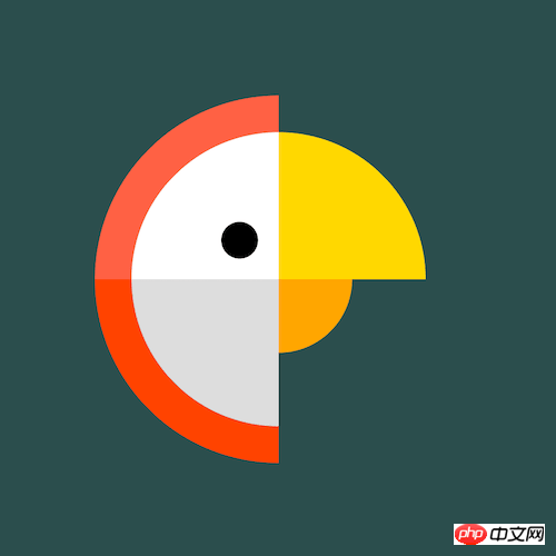
Home >Web Front-end >CSS Tutorial >How to use pure CSS to achieve the effect of cartoon parrot
How to use pure CSS to achieve the effect of cartoon parrot
- 不言Original
- 2018-07-11 16:46:571939browse
This article mainly introduces how to use pure CSS to achieve the effect of cartoon parrots. It has certain reference value. Now I share it with you. Friends in need can refer to it
Source code download
Please download all the source code of the daily front-end practical series from github:
https://github.com/comehope/front-end-daily-challenges
Code Interpretation
Define dom, the container contains 3 sub-elements:
<p>
    </p><p></p>
    <p></p>
    <p></p>
Centered display:
body {
    margin: 0;
    height: 100vh;
    display: flex;
    align-items: center;
    justify-content: center;
    background-color: darkslategray;
}
Define container size:
.parrot {
    width: 10em;
    height: 10em;
    font-size: 30px;
}
Draw the feathers on the parrot’s head:
.parrot {
    position: relative;
    display: flex;
    align-items: center;
    justify-content: center;
}

.parrot .outer {
    position: absolute;
    width: 100%;
    height: 100%;
    border: 1em solid;
    border-color: transparent transparent orangered tomato;
    border-radius: 50%;
}
Draw the parrot’s head and the upper part of its beak:
.parrot .middle {
    position: absolute;
    width: 80%;
    height: 80%;
    border: 4em solid;
    border-color: gold transparent gainsboro white;
    border-radius: 50%;
}
Draw the lower part of the parrot’s beak:
.parrot .inner {
    position: absolute;
    width: 40%;
    height: 40%;
    border: 2em solid;
    border-color: transparent orange transparent transparent;
    border-radius: 50%;
}
Use pseudo elements to draw the parrot’s eyes:
.parrot .inner::before {
    content: '';
    position: absolute;
    width: 1em;
    height: 1em;
    background-color: black;
    border-radius: 50%;
    left: -2em;
    top: -0.5em;
}
Turn the picture to the right side:
.parrot > * {
    transform: rotate(45deg);
}
Set the mouse hover effect, and the parrot’s head turns to the other side when hovering:
.parrot > * {
    transition: 0.5s;
}

.parrot:hover .outer {
    transform: rotate(225deg);
    border-color: transparent transparent tomato orangered;
}

.parrot:hover .middle {
    transform: rotate(calc(225deg - 360deg));
    border-color: transparent gold white gainsboro;
}

.parrot:hover .inner {
    transform: rotate(135deg);
}
Finally, modify the color of the parrot when hovering:
.parrot:hover .outer {
    border-color: transparent transparent lightseagreen darkcyan;
}

.parrot:hover .middle {
    border-color: transparent gold white gainsboro;
}

.parrot:hover .inner {
    border-color: transparent orange transparent transparent;
}
You’re done!
The above is the entire content of this article. I hope it will be helpful to everyone's study. For more related content, please pay attention to the PHP Chinese website!
Related recommendations:
How to use CSS to implement the effect of a single element dot matrix loader
The above is the detailed content of How to use pure CSS to achieve the effect of cartoon parrot. For more information, please follow other related articles on the PHP Chinese website!
Related articles
See more- Summary of clear float methods using CSS
- 7 recommended articles about hardware acceleration
- CSS style implementation of small triangle example on the right side of selection box
- Introduction to mix-blend-mode/background-blend-mode of CSS3
- What are id and Class selectors in CSS? Usage of id and Class selectors (examples)


