Home >WeChat Applet >Mini Program Development >How does the WeChat applet realize the adaptive width ratio display of the image component picture?
How does the WeChat applet realize the adaptive width ratio display of the image component picture?
- 不言Original
- 2018-06-27 14:47:262661browse
This article mainly introduces the method of WeChat applet to realize the adaptive width ratio display of images in the image component. It briefly describes the common attributes of the image component, and analyzes the correlation of WeChat applet to realize the adaptive width ratio of images in the form of examples. For operating skills, friends in need can refer to
This article describes the example of the WeChat applet to implement the adaptive width proportion display of the image component picture. Share it with everyone for your reference, the details are as follows:
1. Understand the image component

Because of image There are default fixed width and height, which makes it difficult for us to adapt the image. Let’s solve it together
2. Method
(1). Use mode: widthFix
widthFix: The width remains unchanged and the height changes automatically, keeping the aspect ratio of the original image unchanged.
First we set the image mode to widthFix, and then add a fixed rpx width to the image, such as: 730rpx.
This way the picture can also be adapted. . Because the rpx of the mini program itself is an adaptive display unit
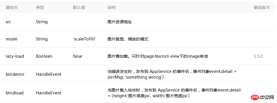
(2). Use the bindload binding function to dynamically adapt.
We can bind a function to the image. With this function, like the bindload description above, we can get the width and height of the original image.
Then calculate their width to height ratio. . Then set a width size (rpx), and finally set the width and height of the image dynamically through style. The code is as follows:
1. Write the page structure index.wxml:
<image src="../uploads/2.jpg" bindload="imageLoad"
style="width:{{imgwidth}}rpx; height:{{imgheight }}rpx;"></image>
2. Set the data index.js
//获取应用实例
var app = getApp()
Page({
  data: {
    screenWidth: 0,
    screenHeight:0,
    imgwidth:0,
    imgheight:0,
  },
  onLoad: function() {
    var _this = this;
    wx.getSystemInfo({
      success: function(res) {
        _this.setData({
          screenHeight: res.windowHeight,
          screenWidth: res.windowWidth,
        });
      }
    });
  },
  imageLoad: function(e) {
    var _this=this;
    var $width=e.detail.width,  //获取图片真实宽度
      $height=e.detail.height,
      ratio=$width/$height;  //图片的真实宽高比例
    var viewWidth=500,      //设置图片显示宽度,
      viewHeight=500/ratio;  //计算的高度值
    this.setData({
      imgwidth:viewWidth,
      imgheight:viewHeight
    })
  }
})

The above is the entire content of this article. I hope it will be helpful to everyone’s study. For more related content, please pay attention to the PHP Chinese website!
Related recommendations:
About WeChat JS-SDK’s function of selecting mobile phone photo uploads
About WeChat Mini Program Implementation Top Introduction to tab (swiper)
WeChat applet development to implement tab page switching
The above is the detailed content of How does the WeChat applet realize the adaptive width ratio display of the image component picture?. For more information, please follow other related articles on the PHP Chinese website!
Related articles
See more- WeChat Mini Program Simple DEMO layout, logic, and style exercises
- Detailed explanation and examples of WeChat applet wx.request (interface calling method)
- WeChat Mini Program - Detailed explanation of WeChat login, WeChat payment, and template messages
- WeChat applet (application account) simple example application and detailed explanation of the example
- Detailed explanation of WeChat applet for loop

