

Two common functions of CSS3 rounded corners and gradients

This article mainly introduces relevant information on the detailed explanation of two commonly used functions of CSS3 rounded corners and gradients. Friends in need can refer to the following
Css3 rounded corners explanation: I believe everyone is familiar with pictures and background rounded corners. You are familiar with it,
Fillet syntax: border-radius: fillet value;
Advantages of CSS3 rounded corners
The traditional rounded corner generation scheme must use multiple pictures as background patterns. The emergence of CSS3 means that we no longer have to waste time creating these images, and there are many other advantages:
* Reduce the workload of maintenance. The work of generating, updating image files, and writing web page code is no longer necessary.
* Improve web page performance. Web pages will load faster because there are no more unnecessary HTTP requests.
* Increase visual reliability. Under certain circumstances (network congestion, server error, slow network speed, etc.), the background image may fail to download, resulting in poor visual effects. This doesn't happen with CSS3.
This value can be used: em, ex, pt, px, percentage;
Border-radius is similar to margin and padding
Border-radius: lefttop, righttop, rightbottom, leftbottom.
<p class="box1">
</p>
.box1{width:200px;height:100px;border-radius:30px 5px;background:#f66f17;margin-top:30px;}
<p class="box2"></p>
.box2{width:200px;height:100px;border-radius:30px 20px 10px 0px;background:#f66f17;margin-top:30px;}
##It should be very simple to understand the rounded corners.
For percentages: The safest approach at present is to set the style and width of each rounded border to the same value and avoid using percentage values.
IE9 and below do not support this attribute
Linear gradient: background: linear-gradient (set the gradient form, the first color starting point, the position of the middle color point, the end point color);
Linear: Type of gradient (linear gradient);
Form of gradient: There are two ways to select optional parameters - 1. Set the rotation angle, 0 degrees means horizontally from left to right, 90 degrees means from top to bottom, from 0 degrees Start transforming counterclockwise.
2. Use keywords, left means from left to right, top means from top to bottom, in the same way right means from right to left, lefttop means from sitting on top to bottom right, and in the same way leftbottom, righttop, rightbottom.
The middle color and middle color position are optional parameters.
But we need to consider browser compatibility, let’s write like this:
-webkit-gradient(linear,0 0,0 100%,from(start color,to(end color))); /*for Safari4, Chrome 2 */
-webkit-linear-gradient (start color, end color); /*for Safari 5.1, Chrome 10 */
-moz-linear-gradient (start color, end color); /*for firefox*/
-o-linear-gradient (start color, end color); /*Opera*/
linear-gradient (start color, end color); /*Standard properties*/
It’s a troublesome thing for IE, the old method
Filter:progid:DXImageTransform.Microsoft.gradient(startColorstr='Start Color',endColorstr=”End Color”); /*IE6,IE 7*/
-ms-linear-gradient (start color, end color); /*IE8*/
<p class="content1"></p>
.content1{width:500px;height:300px;border-radius:10%;background:#ade691;
background:-webkit-linear-gradient(left,#88cfc3,#329e8c 30%,#096e5d);background:-moz-linear-gradient(left,#88cfc3,#329e8c 30%,#096e5d);background:filter: progid:DXImageTransform.Microsoft.gradient(startColorstr='#88cfc3', endColorstr='#096e5d'); /* IE6,IE7 */-ms-filter: "progid:DXImageTransform.Microsoft.gradient(startColorstr='#88cfc3', endColorstr='#096e5d')";background:linear-gradient(lleft,#88cfc3,#329e8c 30%,#096e5d;float:left;}
.tit1{font-size:3em;font-weight: bold;color:#f00;}

<p class="content2"></p>
.content2{width:500px;height:200px;
background-image: -webkit-repeating-linear-gradient(red,green 40px, orange 80px);
background-image: repeating-linear-gradient(red,green 40px, orange 80px);}

Radial gradient: radial-gradient (set the center of the gradient, gradient shape gradient size , starting color value, middle color value, middle color position, end color)
Gradient center, optional parameters, such as 30px 20px refers to 30px from the left and 20px from the top, which can be pixels, percentages, or Keyword, the default is the center position.
Gradient shape, optional parameter, can take the value circle or eclipse [default]
Gradient size, loopable parameter, can take the value
closest-side:
Specify the radius length of the radial gradient from the center of the circle to the side closest to the center
closest-corner:
Specify the radius length of the radial gradient from the center of the circle to the corner closest to the center
farthest-side:
Specify the radius length of the radial gradient from the center of the circle to the farthest corner from the center
farthest-corner:
Specify the radius length of the radial gradient from the center of the circle to the corner farthest from the center
contain :
Includes, specifying the radius length of the radial gradient from the center of the circle to the point closest to the center of the circle. Similar to closest-side
cover:
Cover, specifying the radius length of the radial gradient from the center of the circle to the point farthest from the center of the circle. Similar to farthest-corner
circle farthest-corner circular gradient, ellipse farthest-corner elliptical gradient
<p class="content3"></p>
.content3{width:500px;height:200px;
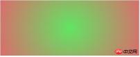
background-image: -webkit-radial-gradient(circle,hsla(120,70%,60%,.9),hsla(360,60%,60%,.9));
background-image: radial-gradient(circle,hsla(120,70%,60%,.9),hsla(360,60%,60%,.9));margin-top:20px;}
Using CSS3 to implement text scrolling upwards at regular intervals
Implementation of linear color gradient in CSS3
The above is the detailed content of Two common functions of CSS3 rounded corners and gradients. For more information, please follow other related articles on the PHP Chinese website!

 Draggin' and Droppin' in ReactApr 17, 2025 am 11:52 AM
The React ecosystem offers us a lot of libraries that all are focused on the interaction of drag and drop. We have react-dnd, react-beautiful-dnd,
 Fast SoftwareApr 17, 2025 am 11:49 AM
There have been some wonderfully interconnected things about fast software lately.
 Nested Gradients with background-clipApr 17, 2025 am 11:47 AM
I can't say I use background-clip all that often. I'd wager it's hardly ever used in day-to-day CSS work. But I was reminded of it in a post by Stefan Judis,
 Using requestAnimationFrame with React HooksApr 17, 2025 am 11:46 AM
Animating with requestAnimationFrame should be easy, but if you haven’t read React’s documentation thoroughly then you will probably run into a few things
 Need to scroll to the top of the page?Apr 17, 2025 am 11:45 AM
Perhaps the easiest way to offer that to the user is a link that targets an ID on the element. So like...
 The Best (GraphQL) API is One You WriteApr 17, 2025 am 11:36 AM
Listen, I am no GraphQL expert but I do enjoy working with it. The way it exposes data to me as a front-end developer is pretty cool. It's like a menu of
 Weekly Platform News: Text Spacing Bookmarklet, Top-Level Await, New AMP Loading IndicatorApr 17, 2025 am 11:26 AM
In this week's roundup, a handy bookmarklet for inspecting typography, using await to tinker with how JavaScript modules import one another, plus Facebook's
 Various Methods for Expanding a Box While Preserving the Border RadiusApr 17, 2025 am 11:19 AM
I've recently noticed an interesting change on CodePen: on hovering the pens on the homepage, there's a rectangle with rounded corners expanding in the back.


Hot AI Tools

Undresser.AI Undress
AI-powered app for creating realistic nude photos

AI Clothes Remover
Online AI tool for removing clothes from photos.

Undress AI Tool
Undress images for free

Clothoff.io
AI clothes remover

AI Hentai Generator
Generate AI Hentai for free.

Hot Article
Hot Tools

VSCode Windows 64-bit Download
A free and powerful IDE editor launched by Microsoft

MantisBT
Mantis is an easy-to-deploy web-based defect tracking tool designed to aid in product defect tracking. It requires PHP, MySQL and a web server. Check out our demo and hosting services.

ZendStudio 13.5.1 Mac
Powerful PHP integrated development environment

Dreamweaver Mac version
Visual web development tools

MinGW - Minimalist GNU for Windows
This project is in the process of being migrated to osdn.net/projects/mingw, you can continue to follow us there. MinGW: A native Windows port of the GNU Compiler Collection (GCC), freely distributable import libraries and header files for building native Windows applications; includes extensions to the MSVC runtime to support C99 functionality. All MinGW software can run on 64-bit Windows platforms.

