
Home >Web Front-end >CSS Tutorial >How to use css3 to draw a loading circle animation of a circle
How to use css3 to draw a loading circle animation of a circle

- 不言Original
- 2018-06-11 15:20:422228browse
This article mainly introduces the relevant information on how to draw a round loading circle in CSS3. The content is quite good. I will share it with you now and give it as a reference.
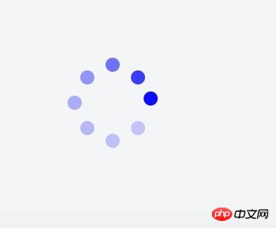
How to draw a round loading circle
The applet needs a loading like the one below. There is no native one. It is too difficult to introduce other component libraries. So, I decided to write one myself.
1. Basic principle
The dynamic implementation principle is to animate the transparency from large to small for 8 small circles, and set different settings for each circle Animation start time. The implementation principle of layout is to set the parent element to position: relative, and set the style of each circle to position: absolute; left: xx; top: xx; right: xx; bottom: xx. Distribute them evenly on a circle by setting different values for left/right/top/bottom. The html code is as follows:
<view class="q-loading-dot-warp">
                <view class="dot dot1"></view>
                <view class="dot dot2"></view>
                <view class="dot dot3"></view>
                <view class="dot dot4"></view>
                <view class="dot dot5"></view>
                <view class="dot dot6"></view>
                <view class="dot dot7"></view>
                <view class="dot dot8"></view>
</view>
It sounds simple, but I have no experience in assigning values to them. For the first time, I used the thinking of a science student to simply divide the circle into three equal parts to calculate the coordinates. Often 8 circles form a circle. Diamond/Square. . . Just like the following

2. Position setting skills
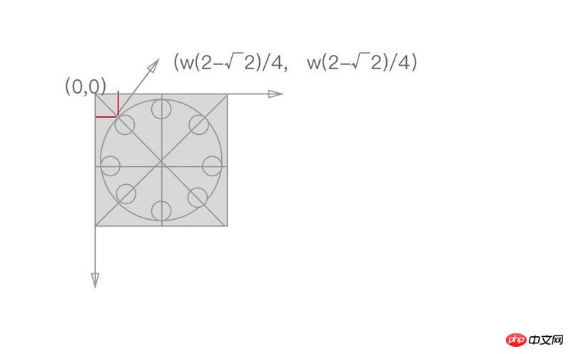
Later I saw the article posted by a classmate with css3 to achieve 10 loading effects. According to the code of JRd3, it is indeed possible to achieve a good-looking effect, but when I want to change the size of the loading circle, the style collapses. After analysis, there is a certain mathematical relationship between their coordinates, as shown in the figure below. The coordinates on the vertical or horizontal lines can be positioned by 50%, and the coordinates on the diagonal line are as shown in the figure, where w is the width and height of the rectangle or the radius of the large circle surrounded by 8 small circles.
The formula is derived as follows:
The specific css code is as follows:
$width: 64px;
$height: 64px;
$dotWidth: 10px;
$dotHeight: 10px;
$radius: 5px;
$offset: 9.37px;

@function getLeft( $x ) {
  @return ($width/4)*$x;
}

@function getTop( $y ) {
  @return ($height/4)*$y;
}

@keyframes changeOpacity {
    from { opacity: 1; }
    to { opacity: .2; }
}

.q-loading {
    position: fixed;
    top: 0;
    left: 0;
    right: 0;
    bottom: 0;
    .q-loading-overlay {
        position: fixed;
        top: 0;
        left: 0;
        right: 0;
        bottom: 0;
        background-color: rgba(255, 255, 255, .5);
    }
    .q-loading-content {
        position: absolute;
        left: 50%;
        top: 50%;
        transform: translate(-50%, -50%);
        width: $width;
        height: $height;
        z-index: 2;
    }
    .dot {
        width: 10px;
        height: 10px;
        position: absolute;
        background-color: #0033cc;
        border-radius: 50% 50%;
        opacity: 1;
        animation: changeOpacity 1.04s ease infinite;
    }
    .dot1 {
        left: 0;
        top: 50%;
        margin-top: -$radius;
        animation-delay: 0.13s;
    }
    .dot2 {
        left: $offset;
        top: $offset;
        animation-delay: 0.26s;
    }
    .dot3 {
        left: 50%;
        top: 0;
        margin-left: -$radius;
        animation-delay: 0.39s;
    }
    .dot4 {
        top: $offset;
        right: $offset;
        animation-delay: 0.52s;
    }
    .dot5 {
        right: 0;
        top: 50%;
        margin-top: -$radius;
        animation-delay: 0.65s;
    }
    .dot6 {
        right: $offset;
        bottom: $offset;
        animation-delay: 0.78s;
    }
    .dot7 {
        bottom: 0;
        left: 50%;
        margin-left: -$radius;
        animation-delay: 0.91s;
    }
    .dot8 {
        bottom: $offset;
        left: $offset;
        animation-delay: 1.04s;
    }
}
The code uses scss to define the radius of the large circle and the small circle, regardless of To change the size, you only need to change the variables, and the following styles do not need to be changed.
The calculation calculated by this formula will look like a circle
3. Animation time setting
Assume that the animation duration is t, the number of circles is c, and the position of a certain small circle is i (for example, i is 1~8 above), then the time for small circles to start one after another is i * t/c
The above is the entire content of this article. I hope it will be helpful to everyone's study. For more related content, please pay attention to the PHP Chinese website!
Related recommendations:
How to use CSS3 linear gradient linear-gradient to create a border
How to hide the scroll bar in CSS
The above is the detailed content of How to use css3 to draw a loading circle animation of a circle. For more information, please follow other related articles on the PHP Chinese website!