1. Panel
Panels are a new component of the Bootstrap framework. Its main function is to handle some functions that cannot be completed by other components. Also has different source codes in different versions:
☑ Less version: The corresponding source code file is panels.less
☑ Sass version: The corresponding source code file is _panels.scss
☑ Compiled Bootstrap: corresponds to lines 4995 to 5302 of the bootstrap.css file
2. Panel – Basic Panel
The basic panel is very simple. It is a div container using the "panel" style to generate a text display block with a border. Since "panel" does not control the theme color, a color-controlling theme "panel-default" is added based on "panel", and a "div.panel-body" is added inside to place the main content of the panel:
<div class="panel panel-default">
 <div class="panel-body">我是一个基础面板,带有默认主题样式风格</div>
</div>
The operation effect is as follows:

Principle analysis:
"Panel" mainly sets certain borders, spacing and rounded corners:
/Line 4995~Line 5005 of the bootstrap.css file/
.panel {
 margin-bottom: 20px;
 background-color: #fff;
 border: 1px solid transparent;
 border-radius: 4px;
 -webkit-box-shadow: 0 1px 1px rgba(0, 0, 0, .05);
   box-shadow: 0 1px 1px rgba(0, 0, 0, .05);
}
.panel-body {
 padding: 15px;
}
3. Panel – panel with head and tail
The basic panel looks too simple. In order to enrich the functions of the panel, Bootstrap specially adds the "Panel Header" and "Page Footer" effects to the panel:
☑ panel-heading: is used to set the panel header style
☑ panel-footer: is used to set the panel footer style
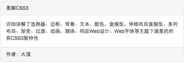
<div class="panel panel-default">
 <div class="panel-heading">图解CSS3</div>
 <div class="panel-body">…</div>
 <div class="panel-footer">作者:大漠</div>
</div>
The operation effect is as follows:

Principle analysis:
Panel-heading and panel-footer only have spacing and rounded corners set:
/Line 5006~Line 5030 of the bootstrap.css file/
.panel-heading {
 padding: 10px 15px;
 border-bottom: 1px solid transparent;
 border-top-left-radius: 3px;
 border-top-right-radius: 3px;
}
.panel-heading > .dropdown .dropdown-toggle {
 color: inherit;
}
.panel-title {
 margin-top: 0;
 margin-bottom: 0;
 font-size: 16px;
 color: inherit;
}
.panel-title > a {
 color: inherit;
}
.panel-footer {
 padding: 10px 15px;
 background-color: #f5f5f5;
 border-top: 1px solid #ddd;
 border-bottom-right-radius: 3px;
 border-bottom-left-radius: 3px;
}
4. Panel – color panel
In the Basic Panel section, we learned that the panel style does not set the theme style, but the theme style is set through panel-default. In addition to the default theme style, the panel component in the Bootstrap framework also includes the following theme styles, which constitute a colorful panel:
☑ panel-primary: key blue
☑ panel-success: success green
☑ panel-info:Information Blue
☑ panel-warning: warning yellow
☑ panel-danger: Danger Red
The method of use is very simple. You only need to add the class name you need based on the class name of the panel:
<div class="panel panel-default"> <div class="panel-heading">图解CSS3</div> <div class="panel-body">…</div> <div class="panel-footer">作者:大漠</div> </div>……………
The operation effect is as follows:

It is not difficult to find from the effect that these styles only change the background color, text and border color of the panel: for the specific source code, you can view lines 5195 to 5302 of the bootstrap.css file.
5. Panel – Nested list group in panel
In the previous section, we introduced how to place a table in the panel. Now let's learn how to place a list group in the panel. Let's simply look at an example:
<div class="panel panel-default">
 <div class="panel-heading">图解CSS3</div>
 <div class="panel-body">
  <p>详细讲解了选择器、边框、背景、文本、颜色、盒模型、伸缩布局盒模型、多列布局、渐变、过渡、动画、媒体、响应Web设计、Web字体等主题下涵盖的所有CSS3新特性
  </p>
  <ul class="list-group">
   <li class="list-group-item">我是列表项</li>
   <li class="list-group-item">我是列表项</li>
   <li class="list-group-item">我是列表项</li>
  </ul>
 </div>
 <div class="panel-footer">作者:大漠</div>
</div>
The operation effect is as follows:

Optimize code:
Same as nested tables, if you think the spacing does not look good, you can extract the list group:
<div class="panel panel-default">
 <div class="panel-heading">图解CSS3</div>
 <div class="panel-body">…</div>
 <ul class="list-group">
  <li class="list-group-item">我是列表项</li>
  <li class="list-group-item">我是列表项</li>
  <li class="list-group-item">我是列表项</li>
 </ul>
 <div class="panel-footer">作者:大漠</div>
</div>
The operation effect is as follows:

For the same reason, Bootstrap has made certain style optimizations for list groups nested in panels. For the specific source code, you can view lines 5031 to 5053 of the bootstrap.css file.
For panels, the above introduces basic panels, color panels, etc. to help you learn the Bootstrap panel more comprehensively. I hope you will gain something from it.
 From C/C to JavaScript: How It All WorksApr 14, 2025 am 12:05 AM
The shift from C/C to JavaScript requires adapting to dynamic typing, garbage collection and asynchronous programming. 1) C/C is a statically typed language that requires manual memory management, while JavaScript is dynamically typed and garbage collection is automatically processed. 2) C/C needs to be compiled into machine code, while JavaScript is an interpreted language. 3) JavaScript introduces concepts such as closures, prototype chains and Promise, which enhances flexibility and asynchronous programming capabilities.
 JavaScript Engines: Comparing ImplementationsApr 13, 2025 am 12:05 AM
Different JavaScript engines have different effects when parsing and executing JavaScript code, because the implementation principles and optimization strategies of each engine differ. 1. Lexical analysis: convert source code into lexical unit. 2. Grammar analysis: Generate an abstract syntax tree. 3. Optimization and compilation: Generate machine code through the JIT compiler. 4. Execute: Run the machine code. V8 engine optimizes through instant compilation and hidden class, SpiderMonkey uses a type inference system, resulting in different performance performance on the same code.
 Beyond the Browser: JavaScript in the Real WorldApr 12, 2025 am 12:06 AM
JavaScript's applications in the real world include server-side programming, mobile application development and Internet of Things control: 1. Server-side programming is realized through Node.js, suitable for high concurrent request processing. 2. Mobile application development is carried out through ReactNative and supports cross-platform deployment. 3. Used for IoT device control through Johnny-Five library, suitable for hardware interaction.
 Building a Multi-Tenant SaaS Application with Next.js (Backend Integration)Apr 11, 2025 am 08:23 AM
I built a functional multi-tenant SaaS application (an EdTech app) with your everyday tech tool and you can do the same. First, what’s a multi-tenant SaaS application? Multi-tenant SaaS applications let you serve multiple customers from a sing
 How to Build a Multi-Tenant SaaS Application with Next.js (Frontend Integration)Apr 11, 2025 am 08:22 AM
This article demonstrates frontend integration with a backend secured by Permit, building a functional EdTech SaaS application using Next.js. The frontend fetches user permissions to control UI visibility and ensures API requests adhere to role-base
 JavaScript: Exploring the Versatility of a Web LanguageApr 11, 2025 am 12:01 AM
JavaScript is the core language of modern web development and is widely used for its diversity and flexibility. 1) Front-end development: build dynamic web pages and single-page applications through DOM operations and modern frameworks (such as React, Vue.js, Angular). 2) Server-side development: Node.js uses a non-blocking I/O model to handle high concurrency and real-time applications. 3) Mobile and desktop application development: cross-platform development is realized through ReactNative and Electron to improve development efficiency.
 The Evolution of JavaScript: Current Trends and Future ProspectsApr 10, 2025 am 09:33 AM
The latest trends in JavaScript include the rise of TypeScript, the popularity of modern frameworks and libraries, and the application of WebAssembly. Future prospects cover more powerful type systems, the development of server-side JavaScript, the expansion of artificial intelligence and machine learning, and the potential of IoT and edge computing.
 Demystifying JavaScript: What It Does and Why It MattersApr 09, 2025 am 12:07 AM
JavaScript is the cornerstone of modern web development, and its main functions include event-driven programming, dynamic content generation and asynchronous programming. 1) Event-driven programming allows web pages to change dynamically according to user operations. 2) Dynamic content generation allows page content to be adjusted according to conditions. 3) Asynchronous programming ensures that the user interface is not blocked. JavaScript is widely used in web interaction, single-page application and server-side development, greatly improving the flexibility of user experience and cross-platform development.


Hot AI Tools

Undresser.AI Undress
AI-powered app for creating realistic nude photos

AI Clothes Remover
Online AI tool for removing clothes from photos.

Undress AI Tool
Undress images for free

Clothoff.io
AI clothes remover

AI Hentai Generator
Generate AI Hentai for free.

Hot Article

Hot Tools

Dreamweaver CS6
Visual web development tools

VSCode Windows 64-bit Download
A free and powerful IDE editor launched by Microsoft

Dreamweaver Mac version
Visual web development tools

MinGW - Minimalist GNU for Windows
This project is in the process of being migrated to osdn.net/projects/mingw, you can continue to follow us there. MinGW: A native Windows port of the GNU Compiler Collection (GCC), freely distributable import libraries and header files for building native Windows applications; includes extensions to the MSVC runtime to support C99 functionality. All MinGW software can run on 64-bit Windows platforms.

SAP NetWeaver Server Adapter for Eclipse
Integrate Eclipse with SAP NetWeaver application server.


