
Home >Web Front-end >HTML Tutorial >HTML5 mobile website development process
HTML5 mobile website development process

- 不言Original
- 2018-05-08 15:49:2718653browse
This article mainly introduces the development process of HTML5 mobile website for everyone. Friends who want to develop mobile website can refer to it.
I have been studying the development of mobile website recently and found that Mobile website is not as difficult as imagined. Why do you say that? Let’s think about it: We can even make a traditional PC website, but can’t we even make a small mobile website? In fact, a mobile website is just a miniature version of a PC website! As for why it is difficult and I feel like I don’t know where to start.
I think there are the following points:
1. There is no complete idea and process
Just like the process of making a website, if you can know With its process, I believe you won’t find it difficult to build a mobile website! What’s really difficult is that you have no idea.
2. Think of HTML5 technology as inscrutable
It seems that learning to use HTML5 CSS3 to build a mobile website is equivalent to learning top peerless martial arts. Actually you are wrong! Don’t think too profoundly about HTML5. In fact, when building a mobile website, you really don’t need much of the powerful features of HTML5. (Perhaps for some newbies who don’t know much about technology: Your mobile website is made with HTML5 CSS3, which is awesome! It can use the latest and most cutting-edge technology on the Internet. In fact, anyone with a discerning eye will know it at a glance. What technology is used to make it? As the saying goes: "A layman can see the excitement, an expert can tell the truth")
Okay, now that I have talked a lot, let’s talk about how to develop a mobile website!
Basically developing mobile websites can be roughly divided into two categories. One is to use frameworks to develop mobile websites. One type is handwritten mobile website.
1. Framework development for mobile websites
Generally used development frameworks are: currently the most popular framework for the Web front-end (BootStrap), Jquery mobile... Of course it is possible There are also some mobile development frameworks, which I have not studied in detail.
Why is BootStrap the most popular front-end development framework currently?
Because bootstrap comes with a responsive layout (grid system) and can implement the principle of mobile device priority.
What are the benefits of using bootstrap to develop websites?
1. You can make a website even if you don’t understand design
Even if you don’t understand design, your webpage can still have a great appearance with the help of Bootstrap. Its powerful built-in style library makes your work look stunning.
Mainly reflected in: font files and bootstrap’s own UI style. (Providing good news for programmers who don’t know how to design UI)
2. Get started quickly
You can concentrate on solving problems, and leave the tedious details to Bootstrap to worry about. It can be developed once and adapted to all terminals, and you can quickly get started and build a website prototype. It also provides many rich plug-ins. Even if you don’t know JS, you can basically understand common APIs and solve the effects on the website.
Disadvantages:
1. Not following best practices
One of the biggest problems we encounter when using Bootstrap is that your DOM elements will be crowded with a large number of classes . This breaks one of the basic rules of good web design, HTML no longer has semantics, and content and presentation are no longer separated. Front-end purists will find this rather annoying, arguing that it makes scalability, reusability, and maintenance more of a challenge.
2. Bootstrap is too heavy
To put it directly: CSS and JS are a bit heavy. CSS is 115k after compression, JS is 35k after compression
If you want to use all the features of Bootstrap, you should carefully consider the loading time of resources. Of course, for some places this might not be a problem, but in New Zealand the internet has to go across the Pacific and the data will be slow to get there. So consider your target market.
I believe that any framework has its advantages and disadvantages. No product is perfect, so choose based on your actual situation. As for some other frameworks, I won’t explain too much for the time being. I believe that as long as you are willing to Baidu, you can find the answer you want.
Mobile terminal development process
2. Handwritten mobile website
Generally, if we develop mobile websites manually by ourselves, we can basically divide them into two categories. arrive. One type is achieved by adding meta tags to the header of the web page (web pages are developed in HTML5 format). The other type is implemented through the Media tag (media query) of CSS3. Friends who don’t know about media queries can read this article: Responsive Layout.
Here we will explain in detail how to use meta tags to build a mobile website.
Basically, we only need to add four meta tags to the head of the web page to implement the framework of a mobile website. Let me take a look at the meta tags.
1. Add the viewport tag
<meta name="viewport" content="width=device-width, initial-scale=1.0, maximum-scale=1.0, user-scalable=0" />
Detailed attributes:
width ---- The width of the viewport (width=device-width means: the width is equal to the device width)
height ------ The height of the viewport (height=device-height means: the height is equal to the device width)
initial-scale ----- The initial scaling ratio
minimum-scale ----- The minimum scale that the user is allowed to zoom to
maximum-scale ----- The maximum scale that the user is allowed to zoom to
user-scalable -- --- Whether the user can manually zoom
关于viewport的详细原理和知识点,各位就百度吧!在这里我就不做详细的讲解了。
2、禁止将数字变为电话号码
b101097c78f8c91e38a82aee2f05e19b
一般情况下,IOS和Android系统都会默认某长度内的数字为电话号码,即使不加也是会默认显示为电话的,so,取消这个很有必要!
3、iphone设备中的safari私有meta标签
286e37713e94d45d6513b09f6d0fa493
它表示:允许全屏模式浏览,隐藏浏览器导航栏
4、iphone的私有标签
6f3e86bef7a1624899c9cf77c76218d8
它指定的iphone中safari顶端的状态条的样式
默认值为default(白色),可以定为black(黑色)和black-translucent(灰色半透明)
另外还有一个个性化的link标签,它支持用户将网页创建快捷方式到桌面时,其图标变为我们自己定义的图标。比如手机腾讯网上的标签:
bc1fa90c231aa876444727cd477e94fa
不过腾讯对这个png图标的命名并不规范,常规我们要求文件名应为 apple-touch-icon.png 或 apple-touch-icon-precomposed.png ,前者的命名iOS会为这个图标自动添加圆角、阴影和高亮覆盖层,后者则不会添加这些效果。
手机网站基本框架代码:
XML/HTML Code复制内容到剪贴板
手机网站 <meta name="viewport" content="width=device-width, initial-scale=1.0, maximum-scale=1.0, user-scalable=0" />大家好!我是段亮,这是我的第一个手机网页哦!
下面是我做的基于微信二次开发的手机页面案例:
其实在移动端的开发让我纠结的是在字体单位上的选择。
随着CSS3的兴起,有一种叫rem的单位渐渐的出现在我们的视野中。它是一个相对单位,能实现响应式的那种。它是相对于html根元素来设置当前文字大小,或者宽高的。因为它是一个不固定值,不像PX。听说在PX这个单位在PC和移动的解析不同,所以才使用rem的。这点我也不是很清楚,也请教了一些做手机网站的高手,了解了一些信息。
原来大部分的人依旧是使用PX来布局,rem都用的少。目前来说,就移动端的淘宝首页就是采用rem来作为单位来布局的。关于使用rem单位这个问题以及它的好处:还得需要大神来解答这个问题,毕竟我也只是刚接触。
关于手机网站的调试问题
一般我们采用的:在浏览器调试+真机测试,因为浏览器毕竟只是一个模拟工具,实际开发的话,我们还得用真机去测试。
比如:(Android类手机,iPhone5、5s、6、6Plus...)
而在浏览器上测试,可以chrome(谷歌浏览器)的F12调试工具:有个手机样的小图标,点击就能模拟手机测试。
如下图:
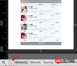
手机测试效果图
或者用火狐的测试工具:按shift+ctrl+M进行查看。
写在最后:其实等你真正熟悉做手机网站这套流程后,你会发现做手机网站没有你想象的那么难,真正难的是不知道如何去下手。对于移动端的JS效果可能和PC端有些不同,因为移动端有移动端的事件,这也是我为什么老是强调学JS,是学原生JS,而不是学Jquery。
相关推荐:
The above is the detailed content of HTML5 mobile website development process. For more information, please follow other related articles on the PHP Chinese website!