
Home >Web Front-end >HTML Tutorial >CSS3 creates various border effects
CSS3 creates various border effects
- php中世界最好的语言Original
- 2018-05-07 17:39:241791browse
This time I will bring you CSS3 to create various border special effects. What are the precautions for CSS3 to create various border special effects. Here are practical cases, let’s take a look.
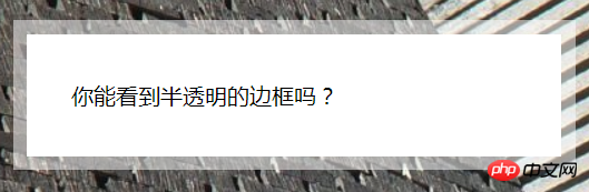
Semi-transparent border
Implementation effect:
Implementation code:
<p>
你能看到半透明的边框吗?
</p>
p {
    /* 关键代码 */
    border: 10px solid rgba(255,255,255,.5);
    background: white;
    background-clip: padding-box;
    /* 其它样式 */
    max-width: 20em;
    padding: 2em;
    margin: 2em auto 0;
    font: 100%/1.5 sans-serif;
}
Implementation points:
Set the border to semi-transparent. This means that the translucent border cannot be seen yet, because by default, the background will extend to the lower layer of the area where the border is located, that is, the background is The outer edge of the border is cut off.
By setting background-clip: padding-box (the initial value is border-box), the background does not extend to the lower layer of the area where the border is located, that is, the outer edge of the inner margin Crop the background.
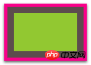
Multiple borders
Implementation effect:
Implementation code:
<p></p>
/* box-shadow 实现方案 */
p {
    /* 关键代码 */
    box-shadow: 0 0 0 10px #655,
            0 0 0 15px deeppink,
            0 2px 5px 15px rgba(0,0,0,.6);
    /* 其它样式 */
    width: 100px;
    height: 60px;
    margin: 25px;
    background: yellowgreen;
}
/* border/outline 实现方案 */
p {
    /* 关键代码 */
    border: 10px solid #655;
    outline: 5px solid deeppink;

    /* 其它样式 */
    width: 100px;
    height: 60px;
    margin: 25px;
    background: yellowgreen;
}
Implementation points:
The box-shadow implementation uses the fourth parameter of box-shadow (expansion radius). With a positive expansion radius plus two zero offsets and a zero blur value, the resulting "projection" actually looks like a solid border. With box-shadow supporting comma separation syntax, any number of shadows can be created, so we can achieve multiple border effects.
border/outline The implementation plan is to use border to set a layer of borders, and then use outline to set a layer of borders. This solution can achieve dotted borders, but it can only achieve two layers of borders.
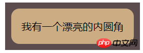
Rounded corners within the border
Implementation effect:
Implementation code:
<p>我有一个漂亮的内圆角</p>
p {
    outline: .6em solid #655;
    box-shadow: 0 0 0 .4em #655; /* 关键代码 */
    max-width: 10em;
    border-radius: .8em;
    padding: 1em;
    margin: 1em;
    background: tan;
    font: 100%/1.5 sans-serif;
}
Implementation points:
outline will not follow the rounded corners of the element (thus showing right angles), but box-shadow does, therefore, superimpose the two together, box- The shadow (whose expansion value is roughly equal to half the border-radius value) will just fill the gap between the outline and the container's rounded corners, so we can achieve the effect we want.
I believe you have mastered the method after reading the case in this article. For more exciting information, please pay attention to other related articles on the php Chinese website!
Recommended reading:
Detailed explanation of the steps to develop mpvue framework with Vue.js
jquery fullpage plug-in adds header and tail copyright related
The above is the detailed content of CSS3 creates various border effects. For more information, please follow other related articles on the PHP Chinese website!