This time I will bring you the react native floating button group picture and text tutorial, what are the precautions when using the react native floating button component, the following is a practical case, let's go together take a look.
React Native floating button component: react-native-action-button, a pure JS component, supports Android and IOS dual platforms, supports setting sub-buttons, and supports custom positions, styles and icons.Rendering

Installation method
npm i react-native-action-button --save
react-native link react-native-vector-icons
Because the react-native-vector-icons icon component is used, a link needs to be made. If you have already used react-native-vector-icons in your project, this step is not required.
Sample code
<view>
  <text>
   悬浮按钮组件示例
  </text>
  <actionbutton>
   <actionbutton.item> console.log("notes tapped!")}>
   <icon></icon>
   </actionbutton.item>
   <actionbutton.item> {}}>
   <icon></icon>
   </actionbutton.item>
   <actionbutton.item> {}}>
   <icon></icon>
   </actionbutton.item>
  </actionbutton>
  <actionbutton> { alert('你点了我!')}}
   renderIcon={() => (<view><icon></icon>
   <text>新增</text>
   </view>)}
  />
  </actionbutton></view>
Main parameter description
ActionButton
- size: The size of the button, the default is 56
- active: Whether to display the button
- position: The position of the button, which can be left center right
- offsetX: The offset position on the X axis
- offsetY : Offset position on the Y axis
- onPress : Click
- onLongPress : Long press event
- buttonText: Button title
- verticalOrientation: The direction of the pop-up button, up or down
- renderIcon: Yes Customize the button display style. The default is a plus sign
ActionButton.Item
- size: the size of the button , the default is 56
- title: button title
- buttonColor: button color
- onPress: Click event
Full example
Full code: GitHub - forrest23/ReactNativeComponents: React Native component collectionThis sample code is in the Component10 folder.
Component address
GitHub - mastermoo/react-native-action-button: customizable multi-action-button component for react-native I believe you have mastered the method after reading the case in this article. For more exciting information, please pay attention to other related articles on the php Chinese website! Recommended reading:Detailed explanation of using webpack hot module replacement
Detailed explanation of the use of three types of $() in jQuery
Summary of JS sorting algorithm
The above is the detailed content of react native floating button component graphic tutorial. For more information, please follow other related articles on the PHP Chinese website!
 react中canvas的用法是什么Apr 27, 2022 pm 03:12 PM
在react中,canvas用于绘制各种图表、动画等;可以利用“react-konva”插件使用canvas,该插件是一个canvas第三方库,用于使用React操作canvas绘制复杂的画布图形,并提供了元素的事件机制和拖放操作的支持。
 react中antd和dva是什么意思Apr 21, 2022 pm 03:25 PM
在react中,antd是基于Ant Design的React UI组件库,主要用于研发企业级中后台产品;dva是一个基于redux和“redux-saga”的数据流方案,内置了“react-router”和fetch,可理解为应用框架。
 React是双向数据流吗Apr 21, 2022 am 11:18 AM
React不是双向数据流,而是单向数据流。单向数据流是指数据在某个节点被改动后,只会影响一个方向上的其他节点;React中的表现就是数据主要通过props从父节点传递到子节点,若父级的某个props改变了,React会重渲染所有子节点。
 Java中Native修饰符的使用方法Apr 22, 2023 pm 03:46 PM
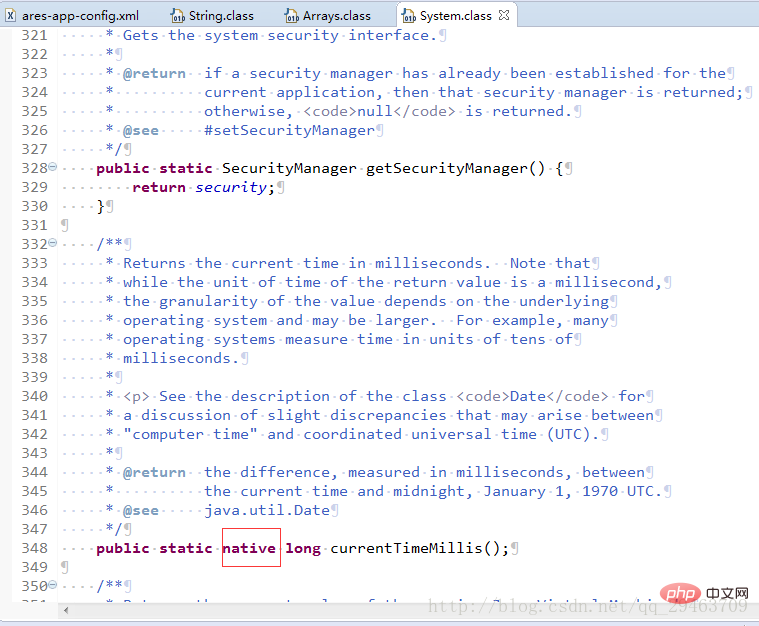
Native修饰符的使用native主要用于方法上1、一个native方法就是一个Java调用非Java代码的接口。一个native方法是指该方法的实现由非Java语言实现,比如用C或C++实现。2、在定义一个native方法时,并不提供实现体(比较像定义一个JavaInterface),因为其实现体是由非Java语言在外面实现的。说明Java语言本身不能对操作系统底层进行访问和操作,但是可以通过JNI接口调用其他语言来实现对底层的访问。JNI是Java本机接口(JavaNativeInterf
 react中为什么使用nodeApr 21, 2022 am 10:34 AM
因为在react中需要利用到webpack,而webpack依赖nodejs;webpack是一个模块打包机,在执行打包压缩的时候是依赖nodejs的,没有nodejs就不能使用webpack,所以react需要使用nodejs。
 react是组件化开发吗Apr 22, 2022 am 10:44 AM
react是组件化开发;组件化是React的核心思想,可以开发出一个个独立可复用的小组件来构造应用,任何的应用都会被抽象成一颗组件树,组件化开发也就是将一个页面拆分成一个个小的功能模块,每个功能完成自己这部分独立功能。
 react和reactdom有什么区别Apr 27, 2022 am 10:26 AM
react和reactdom的区别是:ReactDom只做和浏览器或DOM相关的操作,例如“ReactDOM.findDOMNode()”操作;而react负责除浏览器和DOM以外的相关操作,ReactDom是React的一部分。
 react中forceupdate的用法是什么Apr 19, 2022 pm 12:03 PM
在react中,forceupdate()用于强制使组件跳过shouldComponentUpdate(),直接调用render(),可以触发组件的正常生命周期方法,语法为“component.forceUpdate(callback)”。


Hot AI Tools

Undresser.AI Undress
AI-powered app for creating realistic nude photos

AI Clothes Remover
Online AI tool for removing clothes from photos.

Undress AI Tool
Undress images for free

Clothoff.io
AI clothes remover

AI Hentai Generator
Generate AI Hentai for free.

Hot Article

Hot Tools

PhpStorm Mac version
The latest (2018.2.1) professional PHP integrated development tool

DVWA
Damn Vulnerable Web App (DVWA) is a PHP/MySQL web application that is very vulnerable. Its main goals are to be an aid for security professionals to test their skills and tools in a legal environment, to help web developers better understand the process of securing web applications, and to help teachers/students teach/learn in a classroom environment Web application security. The goal of DVWA is to practice some of the most common web vulnerabilities through a simple and straightforward interface, with varying degrees of difficulty. Please note that this software

SecLists
SecLists is the ultimate security tester's companion. It is a collection of various types of lists that are frequently used during security assessments, all in one place. SecLists helps make security testing more efficient and productive by conveniently providing all the lists a security tester might need. List types include usernames, passwords, URLs, fuzzing payloads, sensitive data patterns, web shells, and more. The tester can simply pull this repository onto a new test machine and he will have access to every type of list he needs.

Safe Exam Browser
Safe Exam Browser is a secure browser environment for taking online exams securely. This software turns any computer into a secure workstation. It controls access to any utility and prevents students from using unauthorized resources.

MinGW - Minimalist GNU for Windows
This project is in the process of being migrated to osdn.net/projects/mingw, you can continue to follow us there. MinGW: A native Windows port of the GNU Compiler Collection (GCC), freely distributable import libraries and header files for building native Windows applications; includes extensions to the MSVC runtime to support C99 functionality. All MinGW software can run on 64-bit Windows platforms.


