

 Web Front-endJS TutorialComprehensive analysis of the implementation method of Bootstrap pop-up window_javascript skills
Comprehensive analysis of the implementation method of Bootstrap pop-up window_javascript skills

1. Structural analysis
The modal pop-up boxes in the Bootstrap framework use the "modal", "modal-dialog" and "modal-content" styles respectively, and the real content of the pop-up window is placed in "modal-content". Its main It also includes three parts:
☑ The header of the pop-up box, generally represented by "modal-header", mainly includes the title and close button
☑ The body of the pop-up box, usually represented by "modal-body", the main content of the pop-up box
☑ The foot of the pop-up box, usually represented by "modal-footer", mainly places the operation buttons
<div class="modal" id="mymodal"> <div class="modal-dialog"> <div class="modal-content"> <div class="modal-header"> <button type="button" class="close" data-dismiss="modal"><span aria-hidden="true">×</span><span class="sr-only">Close</span></button> <h4 id="模态弹出窗标题">模态弹出窗标题</h4> </div> <div class="modal-body"> <p>模态弹出窗主体内容</p> </div> <div class="modal-footer"> <button type="button" class="btn btn-default" data-dismiss="modal">关闭</button> <button type="button" class="btn btn-primary">保存</button> </div> </div><!-- /.modal-content --> </div><!-- /.modal-dialog --> </div><!-- /.modal -->
2. The data-toggle class triggers the pop-up window (no need to write JS)
1. Modal pop-up window declaration , only need to customize two necessary attributes: data-toggle and data-target.
<!-- data-target触发模态弹出窗元素 --> <button class="btn btn-primary" data-toggle="modal" data-target="#mymodal-data" type="button">通过data-target触发</button> <!-- 模态弹出窗内容 --> <div class="modal" id="mymodal-data" tabindex="-1" role="dialog" aria-labelledby="mySmallModalLabel" aria-hidden="true"> <div class="modal-dialog"> <div class="modal-content"> <div class="modal-header"> <button type="button" class="close" data-dismiss="modal"><span aria-hidden="true">×</span><span class="sr-only">Close</span></button> <h4 id="模态弹出窗标题">模态弹出窗标题</h4> </div> <div class="modal-body"> <p>模态弹出窗主体内容</p> </div> <div class="modal-footer"> <button type="button" class="btn btn-default" data-dismiss="modal">关闭</button> <button type="button" class="btn btn-primary">保存</button> </div> </div> </div> </div>

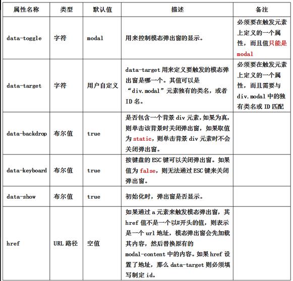
2. data-parameter description
In addition to controlling modal pop-up windows through data-toggle and data-target, the Bootstrap framework also provides other custom data-attributes for modal pop-up boxes to control modal pop-up windows.
3. JS trigger pop-up window (JS needs to be written)
1. In addition to using custom attributes to trigger modal pop-up boxes, you can also trigger modal pop-up windows through JavaScript methods. Triggered by giving an event to an element. For example, give a button a click event, and then trigger a modal pop-up window.
HTML:
<div class="modal" id="mymodal"> <div class="modal-dialog"> <div class="modal-content"> <div class="modal-header"> <button type="button" class="close" data-dismiss="modal"><span aria-hidden="true">×</span><span class="sr-only">Close</span></button> <h4 id="模态弹出窗标题">模态弹出窗标题</h4> </div> <div class="modal-body"> <p>模态弹出窗主体内容</p> </div> <div class="modal-footer"> <button type="button" class="btn btn-default" data-dismiss="modal">关闭</button> <button type="button" class="btn btn-primary">保存</button> </div> </div><!-- /.modal-content --> </div><!-- /.modal-dialog --> </div><!-- /.modal -->
JS:
 $(function(){
 $(".btn").click(function(){
 $("#mymodal").modal("toggle");
 });
 });
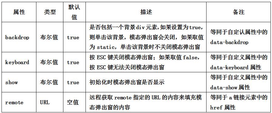
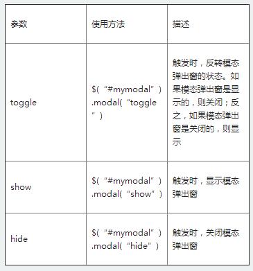
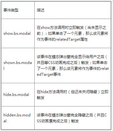
2. When using JavaScript to trigger a modal pop-up window, the Bootstrap framework provides some settings, mainly including
Property settings:
$(function(){
 $(".btn").click(function(){
 $("#mymodal").modal({
  keyboard:false
 });
 });
});
Parameter settings:
Event settings:
$('#myModal').on('hidden.bs.modal', function (e) {
 // 处理代码...
})
4. Pop-up window size
The Bootstrap framework also provides different sizes for modal popups.
One is the large size style "modal-lg".
<divclass="modal-dialog modal-lg">
 <divclass="modal-content"> ... </div>
</div>
The other is the small size style "modal-sm".
<divclass="modal-dialog modal-sm">
 <divclass="modal-content"> ... </div>
</div>
The above is a complete introduction to the implementation method of Bootstrap pop-up window. I hope it will be helpful to everyone's learning.

 From C/C to JavaScript: How It All WorksApr 14, 2025 am 12:05 AM
The shift from C/C to JavaScript requires adapting to dynamic typing, garbage collection and asynchronous programming. 1) C/C is a statically typed language that requires manual memory management, while JavaScript is dynamically typed and garbage collection is automatically processed. 2) C/C needs to be compiled into machine code, while JavaScript is an interpreted language. 3) JavaScript introduces concepts such as closures, prototype chains and Promise, which enhances flexibility and asynchronous programming capabilities.
 JavaScript Engines: Comparing ImplementationsApr 13, 2025 am 12:05 AM
Different JavaScript engines have different effects when parsing and executing JavaScript code, because the implementation principles and optimization strategies of each engine differ. 1. Lexical analysis: convert source code into lexical unit. 2. Grammar analysis: Generate an abstract syntax tree. 3. Optimization and compilation: Generate machine code through the JIT compiler. 4. Execute: Run the machine code. V8 engine optimizes through instant compilation and hidden class, SpiderMonkey uses a type inference system, resulting in different performance performance on the same code.
 Beyond the Browser: JavaScript in the Real WorldApr 12, 2025 am 12:06 AM
JavaScript's applications in the real world include server-side programming, mobile application development and Internet of Things control: 1. Server-side programming is realized through Node.js, suitable for high concurrent request processing. 2. Mobile application development is carried out through ReactNative and supports cross-platform deployment. 3. Used for IoT device control through Johnny-Five library, suitable for hardware interaction.
 Building a Multi-Tenant SaaS Application with Next.js (Backend Integration)Apr 11, 2025 am 08:23 AM
I built a functional multi-tenant SaaS application (an EdTech app) with your everyday tech tool and you can do the same. First, what’s a multi-tenant SaaS application? Multi-tenant SaaS applications let you serve multiple customers from a sing
 How to Build a Multi-Tenant SaaS Application with Next.js (Frontend Integration)Apr 11, 2025 am 08:22 AM
This article demonstrates frontend integration with a backend secured by Permit, building a functional EdTech SaaS application using Next.js. The frontend fetches user permissions to control UI visibility and ensures API requests adhere to role-base
 JavaScript: Exploring the Versatility of a Web LanguageApr 11, 2025 am 12:01 AM
JavaScript is the core language of modern web development and is widely used for its diversity and flexibility. 1) Front-end development: build dynamic web pages and single-page applications through DOM operations and modern frameworks (such as React, Vue.js, Angular). 2) Server-side development: Node.js uses a non-blocking I/O model to handle high concurrency and real-time applications. 3) Mobile and desktop application development: cross-platform development is realized through ReactNative and Electron to improve development efficiency.
 The Evolution of JavaScript: Current Trends and Future ProspectsApr 10, 2025 am 09:33 AM
The latest trends in JavaScript include the rise of TypeScript, the popularity of modern frameworks and libraries, and the application of WebAssembly. Future prospects cover more powerful type systems, the development of server-side JavaScript, the expansion of artificial intelligence and machine learning, and the potential of IoT and edge computing.
 Demystifying JavaScript: What It Does and Why It MattersApr 09, 2025 am 12:07 AM
JavaScript is the cornerstone of modern web development, and its main functions include event-driven programming, dynamic content generation and asynchronous programming. 1) Event-driven programming allows web pages to change dynamically according to user operations. 2) Dynamic content generation allows page content to be adjusted according to conditions. 3) Asynchronous programming ensures that the user interface is not blocked. JavaScript is widely used in web interaction, single-page application and server-side development, greatly improving the flexibility of user experience and cross-platform development.


Hot AI Tools

Undresser.AI Undress
AI-powered app for creating realistic nude photos

AI Clothes Remover
Online AI tool for removing clothes from photos.

Undress AI Tool
Undress images for free

Clothoff.io
AI clothes remover

AI Hentai Generator
Generate AI Hentai for free.

Hot Article
Hot Tools

Dreamweaver CS6
Visual web development tools

VSCode Windows 64-bit Download
A free and powerful IDE editor launched by Microsoft

Dreamweaver Mac version
Visual web development tools

MinGW - Minimalist GNU for Windows
This project is in the process of being migrated to osdn.net/projects/mingw, you can continue to follow us there. MinGW: A native Windows port of the GNU Compiler Collection (GCC), freely distributable import libraries and header files for building native Windows applications; includes extensions to the MSVC runtime to support C99 functionality. All MinGW software can run on 64-bit Windows platforms.

SAP NetWeaver Server Adapter for Eclipse
Integrate Eclipse with SAP NetWeaver application server.

