

This time I will bring you box-reflect to achieve the reflection effect. What are the precautions for box-reflect to achieve the reflection effect? The following is a practical case, let’s take a look.
Usually when we want to achieve the reflection effect, the general approach is to use multiple DOM elementsAbsolute positioning+scale (minus -1) or rotate. The disadvantage of this method is that it takes up space and has too many DOM elements.
In browsers using the webkit kernel (chrome, safari, mobile browsers), you can use the -webkit-box-reflect attribute to achieve reflection. The syntax is as follows[above | below | right | left ]?! ! ! Important: The effect of the mask layer has nothing to do with color. For example, if you use a gradient color as a mask, if it is a solid color, it will be transparent, and if it is transparent, the original color will be exposed.
Usage examples are as follows As shown:
nbsp;html>


  <meta>
  <meta>
  <title>JS Bin</title>
  <style>
    .box{ width:200px; height:200px; margin-bottom:20px;transform:scale(-1,1); background-image:linear-gradient(90deg,red,yellow);-webkit-box-reflect:below 10px linear-gradient(180deg,transparent,#000); }
  </style>


  <p></p>
The effect is as follows:

nbsp;html>


  <meta>
  <meta>
  <title>JS Bin</title>
  <style>
    .box{ width:200px; height:200px; margin:100px 0 0 100px; }
    .box1{ background-image:linear-gradient(180deg,red,yellow); transform:scale(1,-1) rotate(45deg)}
    .box2{ background-image:-moz-element(#box1); }
  </style>


  <p></p>
  <p></p>


<svg>
    <defs>
      <lineargradient>
        <stop></stop>
        <stop></stop>
      </lineargradient>
      <lineargradient>
        <stop></stop>
        <stop></stop>
      </lineargradient>
      <mask>
        <rect></rect>
      </mask>
    </defs>
    <rect>
</rect></svg>
The code for the canvas example is as follows
var canvas = document.getElementById('canvas'),
    ctx = canvas.getContext('2d');
var linearGradient1 = ctx.createLinearGradient(0,0,0,200);
linearGradient1.addColorStop(0,"red");
linearGradient1.addColorStop(1,"yellow");
var linearGradient2 = ctx.createLinearGradient(0,0,0,200);
linearGradient2.addColorStop(0,"transparent");
linearGradient2.addColorStop(1,"#ffffff");
ctx.fillStyle = linearGradient1;
ctx.fillRect(0,0,200,200);
ctx.globalCompositeOperation = 'destination-out';
ctx.fillStyle = linearGradient2;
ctx.fillRect(0,0,200,200);
I believe you have mastered the method after reading the case in this article. For more exciting information, please pay attention to the php Chinese website Other related articles! Recommended reading:
##The difference between width:100%; and width:autoWaterfall flow layout and infinite loading picture album effectThe above is the detailed content of box-reflect achieves reflection effect. For more information, please follow other related articles on the PHP Chinese website!

 用户遭遇罕见故障 三星 Watch 智能手表突现白屏问题Apr 03, 2024 am 08:13 AM
你可能遇到过智能手机屏幕出现绿色线条的问题,即使没见过,也一定在网络上看到过相关图片。那么,智能手表屏幕变白的情况你遇见过吗?4月2日,CNMO从外媒了解到,一名Reddit用户在社交平台上分享了一张图片,展示了三星Watch系列智能手表屏幕变白的情况。该用户写道:"我离开时正在充电,回来时就这样了,我尝试重启,但重启过程中屏幕还是这样。"三星Watch智能手表屏幕变白这位Reddit用户并未指明这款智能手表的具体型号。不过,从图片上看,应该是三星Watch5。此前,另一位Reddit用户也报告
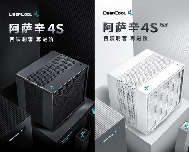 九州风神阿萨辛 4S 散热器评测 风冷“刺客大师”范儿Mar 28, 2024 am 11:11 AM
说起阿萨辛ASSASSIN,相信玩家们一定会想到《刺客信条》中的各位刺客大师,不仅身手了得,而且"躬身于黑暗、服务于光明"的信条,与国内知名机箱/电源/散热器品牌九州风神(DeepCool)旗下的阿萨辛ASSASSIN系列旗舰级风冷散热器不谋而合。最近,该系列的最新产品阿萨辛ASSASSIN4S重磅上线,"西装刺客,再进阶"为高级玩家带来全新的风冷散热体验。外观一览细节满满阿萨辛4S散热器采用双塔构造+单风扇内嵌设计,外面包覆立方体造型的整流罩,整体感极强,并提供白、黑两种配色可选,满足不同色系
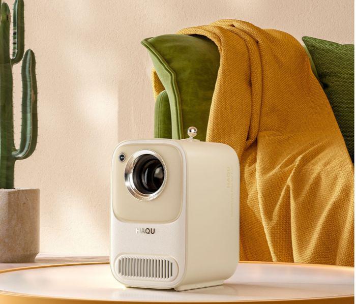 春日里的精致光影艺术,哈趣 H2 性价比之选Apr 17, 2024 pm 05:07 PM
随着春天的到来,万物复苏,一切都充满了生机与活力。在这个美好的季节里,如何为家居生活增添一抹别样的色彩?哈趣H2投影仪,以其精致的设计和超高的性价比,成为了这个春天里不可或缺的一道亮丽风景。这款H2投影仪小巧玲珑却不失时尚。无论是放在客厅的电视柜上,还是卧室的床头柜旁,都能成为一道亮丽的风景线。它的机身采用了奶白色的磨砂质地,这种设计不仅让投影仪的外观更显高级,同时也增加了触感的舒适度。米色仿皮纹材质,更是为整体外观增添了一抹温馨与雅致。这种色彩与材质的搭配,既符合现代家居的审美趋势,又能够融入
 航嘉 MX750P 全模组电源评测:750W 的白金实力浓缩Mar 28, 2024 pm 03:20 PM
ITX平台以小巧的身形吸引了不少追求极致和独特美感的玩家,随着制程的提升和技术的进步,英特尔第14代酷睿和RTX40系显卡都可以在ITX平台中发挥实力,游戏玩家也对SFX电源有了更高的要求。游戏爱好者航嘉推出新的MX系列电源,在满足高性能需求的ITX平台中,MX750P全模组电源的定额功率高达750W,同时通过了80PLUS白金级认证。以下我们就带来这款电源的评测。航嘉MX750P全模组电源采用了简约时尚的设计理念,共有黑白两款供玩家选择,均采用磨砂表面处理,搭配银灰色和红色的字体有很好的质感,
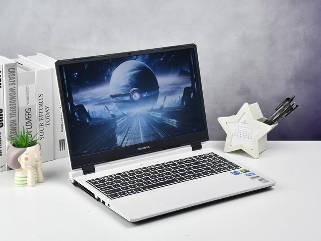 七彩虹隐星 P15 24 评测:颜值性能兼具的硬核全能游戏本Mar 06, 2024 pm 04:40 PM
在当下科技飞速发展的时代,笔记本电脑已经成为人们日常生活和工作中不可或缺的重要工具。对于那些对性能有高要求的玩家而言,拥有配置强大、性能出色的笔记本电脑才能满足其硬核需求。七彩虹隐星P15笔记本电脑凭借其卓越性能和令人惊艳的设计,成为了未来的引领者,堪称硬核笔记本的典范。七彩虹隐星P1524配备了13代英特尔酷睿i7处理器和RTX4060LaptopGPU,外观采用更时尚的宇宙飞船设计风格,同时在细节表现上也有出色表现。让我们先来了解一下这款笔记本的特点。至高搭载英特尔酷睿i7-13620H处理
 轻松拿捏 4K 高清图像理解!这个多模态大模型自动分析网页海报内容,打工人简直不要太方便Apr 23, 2024 am 08:04 AM
一个可以自动分析PDF、网页、海报、Excel图表内容的大模型,对于打工人来说简直不要太方便。上海AILab,香港中文大学等研究机构提出的InternLM-XComposer2-4KHD(简写为IXC2-4KHD)模型让这成为了现实。相比于其他多模态大模型不超过1500x1500的分辨率限制,该工作将多模态大模型的最大输入图像提升到超过4K(3840x1600)分辨率,并支持任意长宽比和336像素~4K动态分辨率变化。发布三天,该模型就登顶HuggingFace视觉问答模型热度榜单第一。轻松拿捏
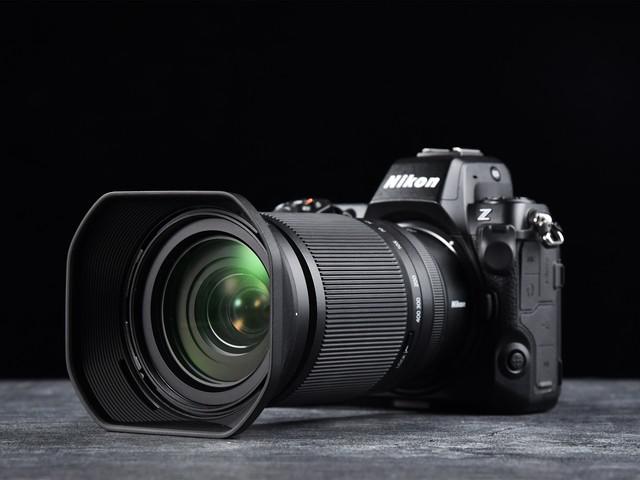 真正的一镜走天下 尼克尔 Z 28-400mm f/4-8 VR 镜头上手体验Mar 28, 2024 pm 02:54 PM
很多摄影爱好者喜欢使用镜头,他们的拍摄需求非常多变,因此在镜头的选择上更倾向于一支比较全能的产品,也就是我们俗称的"一镜走天下"镜头。刚好,现在尼康推出了一支新的产品,尼克尔Z28-400mmf/4-8VR镜头,一支真正的"一镜走天下"镜头。镜头从28mm广角端一直覆盖到400mm长焦端,配备其Z卡口相机,可以轻松拍摄十分丰富的摄影主题,并带来一场丰富的视角变化。今天,我们就通过近期的使用体验,跟大家一起聊聊这支尼克尔Z28-400mmf/4-8VR镜头。尼克尔Z28-400mmf/4-8VR是
 Garmin Forerunner 165 评测:颜值功能兼具 让腕表成为运动伴侣Apr 01, 2024 am 11:31 AM
在400年前,手表作为计时工具被发明出来,自此人们获得了一个能随时"掌控时间"的工具,而随着技术的发展,手表已然从单纯的装饰品,变成现如今兼顾设计与功能为一体的智能手表。在众多厂商中,Garmin(佳明)毫无疑问是行业的领跑者,通过整合专业运动健康领域的技术与算法,将人、健康、空间、科技紧密结合在一起,更创新了跑步科技,让全新的GarminForerunner165成为跑步爱好者的理想伴侣。1、设计:操作便捷,外观更时尚作为常年佩戴在手腕上的智能手表来说,佩戴体验是购买的重点之一,尤其对于专业运


Hot AI Tools

Undresser.AI Undress
AI-powered app for creating realistic nude photos

AI Clothes Remover
Online AI tool for removing clothes from photos.

Undress AI Tool
Undress images for free

Clothoff.io
AI clothes remover

AI Hentai Generator
Generate AI Hentai for free.

Hot Article
Hot Tools

SAP NetWeaver Server Adapter for Eclipse
Integrate Eclipse with SAP NetWeaver application server.

Dreamweaver Mac version
Visual web development tools

ZendStudio 13.5.1 Mac
Powerful PHP integrated development environment

Atom editor mac version download
The most popular open source editor

SublimeText3 Linux new version
SublimeText3 Linux latest version

