
Home >WeChat Applet >Mini Program Development >Example of implementation method of folding panel of WeChat applet
Example of implementation method of folding panel of WeChat applet

- 小云云Original
- 2018-02-02 10:22:145191browse
This article mainly introduces the relevant information of WeChat applet to realize folding panel in detail. It has certain reference value. Interested friends can refer to it. I hope it can help everyone.
Implementation Principle
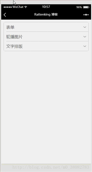
By controlling the display and hiding of the details part, the folding effect is achieved, and at the same time, the downward arrow on the right is switched.
Rendering
WXML
##
<!--pages/accordion/accordion.wxml-->
<view class="tui-accordion-content">
<view class="tui-menu-list {{isShowFrom1 ? 'tui-shangjiantou' : 'tui-xiajiantou'}}">
<view bindtap="showFrom" data-param="1"><text>表单</text></view>
<view class="tui-accordion-from {{isShowFrom1 ? '' : 'tui-hide'}}">
<view class="tui-menu-list tui-clear">
<text class="tui-input-name">input</text>
<input placeholder="普通输入框"></input>
</view>
<view class="tui-menu-list tui-clear">
<text class="tui-input-name">input</text>
<input placeholder="普通输入框"></input>
</view>
<view class="tui-menu-list tui-clear">
<text class="tui-input-name">input</text>
<input placeholder="普通输入框"></input>
</view>
<view class="tui-menu-list tui-clear" style="text-align:center;padding-top:20rpx;">
<button size="mini" type="primary">确定</button>
<button size="mini" style="margin-left:10rpx;">取消</button>
</view>
</view>
</view>
<view class="tui-menu-list {{isShowFrom2 ? 'tui-shangjiantou' : 'tui-xiajiantou'}}">
<view bindtap="showFrom" data-param="2"><text>轮播图片</text></view>
<view class="{{isShowFrom2 ? '' : 'tui-hide'}}">
<swiper class="tui-swiper" indicator-dots="{{indicatorDots}}" vertical="{{vertical}}"
autoplay="{{autoplay}}" interval="{{interval}}" duration="{{duration}}"
indicator-color="#fff" indicator-active-color="red">
<block wx:for-items="{{banner_url}}">
<swiper-item>
<block wx:if="{{item}}">
<image class="tui-img" src="{{item}}" mode="aspectFill"/>
</block>
<block wx:else>
<image src="../../images/default_pic.png" mode="aspectFill"></image>
</block>
</swiper-item>
</block>
</swiper>
</view>
</view>
<view class="tui-menu-list {{isShowFrom3 ? 'tui-shangjiantou' : 'tui-xiajiantou'}}">
<view bindtap="showFrom" data-param="3"><text>文字排版</text></view>
<view class="{{isShowFrom3 ? '' : 'tui-hide'}}">
<view class="tui-h1"><text>H1 标签内文字大小及加粗样式</text></view>
<view class="tui-h2"><text>H2 标签内文字大小及加粗样式</text></view>
<view class="tui-h3"><text>H3 标签内文字大小及加粗样式</text></view>
<view class="tui-h4"><text>H4 标签内文字大小及加粗样式</text></view>
<view class="tui-h5"><text>H5 标签内文字大小及加粗样式</text></view>
<view class="tui-h6"><text>H6 标签内文字大小及加粗样式</text></view>
<view class="tui-p"><text>P 标签内文字大小及加粗样式</text></view>
</view>
</view>
</view>WXSS
/* pages/accordion/accordion.wxss */
.tui-accordion-content{
 margin: 10px;
 border: 1px solid #c8c7cc;
 border-radius: 5px;
 overflow: hidden;
}
.tui-accordion-from{padding-left: 0;}
.tui-accordion-from input{
 height: 80rpx;
 line-height: 80rpx;
}

.tui-input-name{
 height: 80rpx;
 float: left;
 width: 200rpx;
}
JS
var banner = require("../../src/js/banner.js");

Page({
 data: {
  isShowFrom1: false,
  isShowFrom2: false,
  isShowFrom3: false,
  indicatorDots: true,
  vertical: false,
  autoplay: true,
  interval: 3000,
  duration: 800,
  banner_url: banner.bannerList
 },
 onLoad: function (options) {

 },
 showFrom(e){
  var param = e.target.dataset.param;
  this.setData({
   isShowFrom1: param == 1 ? (this.data.isShowFrom1 ? false : true) : false,
   isShowFrom2: param == 2 ? (this.data.isShowFrom2 ? false : true) : false,
   isShowFrom3: param == 3 ? (this.data.isShowFrom3 ? false : true) : false
  });
 }
})
Summary:
2 When controlling the hiding and display of details, switch the arrows on the right accordingly;
3 The showFrom function optimizes the modified ternary expression of each Boolean variable.
Pure CSS3 cool 3D folding panel animation effects_html/css_WEB-ITnose
##jQuery In-depth analysis of folding panel_jquerySimple folding menu (folding panel) effect code implemented by jQuery_jqueryThe above is the detailed content of Example of implementation method of folding panel of WeChat applet. For more information, please follow other related articles on the PHP Chinese website!
Related articles
See more- WeChat Mini Program Simple DEMO layout, logic, and style exercises
- Detailed explanation and examples of WeChat applet wx.request (interface calling method)
- WeChat Mini Program - Detailed explanation of WeChat login, WeChat payment, and template messages
- WeChat applet (application account) simple example application and detailed explanation of the example
- Detailed explanation of WeChat applet for loop