
Home >Web Front-end >CSS Tutorial >transform function in CSS3
transform function in CSS3

- 小云云Original
- 2017-12-30 13:38:131859browse
Transform is an attribute in CSS3. This article mainly introduces the transformation function in CSS3 - the transform function. I think it is quite good. Now I will share it with you and give it as a reference. Let’s follow the editor to take a look, I hope it can help everyone.
Transformation function in CSS3: In CSS3, you can use the transform function to realize four types of deformation functions: rotation, scaling, tilting, and movement of text or images.
1. How to use the transform function:
(1) Implement the transform function through the transform attribute in CSS3:
(2) Transform function Usage:
transform:function;
-ms-transform:function;/*IE9*/
-moz-transform:function;/*Firefox*/
-webkit-transform:function; /*Safari and chrome*/
-o-transform: function;/*Opera*/
2. rotate, specify the angle in the parameter (rotate means clockwise rotation, deg is the angle unit in CSS3):
(1) How to use:
-ms-transform:rotate(angle);/*IE9*/
-moz-transform: rotate(angle);/*Firefox*/
-webkit-transform:rotate(angle);/*Safari and chrome*/
-o-transform:rotate(angle);/*Opera*/
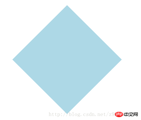
(2)rotate rotation application:
1) HTML code:
<p></p>
2) CSS code:
p{
    width: 300px;
    height: 300px;
    background-color: lightblue;
    -ms-transform:rotate(45deg);/*IE9*/
    -moz-transform:rotate(45deg);/*Firefox*/
    -webkit-transform:rotate(45deg);/*Safari和chrome*/
    -o-transform:rotate(45deg);/*Opera*/
}
3) The rendering is as follows:
3. Scale scaling conversion:
( 1) How to use: transform:scale(value), its value is the specified zoom ratio, for example, 0.5 means zooming by 50%, 1 means zooming by 100%, 1.5 means zooming by 150%;
-ms-transform :scale(value);/*IE9*/
-moz-transform:scale(value);/*Firefox*/
-webkit-transform:scale(value);/*Safari and chrome*/
-o-transform:scale(value);/*Opera*/
(2) Possible values:
1) scale(x,y) makes the element X axis and Y axis The axes are scaled at the same time;
2) scale(x) makes the element scale only on the X axis;
3) scale(y) makes the element scale only on the Y axis;
(3) Application of scale scaling transformation :
1) HTML code:
<p></p>
2) CSS code:
p{
width: 300px;
height: 300px;
background-color: lightblue;
/*缩放值X与Y为正整数时*/
-ms-transform:scale(2,2);/*IE9*/
-moz-transform:scale(2,2);/*Firefox*/
-webkit-transform:scale(2,2);/*Safari和chrome*/
-o-transform:scale(2,2);/*Opera*/
/*缩放值X与Y均为小于1的浮点数时*/
/*-ms-transform:scale(0.5,0.5);*//*IE9*/
/*-moz-transform:scale(0.5,0.5);*//*Firefox*/
/*-webkit-transform:scale(0.5,0.5);*//*Safari和chrome*/
/*-o-transform:scale(0.5,0.5);*//*Opera*/
/*缩放值仅X为小于1的浮点数时*/
/*-ms-transform:scaleX(0.5);*//*IE9*/
/*-moz-transform:scaleX(0.5);*//*Firefox*/
/*-webkit-transform:scaleX(0.5);*//*Safari和chrome*/
/*-o-transform:scaleX(0.5);*//*Opera*/
/*缩放值仅Y为小于1的浮点数时*/
/*-ms-transform:scaleY(0.5);*//*IE9*/
/*-moz-transform:scaleY(0.5);*//*Firefox*/
/*-webkit-transform:scaleY(0.5);*//*Safari和chrome*/
/*-o-transform:scaleY(0.5);*//*Opera*/
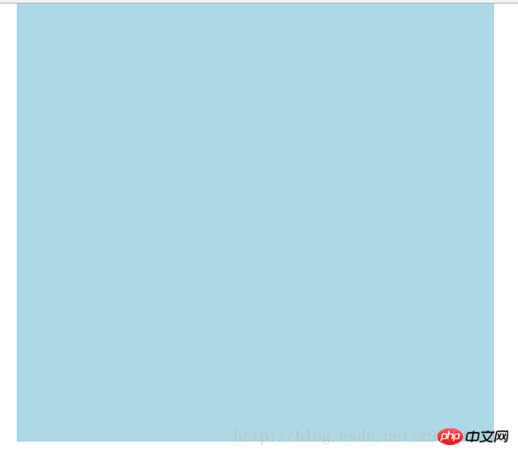
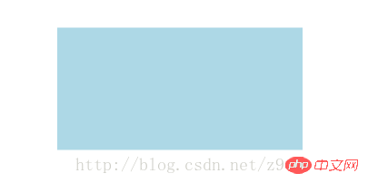
}3 ) The rendering is as follows:
① The rendering without scaling:

② The rendering when the scaling values X and Y are positive integers:
③The rendering when the scaling values X and Y are both floating point numbers less than 1:

④The scaling value is only The rendering when
 ##4. Skew:
 transform:skew(angle); Its value is the angle;
-moz-transform:skew(angle);/*Firefox*/-webkit-transform:skew(angle);/ *Safari and chrome*/-o-transform:skew(angle);/*Opera*/
(2) Possible values:
1) skew(x,y ) causes the element to twist in the horizontal and vertical directions at the same time (the X-axis and the Y-axis are twisted and deformed according to a certain angle value at the same time). When there is only one parameter, it is only tilted in the horizontal direction;
2) skewX(x) only Make the element distort in the horizontal direction (X-axis distortion)
3) skewY(y) Only make the element distort in the vertical direction (Y-axis distortion)
(3) Skew skew Application:
1) HTML code:
<p></p>2) CSS code: <p></p> <p></p>
p{
    width: 300px;
    height: 300px;
    background-color: lightblue;

    /*X轴与Y轴均倾斜*/
    -ms-transform:skew(30deg,30deg);
    -moz-transform:skew(30deg,30deg);
    -webkit-transform:skew(30deg,30deg);
    -o-transform:skew(30deg,30deg);

    /*设置一个值相当于仅X轴倾斜*/
    /*-ms-transform:skew(30deg);*//*IE9*/
    /*-moz-transform:skew(30deg);*//*Firefox*/
    /*-webkit-transform:skew(30deg);*//*Safari和chrome*/
    /*-o-transform:skew(30deg);*//*Opera*/

    /*仅X轴倾斜*/
    /*-ms-transform:skewX(30deg);*//*IE9*/
    /*-moz-transform:skewX(30deg);*//*Firefox*/
    /*-webkit-transform:skewX(30deg);*//*Safari和chrome*/
    /*-o-transform:skewX(30deg);*//*Opera*/

    /*仅Y轴倾斜*/
    /*-ms-transform:skewY(30deg);*//*IE9*/
    /*-moz-transform:skewY(30deg);*//*Firefox*/
    /*-webkit-transform:skewY(30deg);*//*Safari和chrome*/
    /*-o-transform:skewY(30deg);*//*Opera*/
}
3) The renderings are as follows:
③Set a value equivalent to the rendering of only the X-axis tilt: 
④The rendering of only the X-axis tilt: 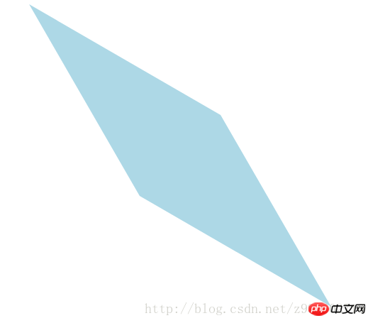
⑤The rendering of Y-axis tilt only: 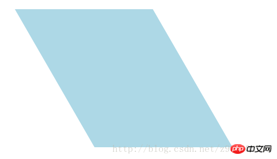
5、移动translate:
(1)使用方法:
transform:translate(值);它的值是指定移动的距离;
-ms-transform:translate(值);/*IE9*/
-moz-transform:translate(值);/*Firefox*/
-webkit-transform:translate(值);/*Safari和chrome*/
-o-transform:translate(值);/*Opera*/
(2)可能的值:
1)translate(x,y)水平方向与垂直方向同时移动(也就是X轴和Y轴同时移动)只有一个参数的时候,只在水平方向上移动;
2)translateX(x)仅水平方向(X轴移动)
3)translateY(y)仅垂直方向(Y轴移动)
(3)移动translate的应用:
1)HTML代码:
<p class="main">
    <p class="p"></p>
</p>
2)CSS代码:
.main{
width: 100%;
height: 500px;
background-color: lightcoral;
}
.p{
width: 300px;
height: 300px;
background-color: lightblue;
/*在X轴与Y轴上均移动*/
-ms-transform:translate(50px,50px);/*IE9*/
-moz-transform:translate(50px,50px);/*Firefox*/
-webkit-transform:translate(50px,50px);/*Safari和chrome*/
-o-transform:translate(50px,50px);/*Opera*/
/*设置一个值相当于仅在X轴上移动*/
/*-ms-transform:translate(50px);*//*IE9*/
/*-moz-transform:translate(50px);*//*Firefox*/
/*-webkit-transform:translate(50px);*//*Safari和chrome*/
/*-o-transform:translate(50px);*//*Opera*/
/*仅在X轴上移动*/
/*-ms-transform:translateX(50px);*//*IE9*/
/*-moz-transform:translateX(50px);*//*Firefox*/
/*-webkit-transform:translateX(50px);*//*Safari和chrome*/
/*-o-transform:translateX(50px);*//*Opera*/
/*仅在Y轴上移动*/
/*-ms-transform:translateY(50px);*//*IE9*/
/*-moz-transform:translateY(50px);*//*Firefox*/
/*-webkit-transform:translateY(50px);*//*Safari和chrome*/
/*-o-transform:translateY(50px);*//*Opera*/
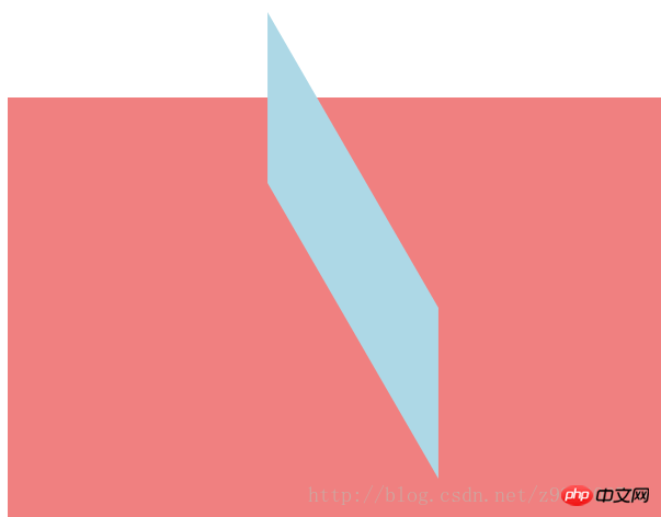
}3)效果图如下:
①未移动的效果图:

②在X轴与Y轴上均移动时的效果图:
③设置一个值相当于仅在X轴上移动时的效果图:

④仅在X轴上移动时的效果图:
⑤仅在Y轴上移动时的效果图:

6、对一个元素使用多种变形方法:(同样的方法只能使用一次)
(1)使用方法:
transform:方法1 方法2 方法3 方法4;
-ms-transform:方法1 方法2 方法3 方法4;/*IE9*/
-moz-transform:方法1 方法2 方法3 方法4;/*Firefox*/
-webkit-transform:方法1 方法2 方法3 方法4;/*Safari和chrome*/
-o-transform:方法1 方法2 方法3 方法4;/*Opera*/
(2)对一个元素使用多种变形方法的应用:
1)HTML代码:
<p class="main">
    <p class="p"></p>
</p>
2)CSS代码:
.main{
width: 100%;
height: 500px;
background-color: lightcoral;
}
.p{
width: 300px;
height: 300px;
background-color: lightblue;
-ms-transform:translateX(200px) rotate(30deg) skew(30deg,30deg) scaleY(0.5);/*IE9*/
-moz-transform:translateX(200px) rotate(30deg) skew(30deg,30deg) scaleY(0.5);/*Firefox*/
-webkit-transform:translateX(200px) rotate(30deg) skew(30deg,30deg) scaleY(0.5);/*Safari和chrome*/
-o-transform:translateX(200px) rotate(30deg) skew(30deg,30deg) scaleY(0.5);/*Opera*/
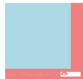
}3)效果图如下:
①未添加方法时的效果图:
②添加了多种方法时的效果图:
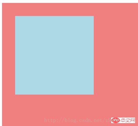
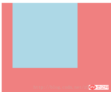
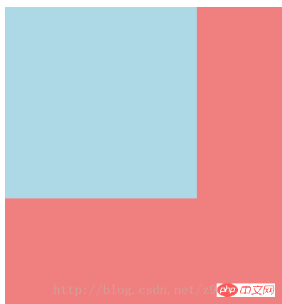
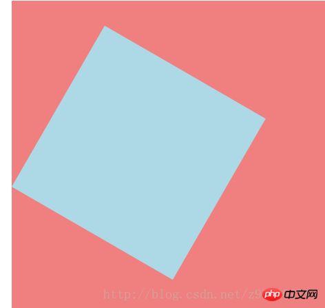
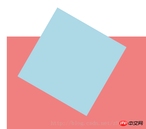
7、改变元素基点transform-origin:
(1)可能的值:
| top left | top | right top |
| left | center | right |
| bottom left | bottom | bottom right |
(2)默认情况下transform属性变化的基点是center,但是可以通过transform-origin改变transform属性变化的基点;
(3)改变元素基点transform-origin的应用:
1)HTML代码:
<p class="main">
    <p class="p"></p>
</p>
2)CSS代码:
.main{
width: 100%;
height: 500px;
background-color: lightcoral;
margin-left: 140px;
margin-top: 180px;
}
.p{
width: 300px;
height: 300px;
background-color: lightblue;
-ms-transform:rotate(30deg);/*IE9*/
-moz-transform:rotate(30deg);/*Firefox*/
-webkit-transform:rotate(30deg);/*Safari和chrome*/
-o-transform:rotate(30deg);/*Opera*/
transform-origin: center;
/*transform-origin: top;*/
/*transform-origin: top left;*/
/*transform-origin: right top;*/
/*transform-origin: left;*/
/*transform-origin: right;*/
/*transform-origin: bottom left;*/
/*transform-origin: bottom;*/
/*transform-origin: bottom right;*/
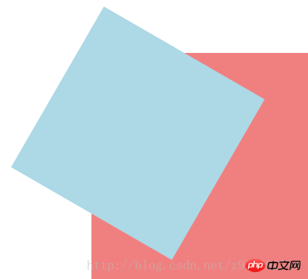
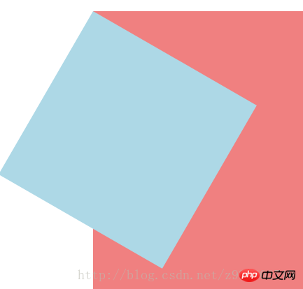
}3)效果图如下:
①未添加变形功能的效果图:
②添加旋转功能的效果图:

③以center为基点旋转的效果图:
④以top为基点旋转的效果图:
⑤以top left为基点旋转的效果图:
⑥以right top为基点旋转的效果图:

⑦以left为基点旋转的效果图:

⑧以right为基点旋转的效果图:

⑨以bottom left为基点旋转的效果图:
⑩以bottom为基点旋转的效果图:

⑪以bottom right为基点旋转的效果图:
相关推荐:
全面对比CSS3与动画有关的属性transition、animation、transform
The above is the detailed content of transform function in CSS3. For more information, please follow other related articles on the PHP Chinese website!