

 Web Front-endJS TutorialA brief introduction to responsive layout design for jQuery mobile web development_jquery
A brief introduction to responsive layout design for jQuery mobile web development_jquery

Responsive layout design is a design that responds to the user device according to the screen resolution of the user device. This means that whether a user is browsing a web page on a mobile, tablet, or desktop device, the design will respond appropriately to the device by displaying a specific layout based on that device's screen resolution.
The framework’s documentation actually uses a combination of the jQuery Mobile framework and CSS3 media queries to implement its own responsive design. How it reacts to different screen resolutions.
Without custom styles, our grid will be a 3-column layout across all screen widths:

In our custom style, we want this grid to overlay the narrow width and then switch to a standard 3-column layout. At very wide screen widths, we want the first column to take up 50% of the width, like this:

In order to achieve this, we need to customize a new class name, such as "my-breakpoint".
This class is used for scoped styles in custom media queries, they will only be applied when this class is added to a grid container. For media query packages we only want 50em styles applying the following conditions.
In your media queries, use EM units instead of pixels to ensure that the media query takes the font size into account in addition to the screen width. To calculate the EMS screen width, add 16 pixels to the target width, which is the default font size for body.
HTML5 part:
<div class="ui-grid-b my-breakpoint">
 <div class="ui-block-a">Block A</div>
 <div class="ui-block-b">Block B</div>
 <div class="ui-block-c">Block C</div>
</div><!-- /grid-b -->
CSS3 part:
@media all and (max-width: 50em) {
 .my-breakpoint .ui-block-a,
 .my-breakpoint .ui-block-b,
 .my-breakpoint .ui-block-c,
 .my-breakpoint .ui-block-d,
 .my-breakpoint .ui-block-e {
  width: 100%;
  float:none;
 }
}
In this media query, we set the width to 100% and negate the float attribute to 50em screen width. These rules apply to every grid type by stacking selector grids of all classes ui-block-a through ui-block-e styles.
That's making the grid responsive and adding additional styling rules to make each breakpoint change easier. We encourage you to create as many custom breakpoints as you need based on your unique content and layout needs.
Add a widescreen breakpoint to adjust the ratio
Based on the example above, we can add an additional breakpoint to set the width so that the first column is 50% wide and the other two 25% above 75em (1200 pixels) by additional min-width media queries to adjust the width Just like this in custom style:
@media all and (min-width: 75em) {
 .my-breakpoint.ui-grid-b .ui-block-a { width: 49.95%; }
 .my-breakpoint.ui-grid-b .ui-block-b,
 .my-breakpoint.ui-grid-b .ui-block-c { width: 24.925%; }
 .my-breakpoint.ui-grid-b .ui-block-a { clear: left; }
 }
}
NOTE: A slightly narrower width setting is required to work on rounding issues across platforms.
Apply custom breakpoint ui-responsive
Using this default breakpoint, add the ui-responsive class to the grid container, which will render the stack below 560px (35em). If this breakpoint doesn't work for your content, we encourage you to write a custom breakpoint as described above.
<div class=" ui-grid-b ui-responsive ">
These are standard grids that are responsive class grid containers made by ui-responsive (interface response, custom class, my-breakpoint in the example above)
Example:
<!doctype html>
<html lang="en">
<head>
<meta charset="utf-8">
<meta name="viewport" content="width=device-width, initial-scale=1">
<title>responsive-grid demo</title>
<link rel="stylesheet" href="http://code.jquery.com/mobile/1.3.0/jquery.mobile-1.3.0.min.css">
<script src="http://code.jquery.com/jquery-1.9.1.min.js"></script>
<!-- The script below can be omitted -->
<script src="/resources/turnOffPushState.js"></script>
<script src="http://code.jquery.com/mobile/1.3.0/jquery.mobile-1.3.0.min.js"></script>
<style>
@media all and (max-width: 35em) {
.my-breakpoint .ui-block-a,
.my-breakpoint .ui-block-b,
.my-breakpoint .ui-block-c,
.my-breakpoint .ui-block-d,
.my-breakpoint .ui-block-e {
width: 100%;
float:none;
}
}
@media all and (min-width: 45em) {
.my-breakpoint.ui-grid-b .ui-block-a { width: 49.95%; }
.my-breakpoint.ui-grid-b .ui-block-b,
.my-breakpoint.ui-grid-b .ui-block-c { width: 24.925%; }
}
</style>
</head>
<body>
<div data-role="page">
<div data-role="header">
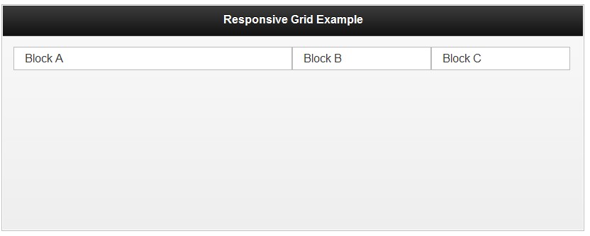
<h1 id="Responsive-Grid-Example">Responsive Grid Example</h1>
</div>
<div data-role="content">
<div class="ui-grid-b my-breakpoint">
<div class="ui-block-a"><div class="ui-body ui-body-d">Block A</div></div>
<div class="ui-block-b"><div class="ui-body ui-body-d">Block B</div></div>
<div class="ui-block-c"><div class="ui-body ui-body-d">Block C</div></div>
</div>
</div>
</body>
</html>

 JavaScript and the Web: Core Functionality and Use CasesApr 18, 2025 am 12:19 AM
The main uses of JavaScript in web development include client interaction, form verification and asynchronous communication. 1) Dynamic content update and user interaction through DOM operations; 2) Client verification is carried out before the user submits data to improve the user experience; 3) Refreshless communication with the server is achieved through AJAX technology.
 Understanding the JavaScript Engine: Implementation DetailsApr 17, 2025 am 12:05 AM
Understanding how JavaScript engine works internally is important to developers because it helps write more efficient code and understand performance bottlenecks and optimization strategies. 1) The engine's workflow includes three stages: parsing, compiling and execution; 2) During the execution process, the engine will perform dynamic optimization, such as inline cache and hidden classes; 3) Best practices include avoiding global variables, optimizing loops, using const and lets, and avoiding excessive use of closures.
 Python vs. JavaScript: The Learning Curve and Ease of UseApr 16, 2025 am 12:12 AM
Python is more suitable for beginners, with a smooth learning curve and concise syntax; JavaScript is suitable for front-end development, with a steep learning curve and flexible syntax. 1. Python syntax is intuitive and suitable for data science and back-end development. 2. JavaScript is flexible and widely used in front-end and server-side programming.
 Python vs. JavaScript: Community, Libraries, and ResourcesApr 15, 2025 am 12:16 AM
Python and JavaScript have their own advantages and disadvantages in terms of community, libraries and resources. 1) The Python community is friendly and suitable for beginners, but the front-end development resources are not as rich as JavaScript. 2) Python is powerful in data science and machine learning libraries, while JavaScript is better in front-end development libraries and frameworks. 3) Both have rich learning resources, but Python is suitable for starting with official documents, while JavaScript is better with MDNWebDocs. The choice should be based on project needs and personal interests.
 From C/C to JavaScript: How It All WorksApr 14, 2025 am 12:05 AM
The shift from C/C to JavaScript requires adapting to dynamic typing, garbage collection and asynchronous programming. 1) C/C is a statically typed language that requires manual memory management, while JavaScript is dynamically typed and garbage collection is automatically processed. 2) C/C needs to be compiled into machine code, while JavaScript is an interpreted language. 3) JavaScript introduces concepts such as closures, prototype chains and Promise, which enhances flexibility and asynchronous programming capabilities.
 JavaScript Engines: Comparing ImplementationsApr 13, 2025 am 12:05 AM
Different JavaScript engines have different effects when parsing and executing JavaScript code, because the implementation principles and optimization strategies of each engine differ. 1. Lexical analysis: convert source code into lexical unit. 2. Grammar analysis: Generate an abstract syntax tree. 3. Optimization and compilation: Generate machine code through the JIT compiler. 4. Execute: Run the machine code. V8 engine optimizes through instant compilation and hidden class, SpiderMonkey uses a type inference system, resulting in different performance performance on the same code.
 Beyond the Browser: JavaScript in the Real WorldApr 12, 2025 am 12:06 AM
JavaScript's applications in the real world include server-side programming, mobile application development and Internet of Things control: 1. Server-side programming is realized through Node.js, suitable for high concurrent request processing. 2. Mobile application development is carried out through ReactNative and supports cross-platform deployment. 3. Used for IoT device control through Johnny-Five library, suitable for hardware interaction.
 Building a Multi-Tenant SaaS Application with Next.js (Backend Integration)Apr 11, 2025 am 08:23 AM
I built a functional multi-tenant SaaS application (an EdTech app) with your everyday tech tool and you can do the same. First, what’s a multi-tenant SaaS application? Multi-tenant SaaS applications let you serve multiple customers from a sing


Hot AI Tools

Undresser.AI Undress
AI-powered app for creating realistic nude photos

AI Clothes Remover
Online AI tool for removing clothes from photos.

Undress AI Tool
Undress images for free

Clothoff.io
AI clothes remover

AI Hentai Generator
Generate AI Hentai for free.

Hot Article
Hot Tools

Notepad++7.3.1
Easy-to-use and free code editor

ZendStudio 13.5.1 Mac
Powerful PHP integrated development environment

VSCode Windows 64-bit Download
A free and powerful IDE editor launched by Microsoft

MantisBT
Mantis is an easy-to-deploy web-based defect tracking tool designed to aid in product defect tracking. It requires PHP, MySQL and a web server. Check out our demo and hosting services.

SecLists
SecLists is the ultimate security tester's companion. It is a collection of various types of lists that are frequently used during security assessments, all in one place. SecLists helps make security testing more efficient and productive by conveniently providing all the lists a security tester might need. List types include usernames, passwords, URLs, fuzzing payloads, sensitive data patterns, web shells, and more. The tester can simply pull this repository onto a new test machine and he will have access to every type of list he needs.

