
 Web Front-endCSS TutorialThe height is known and the left and right widths are fixed. 5 ways to implement a three-column layout
The height is known and the left and right widths are fixed. 5 ways to implement a three-column layout
As the saying goes, a good memory is not as good as a bad writing. The same is true for writing code. If you don’t write down something you have read, it will not stay in your mind for long. So after working for so long, I slowly uploaded the previously recorded knowledge, firstly for sharing, and secondly for a better summary! Okay, without further ado, let’s get to the point.
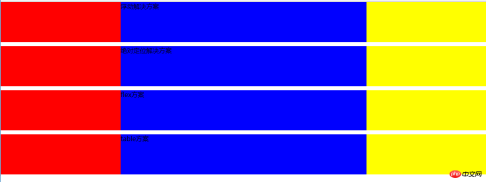
First method: float
<style>
    *{
        padding:0;
        margin:0;
    }
    .big div{
        height:100px;
    }
    .big .left{
        width:300px;
        float:left;
        background:red;
    }
    .big .right{
        width:300px;
        float:right;
        background:yellow;
    }
    .big .center{
        background:blue;
    }
</style>
<body>
<div class="big">
    <div class="left">

    </div>
    <div class="right">

    </div>
    <div class="center">
        浮动解决方案
    </div>
</div>
The first solution is basically It’s not difficult at all, and you should use it a lot every day!
The second method: absolute positioning
<span style="color: #008080"> <style><br/> .position{<br/> margin-top:10px;<br/> }<br/> .position>div{<br/> position:absolute;<br/> height:100px;<br/> }<br/> .position .left{<br/> left:0;<br/> width:300px;<br/> background:red;<br/> }<br/> .position .right{<br/> right:0;<br/> width:300px;<br/> background:yellow;<br/> }<br/> .position .center{<br/> left:300px;<br/> right:300px;<br/> background:blue;<br/> }<br/></style><br/><body><br/><div class="position"><br/> <div class="left"><br/> <br/> </div><br/> <div class="right"><br/> <br/> </div><br/> <div class="center"><br/> 绝对定位方案2<br/> </div><br/></div><br/></body></span><span style="color: #0000ff"></span>
The second method is also easy to achieve the effect.
The third method: flexbox
<style>
 .flex{
        margin-top:120px;
        display:flex;
    }
    .flex>p{
        height:100px;
    }
    .flex .left{
        width:300px;
        background:red;
    }
    .flex .center{
        flex:1;
        background:blue;
    }
    .flex .right{
        width:300px;
        background:yellow;
    }</style><body><p class="flex">
    <p class="left">

    </p>
    <p class="center">
        flex方案    </p>
    <p class="right">

    </p></p></body>
## The fourth method: table layout
<span style="color: #0000ff"><</span><span style="color: #800000">style</span><span style="color: #0000ff">></span><span style="background-color: #f5f5f5; color: #800000">.table</span><span style="background-color: #f5f5f5; color: #000000">{</span><span style="background-color: #f5f5f5; color: #ff0000">
        margin-top</span><span style="background-color: #f5f5f5; color: #000000">:</span><span style="background-color: #f5f5f5; color: #0000ff">10px</span><span style="background-color: #f5f5f5; color: #000000">;</span><span style="background-color: #f5f5f5; color: #ff0000">
        width</span><span style="background-color: #f5f5f5; color: #000000">:</span><span style="background-color: #f5f5f5; color: #0000ff">100%</span><span style="background-color: #f5f5f5; color: #000000">;</span><span style="background-color: #f5f5f5; color: #ff0000">
        display</span><span style="background-color: #f5f5f5; color: #000000">:</span><span style="background-color: #f5f5f5; color: #0000ff">table</span><span style="background-color: #f5f5f5; color: #000000">;</span><span style="background-color: #f5f5f5; color: #ff0000">
        height</span><span style="background-color: #f5f5f5; color: #000000">:</span><span style="background-color: #f5f5f5; color: #0000ff">100px</span><span style="background-color: #f5f5f5; color: #000000">;</span>
    <span style="background-color: #f5f5f5; color: #000000">}</span><span style="background-color: #f5f5f5; color: #800000">
    .table>p</span><span style="background-color: #f5f5f5; color: #000000">{</span><span style="background-color: #f5f5f5; color: #ff0000">
        display</span><span style="background-color: #f5f5f5; color: #000000">:</span><span style="background-color: #f5f5f5; color: #0000ff">table-cell</span><span style="background-color: #f5f5f5; color: #000000">;</span>
    <span style="background-color: #f5f5f5; color: #000000">}</span><span style="background-color: #f5f5f5; color: #800000">
     .table .left</span><span style="background-color: #f5f5f5; color: #000000">{</span><span style="background-color: #f5f5f5; color: #ff0000">
        width</span><span style="background-color: #f5f5f5; color: #000000">:</span><span style="background-color: #f5f5f5; color: #0000ff">300px</span><span style="background-color: #f5f5f5; color: #000000">;</span><span style="background-color: #f5f5f5; color: #ff0000">
        background</span><span style="background-color: #f5f5f5; color: #000000">:</span><span style="background-color: #f5f5f5; color: #0000ff">red</span><span style="background-color: #f5f5f5; color: #000000">;</span>
    <span style="background-color: #f5f5f5; color: #000000">}</span><span style="background-color: #f5f5f5; color: #800000">
    .table .center</span><span style="background-color: #f5f5f5; color: #000000">{</span><span style="background-color: #f5f5f5; color: #ff0000">
        background</span><span style="background-color: #f5f5f5; color: #000000">:</span><span style="background-color: #f5f5f5; color: #0000ff">blue</span><span style="background-color: #f5f5f5; color: #000000">;</span>
    <span style="background-color: #f5f5f5; color: #000000">}</span><span style="background-color: #f5f5f5; color: #800000">
    .table .right</span><span style="background-color: #f5f5f5; color: #000000">{</span><span style="background-color: #f5f5f5; color: #ff0000">
        width</span><span style="background-color: #f5f5f5; color: #000000">:</span><span style="background-color: #f5f5f5; color: #0000ff">300px</span><span style="background-color: #f5f5f5; color: #000000">;</span><span style="background-color: #f5f5f5; color: #ff0000">
        background</span><span style="background-color: #f5f5f5; color: #000000">:</span><span style="background-color: #f5f5f5; color: #0000ff">yellow</span><span style="background-color: #f5f5f5; color: #000000">;</span>
    <span style="background-color: #f5f5f5; color: #000000">}</span><span style="color: #0000ff"></</span><span style="color: #800000">style</span><span style="color: #0000ff">></span><br/><br/><span style="color: #0000ff"><</span><span style="color: #800000">body</span><span style="color: #0000ff">></span><span style="color: #0000ff"><</span><span style="color: #800000">p </span><span style="color: #ff0000">class</span><span style="color: #0000ff">="table"</span><span style="color: #0000ff">></span>
    <span style="color: #0000ff"><</span><span style="color: #800000">p </span><span style="color: #ff0000">class</span><span style="color: #0000ff">="left"</span><span style="color: #0000ff">></span>

    <span style="color: #0000ff"></</span><span style="color: #800000">p</span><span style="color: #0000ff">></span>
    <span style="color: #0000ff"><</span><span style="color: #800000">p </span><span style="color: #ff0000">class</span><span style="color: #0000ff">="center"</span><span style="color: #0000ff">></span><span style="color: #000000">
        table方案    </span><span style="color: #0000ff"></</span><span style="color: #800000">p</span><span style="color: #0000ff">></span>
    <span style="color: #0000ff"><</span><span style="color: #800000">p </span><span style="color: #ff0000">class</span><span style="color: #0000ff">="right"</span><span style="color: #0000ff">></span>

    <span style="color: #0000ff"></</span><span style="color: #800000">p</span><span style="color: #0000ff">></span><span style="color: #0000ff"></</span><span style="color: #800000">p</span><span style="color: #0000ff">></span><span style="color: #0000ff"></</span><span style="color: #800000">body</span><span style="color: #0000ff">></span>
The fifth method: grid layout grid
<style>
  .grid{
        margin-top:10px;
        display:grid;
        width:100%;
        grid-template-rows:100px;
        grid-template-columns: 300px auto 300px;
    }
    .grid .left{
        background:red;
    }
    .grid .center{
        background:blue;
    }
    .grid .right{
        background:yellow;
    }</style><body><p class="grid">
    <p class="left">

    </p>
    <p class="center">
        grid方案    </p>
    <p class="right">

    </p></p></body>
 ##The grid layout method is also implemented, CSS3 grid layout It is somewhat similar to bootstrap's grid layout, which uses a grid to divide the blocks occupied by elements.
The question is not over, we continue to discuss. Which of the five solutions is better? The author has always believed that technology is not good or bad, it all depends on where you use it.
Personally think the advantages and disadvantages of the five methods:
1. Floating: good compatibility. If there are clear requirements for compatibility, floating should meet the needs, but you must deal with the surrounding environment. The relationship between elements, because if you don’t pay attention to floating, it may cause problems such as confusing page layout. However, there are many ways to solve the side effects caused by floating, which we will not discuss here.
2. Absolute positioning: simple and direct, but it will cause the parent element to break away from the normal document flow and the child elements will also break away.
3.flex: It seems to be perfect at present, but now there are more or less compatibility issues with slightly more perfect technologies. The same style is not supported by IE8! (IE!)
4. Table layout: Although there is no big problem with the table layout, it will be very cumbersome when we want to refine the structure. At the same time, the height of the three cells in the table layout will be the same. Changes are also not conducive to our layout.
5. Grid layout: The code is beautiful and concise, but it still has compatibility issues. But the future is bright!
The above is the detailed content of The height is known and the left and right widths are fixed. 5 ways to implement a three-column layout. For more information, please follow other related articles on the PHP Chinese website!

 What is CSS Grid?Apr 30, 2025 pm 03:21 PM
CSS Grid is a powerful tool for creating complex, responsive web layouts. It simplifies design, improves accessibility, and offers more control than older methods.
 What is CSS flexbox?Apr 30, 2025 pm 03:20 PM
Article discusses CSS Flexbox, a layout method for efficient alignment and distribution of space in responsive designs. It explains Flexbox usage, compares it with CSS Grid, and details browser support.
 How can we make our website responsive using CSS?Apr 30, 2025 pm 03:19 PM
The article discusses techniques for creating responsive websites using CSS, including viewport meta tags, flexible grids, fluid media, media queries, and relative units. It also covers using CSS Grid and Flexbox together and recommends CSS framework
 What does the CSS box-sizing property do?Apr 30, 2025 pm 03:18 PM
The article discusses the CSS box-sizing property, which controls how element dimensions are calculated. It explains values like content-box, border-box, and padding-box, and their impact on layout design and form alignment.
 How can we animate using CSS?Apr 30, 2025 pm 03:17 PM
Article discusses creating animations using CSS, key properties, and combining with JavaScript. Main issue is browser compatibility.
 Can we add 3D transformations to our project using CSS?Apr 30, 2025 pm 03:16 PM
Article discusses using CSS for 3D transformations, key properties, browser compatibility, and performance considerations for web projects.(Character count: 159)
 How can we add gradients in CSS?Apr 30, 2025 pm 03:15 PM
The article discusses using CSS gradients (linear, radial, repeating) to enhance website visuals, adding depth, focus, and modern aesthetics.
 What are pseudo-elements in CSS?Apr 30, 2025 pm 03:14 PM
Article discusses pseudo-elements in CSS, their use in enhancing HTML styling, and differences from pseudo-classes. Provides practical examples.


Hot AI Tools

Undresser.AI Undress
AI-powered app for creating realistic nude photos

AI Clothes Remover
Online AI tool for removing clothes from photos.

Undress AI Tool
Undress images for free

Clothoff.io
AI clothes remover

Video Face Swap
Swap faces in any video effortlessly with our completely free AI face swap tool!

Hot Article
Hot Tools

ZendStudio 13.5.1 Mac
Powerful PHP integrated development environment

MantisBT
Mantis is an easy-to-deploy web-based defect tracking tool designed to aid in product defect tracking. It requires PHP, MySQL and a web server. Check out our demo and hosting services.

SecLists
SecLists is the ultimate security tester's companion. It is a collection of various types of lists that are frequently used during security assessments, all in one place. SecLists helps make security testing more efficient and productive by conveniently providing all the lists a security tester might need. List types include usernames, passwords, URLs, fuzzing payloads, sensitive data patterns, web shells, and more. The tester can simply pull this repository onto a new test machine and he will have access to every type of list he needs.

Notepad++7.3.1
Easy-to-use and free code editor

DVWA
Damn Vulnerable Web App (DVWA) is a PHP/MySQL web application that is very vulnerable. Its main goals are to be an aid for security professionals to test their skills and tools in a legal environment, to help web developers better understand the process of securing web applications, and to help teachers/students teach/learn in a classroom environment Web application security. The goal of DVWA is to practice some of the most common web vulnerabilities through a simple and straightforward interface, with varying degrees of difficulty. Please note that this software

