
 Backend DevelopmentPython TutorialDetailed explanation of Python data visualization tool Matplotlib
The following editor will bring you an article based on the Python data visualization tool Matplotlib, an introduction to drawing, and a detailed explanation of Pyplot. The editor thinks it is quite good, so I will share it with you now and give it as a reference for everyone. Let’s follow the editor and take a look.
Pyplot
matplotlib.pyplot is a collection of imperative functions, which allows us to use MATLAB like Use matplotlib as well. Each function in pyplot will make corresponding changes to the canvas image, such as creating a canvas, creating a drawing area in the canvas, drawing several lines on the drawing area, adding text descriptions to the image, etc. Below we will appreciate its charm through example code.
import matplotlib.pyplot as plt
plt.plot([1,2,3,4])
plt.ylabel('some numbers')
plt.show()

The above picture is drawn by the line of code plt.plot([1,2,3,4]) Image, at this time some friends may have a question, "Why is the coordinate range of the X-axis 0-3, and the coordinate range of the Y-axis is 1-4?"
This is because , when we use the plot() command function, if we only pass a value list or array as a parameter to the function, matplotlib will treat this value list as the value of the Y-axis, and then automatically generate it based on the number N of values on the Y-axis. A list of values [0,N-1] as the X-axis value. So the Y-axis value in the above picture is the list we gave [1,2,3,4], and the X-axis value is the automatically generated list [0,1,2,3].
Some friends who see this may think that this is too weak. Don't worry, let's learn step by step. The above picture is just a very simple example. In fact, the plot() command is very powerful. Through this command, we can pass multiple image parameters at the same time. For example, if we want to give the values of the X-axis and Y-axis at the same time, we can achieve it through the following line of code:
##
plt.plot([1, 2, 3, 4], [1, 4, 9, 16]) #X:[1, 2, 3, 4],Y:[1, 4, 9, 16]In addition, we can also use MATLAB like MATLAB After each set of X-axis and Y-axis values, a string parameter in the form of "color + line type" is passed. This parameter can set the color and type of the line in our image. The default parameter is 'b-', which means Solid blue line. The color characters supported by the
command are:
'b': blue'g': green
'r': red
'c': cyan
'm': magenta
'y': yellow
'k': black
'w': white
Command support Line characters:

import matplotlib.pyplot as plt
plt.plot([1,2,3,4], [1,4,9,16], 'ro')
plt.axis([0, 6, 0, 20])
plt.show()

import matplotlib.pyplot as plt
import numpy as np
t = np.arange(0., 5., 0.2)
plt.plot(t, t, 'r--', t, t**2, 'bs', t, t**3, 'g^')
plt.show()

The above is the detailed content of Detailed explanation of Python data visualization tool Matplotlib. For more information, please follow other related articles on the PHP Chinese website!

 pycharm如何安装MatplotlibDec 18, 2023 pm 04:32 PM
安装步骤:1、打开PyCharm集成开发环境;2、转到“File”菜单,然后选择“Settings”;3、在“Settings”对话框中,选择“Project: <your_project_name>”下的“Python Interpreter”;4、单击右上角的加号按钮“+”,在弹出的对话框中搜索“matplotlib”;5、选择“matplotlib”安装即可。
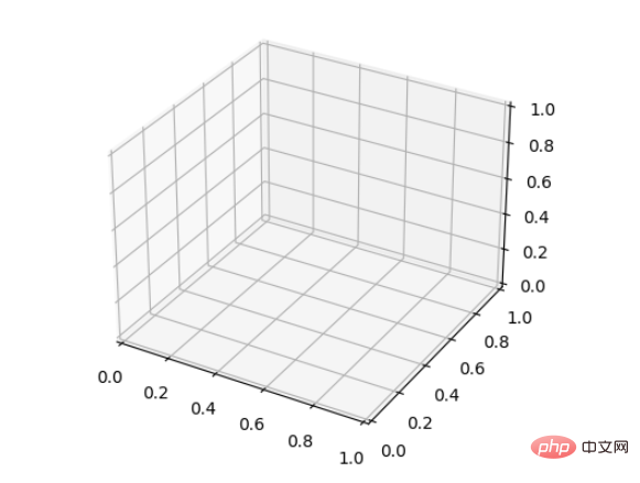 如何使用Python和Matplotlib创建三维折线图Apr 22, 2023 pm 01:19 PM
1.0简介三维图像技术是现在国际最先进的计算机展示技术之一,任何普通电脑只需要安装一个插件,就可以在网络浏览器中呈现三维的产品,不但逼真,而且可以动态展示产品的组合过程,特别适合远程浏览。立体图视觉上层次分明色彩鲜艳,具有很强的视觉冲击力,让观看的人驻景时间长,留下深刻的印象。立体图给人以真实、栩栩如生,人物呼之欲出,有身临其境的感觉,有很高的艺术欣赏价值。2.0三维图画法与类型首先要安装Matplotlib库可以使用pip:pipinstallmatplotlib假设已经安装了matplotl
 深入研究matplotlib的色彩映射表Jan 09, 2024 pm 03:51 PM
深入学习matplotlib颜色表,需要具体代码示例一、引言matplotlib是一个功能强大的Python绘图库,它提供了丰富的绘图函数和工具,可以用于创建各种类型的图表。而颜色表(colormap)是matplotlib中一个重要的概念,它决定了图表的配色方案。深入学习matplotlib颜色表,将帮助我们更好地掌握matplotlib的绘图功能,使绘
 详细讲解Python之Seaborn(数据可视化)Apr 21, 2022 pm 06:08 PM
本篇文章给大家带来了关于Python的相关知识,其中主要介绍了关于Seaborn的相关问题,包括了数据可视化处理的散点图、折线图、条形图等等内容,下面一起来看一下,希望对大家有帮助。
 Python中Matplotlib图像怎么添加标签May 12, 2023 pm 12:52 PM
一、添加文本标签plt.text()用于在绘图过程中,在图像上指定坐标的位置添加文本。需要用到的是plt.text()方法。其主要的参数有三个:plt.text(x,y,s)其中x、y表示传入点的x和y轴坐标。s表示字符串。需要注意的是,这里的坐标,如果设定有xticks、yticks标签,则指的不是标签,而是绘图时x、轴的原始值。因为参数过多,不再一一解释,根据代码学习其用法。ha='center’表示垂直对齐方式居中,fontsize=30表示字体大小为3
 如何安装matplotlibDec 20, 2023 pm 05:54 PM
安装教程:1、打开命令行窗口,确保已经安装了Python和pip;2、输入“pip install matplotlib”命令安装matplotlib;3、等待安装完成后,通过import matplotlib.pyplot as plt代码验证matplotlib是否成功安装,若没有报错,说明matplotlib已经成功安装。
 matplotlib显示中文的方法有哪些Nov 22, 2023 pm 05:34 PM
显示中文的方法有安装中文字体、配置字体路径、使用中文字符等。详细介绍:1、安装中文字体:首先,您需要安装支持中文字符的字体文件。常用的中文字体有SimHei、SimSun、Microsoft YaHei等;2、配置字体路径:在代码中,需要指定字体文件的路径;3、使用中文字符:在代码中,直接使用中文字符即可。
 分享10款高效的VSCode插件,总有一款能够惊艳到你!!Mar 09, 2021 am 10:15 AM
VS Code的确是一款非常热门、有强大用户基础的一款开发工具。本文给大家介绍一下10款高效、好用的插件,能够让原本单薄的VS Code如虎添翼,开发效率顿时提升到一个新的阶段。


Hot AI Tools

Undresser.AI Undress
AI-powered app for creating realistic nude photos

AI Clothes Remover
Online AI tool for removing clothes from photos.

Undress AI Tool
Undress images for free

Clothoff.io
AI clothes remover

AI Hentai Generator
Generate AI Hentai for free.

Hot Article
Hot Tools

SublimeText3 Chinese version
Chinese version, very easy to use

SublimeText3 English version
Recommended: Win version, supports code prompts!

MantisBT
Mantis is an easy-to-deploy web-based defect tracking tool designed to aid in product defect tracking. It requires PHP, MySQL and a web server. Check out our demo and hosting services.

Dreamweaver CS6
Visual web development tools

WebStorm Mac version
Useful JavaScript development tools

