In recent years, with the development of responsive layout, once developed and used multiple times, there is an increasing demand for responsive websites that adapt to the screen. But how to make the website adapt to the screen? Here we need to mention a new technology in CSS3 - media media queryer.
So what is a media media queryer?
Media media query is a new technology in CSS3 that can detect the screen resolution of the terminal that opens the website.
The usage method of Media Media Queryer is roughly as follows:
1. Set a meta tag such as:
<meta name="viewport"content="width=device-width, initial-scale=1.0, maximum-scale=1.0, user-scalable=no">
Explanation of related parameters:
device-width:Define the visible width of the screen of the output device.
device-height:Define the visible height of the screen of the output device.
Width = device-width:The width is equal to the width of the current device.
initial-scale:Initial scaling ratio (default setting is 1.0).
Minimum-scale:The minimum ratio that the user is allowed to zoom to (default is 1.0).
Maximum-scale:The maximum ratio that the user is allowed to zoom to (default setting is 1.0).
User-scalable: Whether the user can manually zoom (the default setting is no, because we do not want users to zoom in and out of the page).
2. Load compatible file js
Why load compatible file js?
Because the core of IE8 or above is not compatible with html5 and CSS3 media. Therefore, two compatible files need to be loaded so that our code can be implemented.
1 <!--[if lt IE 9]>
2 <script src="
3      <script src="
4 <![endif]-->
You can also download html5hiv.js and respond by yourself. When using js, you only need to modify the src path in the corresponding script.
3. Adjust IE's rendering mode to the highest level. Most IE is version 9 or above. The document mode of this version of IE is not the latest, or many friends have not paid attention to this. Therefore, you can use the following code to keep the document mode of IE up to date. :
1 <meta http-equiv="X-UA-Compatible" content="IE=edge">
Second method:
1 <meta http-equiv="X-UA-Compatible" content="IE=Edge,chrome=1">
Install a Google chrome frame, a Google chrome plug-in. This allows all browsers to use the Webkit engine and the V8 engine for typesetting and calculation. If this plug-in is not installed, the above code will make the browser the highest document The pattern shows the effect.
Standard writing method of CSS3 media:
For example: when the page is smaller than 960px, execute the CSS code below it.
1 @media screen and (max-width: 960px){
3     body{
5         background: #000;
7      }
9 }
There is a screen in this code, which means to tell the device to use serif fonts when printing pages.
CSS2 Media Usage
In fact, it is not only CSS3 that supports the usage of Media. Media has been supported as early as CSS2. The specific usage is to insert the following paragraph into the head tag of the HTML page. Code:
1 <link rel="stylesheet" type="text/css" media="screen" href="style.css">
If you want to know whether the current mobile device has a portrait display, you can write like this:
1 <link rel="stylesheet" type="text/css" media="screen and (orientation:portrait)" href="style.css">
The first paragraph of code is also implemented using CSS2, so that it can be used as well. If the page width is less than 960, execute the specified style file:
1 <link rel="stylesheet" type="text/css" media="screen and (max-width:960px)" href="style.css">
However, this method will increase the number of http visits. So it is best to use CSS3 to write all the CSS together.
Ok, now let’s go back to the media usage of CSS3. We talked about how to use CSS3 to write the size of the screen width less than 960px. Now let’s write the method of equal to 960px:
1 @media screen and (max-width-device:960px){
2
3 Body{
4
5        Background:blue;
6
7
}
8
9 }
Writing methods with a width greater than 960px:
1 @media screen and(min-width:960px){
2
        Body{
        4
        5               Background:red;
        6
        7
        }
        8
        9
        }
The previous ones are several commonly used writing methods. Next, we will make a summary of CSS3 media:
width: Browser visible width.
height: Browser visible height.
device-width: The width of the device screen.
device-height:The height of the device screen.
orientation: Detect whether the device is currently in landscape or portrait orientation.
aspect-ratio: Detect the ratio of the browser's visible width and height. (For example: aspect-ratio:16/9)
device-aspect-ratio: Detect the ratio of the width and height of the device.
color: Number of digits to detect color. (For example: min-color:32 will detect whether the device has 32-bit color)
color-index: Check the color in the device color index table. Its value cannot be a negative number.
monochrome: Detect the number of bits per pixel in the monochrome frame buffer area. (This is too advanced, I guess we will rarely use it)
resolution: Detect the resolution of the screen or printer. (For example: min-resolution:300dpi or min-resolution:118dpcm).
grid: Detect whether the output device is a grid or bitmap device.
Finally, here is an interesting demo ending:
1 <!DOCTYPE html>
2 <html lang="en">
3 <head>
4 <meta charset="utf-8" />
5 <title>CSS3 media Test</title>
6 <meta name="author" content="LostWeapon" />
7 <style>
8 *{
9 text-align: center;
10 font-size: 20px;
11 }
12 p{
13 font-size: 14px;
14 }
15 @media screen and (min-resolution: 75.5dpcm) {
16 .normal{display:none;}
17 }
18 @media screen and (min-resolution: 28.3dpcm) and (max-resolution: 75.4dpcm) {
19 .retina{display:none;}
20 }
21 </style>
22 </head>
23 <body>
24 <p class="retina">视网膜屏</br>哎呦 不错哦,小伙子有前途!</p>
25 <p class="normal">普通屏</br>还不快去努力学习挣钱换电脑!</br><strong>看什么看,说的就是你!</strong></p>
26 </body>
27 <footer>
28 <p>
29 Copyright ©2017 墨雨溪风
30 </p>
31 </footer>
32 </html>The above is the detailed content of Detailed explanation of the use of media media query in CSS3. For more information, please follow other related articles on the PHP Chinese website!
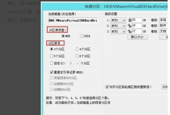 联想电脑checking media开不了机如何解决?Feb 12, 2024 am 08:36 AM
有用户在启动联想笔记本时,出现checkingmedia无法启动的问题,让人不知所措,那么联想电脑checkingmedia开不了机如何解决?本期教程就为大家带来联想笔记本出现checkingmedia无法启动原因及解决办法。导致原因:1、硬盘损坏:若联想笔记本存在硬盘损坏、故障的问题,会导致笔记本显示checkingmedia且开不了机。操作系统损坏:若联想笔记本的操作系统损坏,会导致笔记本显示checkingmedia且开不了机。2、重新开机,按F12进入BIOS,在“启动”项
 css怎么隐藏元素但不占空间Jun 01, 2022 pm 07:15 PM
两种方法:1、利用display属性,只需给元素添加“display:none;”样式即可。2、利用position和top属性设置元素绝对定位来隐藏元素,只需给元素添加“position:absolute;top:-9999px;”样式。
 原来利用纯CSS也能实现文字轮播与图片轮播!Jun 10, 2022 pm 01:00 PM
怎么制作文字轮播与图片轮播?大家第一想到的是不是利用js,其实利用纯CSS也能实现文字轮播与图片轮播,下面来看看实现方法,希望对大家有所帮助!
 css3如何实现鼠标点击图片放大Apr 25, 2022 pm 04:52 PM
实现方法:1、使用“:active”选择器选中鼠标点击图片的状态;2、使用transform属性和scale()函数实现图片放大效果,语法“img:active {transform: scale(x轴放大倍数,y轴放大倍数);}”。
 css3什么是自适应布局Jun 02, 2022 pm 12:05 PM
自适应布局又称“响应式布局”,是指可以自动识别屏幕宽度、并做出相应调整的网页布局;这样的网页能够兼容多个不同的终端,而不是为每个终端做一个特定的版本。自适应布局是为解决移动端浏览网页而诞生的,能够为使用不同终端的用户提供很好的用户体验。
 css3动画效果有变形吗Apr 28, 2022 pm 02:20 PM
css3中的动画效果有变形;可以利用“animation:动画属性 @keyframes ..{..{transform:变形属性}}”实现变形动画效果,animation属性用于设置动画样式,transform属性用于设置变形样式。
 css3怎么设置动画旋转速度Apr 28, 2022 pm 04:32 PM
在css3中,可以利用“animation-timing-function”属性设置动画旋转速度,该属性用于指定动画将如何完成一个周期,设置动画的速度曲线,语法为“元素{animation-timing-function:速度属性值;}”。
 css3线性渐变可以实现三角形吗Apr 25, 2022 pm 02:47 PM
css3线性渐变可以实现三角形;只需创建一个45度的线性渐变,设置渐变色为两种固定颜色,一个是三角形的颜色,另一个为透明色即可,语法“linear-gradient(45deg,颜色值,颜色值 50%,透明色 50%,透明色 100%)”。


Hot AI Tools

Undresser.AI Undress
AI-powered app for creating realistic nude photos

AI Clothes Remover
Online AI tool for removing clothes from photos.

Undress AI Tool
Undress images for free

Clothoff.io
AI clothes remover

AI Hentai Generator
Generate AI Hentai for free.

Hot Article

Hot Tools

mPDF
mPDF is a PHP library that can generate PDF files from UTF-8 encoded HTML. The original author, Ian Back, wrote mPDF to output PDF files "on the fly" from his website and handle different languages. It is slower than original scripts like HTML2FPDF and produces larger files when using Unicode fonts, but supports CSS styles etc. and has a lot of enhancements. Supports almost all languages, including RTL (Arabic and Hebrew) and CJK (Chinese, Japanese and Korean). Supports nested block-level elements (such as P, DIV),

Dreamweaver CS6
Visual web development tools

SublimeText3 Mac version
God-level code editing software (SublimeText3)

SublimeText3 Linux new version
SublimeText3 Linux latest version

SublimeText3 English version
Recommended: Win version, supports code prompts!


