Home >Web Front-end >HTML Tutorial >Example explanation of flex layout
Example explanation of flex layout
- 零下一度Original
- 2017-07-23 13:21:062631browse
Flex layout can help us quickly lay out some blocks to achieve the effect you want, without having to worry about float, position, etc. When we lay out web pages, we often use special layouts, and flex can help us. Quickly go to layout without positioning.
Any box can be designated as flex layout, but please note that after setting to Flex layout, the float and clear of the child elements The and vertical-align properties will have no effect.
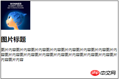
Let’s take a look at the examples we often encounter on our website: We want to center the pictures and text and attach them to the bottom layout. Past experience will be that the parent container sets text-align:center, but the vertical direction is very cumbersome. Yes,
Either the parent container sets padding-top,
or sets margin-top for the image;
or position it;
But pay attention :Although you can do it with this setting, if you change the picture and the size is inconsistent, haha, just cry; Container {
    display: flex;
    flex-direction:column;//让子元素纵向布局
    justify-content:flex-end;//子元素垂直方向布局,依次向下
    align-items: center;//让子元素水平方向居中
}
Similarly, if you center it vertically, you only need 
justify-content:center;垂直方向居中

如果是想要图片居顶部,文字居底部;justify-content: space-between;//两端对齐

justify-content有下面几个属性
 flex-start
- (default value):
-
flex-direction:column时候为上对齐
flex-direction:row为左对齐
flex-end : In the same way, column is aligned at the bottom and row is aligned to the right -
center : Centered -
space-between : Align both ends, with equal spacing between items. -
space-around : Each item is equally spaced on both sides. Therefore, the space between items is twice as large as the space between items and the border. It’s even simpler. If you are interested in flex, you can try it yourself;
 The following 6 properties are set on the container.
flex-directionflex-direction property
flex-wrap
flex-flow
justify-content
align-items
align-content
property determines the direction of the main axis (that is, the arrangement direction of items).
.box { flex-direction: row | row-reverse | column | column-reverse;}It may have 4 values.
row## column-reverse is vertical reverse order(default value): The main axis is horizontal and the starting point is at the left end.
- : The main axis is horizontal and the starting point is at the right end.
row-reverse
- : The main axis is vertical and the starting point is on the upper edge.
column
- : The main axis is vertical, and the starting point is at the lower edge.
column-reverse
- row-reverse is horizontal reverse order;
##row and column have been demonstrated above, that is, the order

flex-wrap Attribute definition, if one axis line cannot be arranged, how to wrap the line.
.box{ flex-wrap: nowrap | wrap | wrap-reverse;}
flex-flow
flex-flow properties are flex-direction properties and
The abbreviation of the attribute, the default value isrow nowrap
.
.box { flex-flow: <flex-direction> || <flex-wrap>;}align-items: In fact, it is similar to the justify-content attribute. If flex- is not specified, direction;
align-items is to change the position relationship in the vertical direction; justify-content is to change the position relationship in the horizontal direction
.box { align-items: flex-start | flex-end | center | baseline | stretch;}
It may take 5 values. The specific alignment is related to the direction of the cross axis. It is assumed below that the cross axis is from top to bottom.
flex-start: Align the starting point of the cross axis.
flex-end: The end point alignment of the cross axis.
- : Align the midpoint of the cross axis.
#center
- : The baseline alignment of the first line of text of the item.
baseline
stretch(默认值):如果项目未设置高度或设为auto,将占满整个容器的高度。
align-content属性
align-content属性定义了多根轴线的对齐方式。如果项目只有一根轴线,该属性不起作用。
align-content:center;就是让这三排盒子垂直方向居中

如果你设置为align-item:content;就没有让三个盒子一起垂直居中的效果了

.box { align-content: flex-start | flex-end | center | space-between | space-around | stretch;}
下面讲一点flex应用在子集元素上
flex-grow属性
flex-grow属性定义项目的放大比例,默认为0,即如果存在剩余空间,也不放大。
.item { flex-grow: <number>; /* default 0 */}
如果所有项目的flex-grow属性都为1,则它们将等分剩余空间(如果有的话)。如果一个项目的flex-grow属性为2,其他项目都为1,则前者占据的剩余空间将比其他项多一倍。
如果给所有子集都设置flex-grow:1;将会成右边图,平分宽度;同理也可以平分高度;


例如给第三个盒子设置flex-grow:2,效果如下,第三个盒子分的宽度为其他的2倍

flex-basis属性
flex-basis属性定义了在分配多余空间之前,项目占据的主轴空间(main size)。浏览器根据这个属性,计算主轴是否有多余空间。它的默认值为auto,即项目的本来大小。
.item { flex-basis: <length> | auto; /* default auto */}它可以设为跟width或height属性一样的值(比如350px),则项目将占据固定空间。
其实这个跟flex-grow差不多,区别就在于可以单独设置其中某一个盒子的占比(长度或者宽度)
给第三个盒子设置flex-basis:100px;
给第九个盒子设置flex-basis:200px


flex属性
flex属性是flex-grow, flex-shrink 和 flex-basis的简写,默认值为0 1 auto。后两个属性可选。
.item { flex: none | [ <'flex-grow'> <'flex-shrink'>? || <'flex-basis'> ]}该属性有两个快捷值:auto (1 1 auto) 和 none (0 0 auto)。
建议优先使用这个属性,而不是单独写三个分离的属性,因为浏览器会推算相关值。
align-self属性
align-self属性允许单个项目有与其他项目不一样的对齐方式,可覆盖align-items属性。默认值为auto,表示继承父元素的align-items属性,如果没有父元素,则等同于stretch。
.item { align-self: auto | flex-start | flex-end | center | baseline | stretch;}该属性可能取6个值,除了auto,其他都与align-items属性完全一致。
第三个盒子align-self:flex-end;
第五个盒子align-self;stretch;
第九个盒子align-self:flex-start;

The above is the detailed content of Example explanation of flex layout. For more information, please follow other related articles on the PHP Chinese website!

