
Home >Web Front-end >HTML Tutorial >Example tutorial of setting up Checkbox with pure CSS
Example tutorial of setting up Checkbox with pure CSS

- 零下一度Original
- 2017-07-18 13:31:041585browse
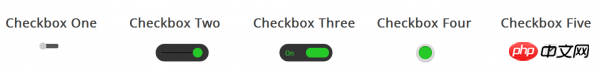
The following are five simple styles for setting the Checkbox checkbox control using pure CSS. If you are interested, you can change it to the style you want.
If you are interested in this article, you can leave a comment below.
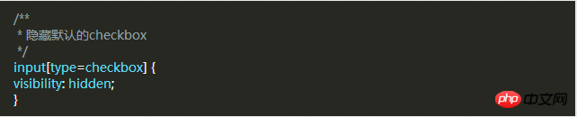
First, you need to add a piece of CSS to hide all Checkbox checkboxes. Next we will change its appearance. To do this you need to add a piece of code to your CSS file.
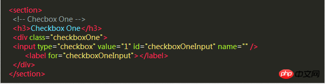
After hiding all the Checkbox checkboxes, we need to add a label HTML element. We all know that when a label with a for attribute is clicked, the corresponding The Checkbox checkbox will be selected. This means that we can handle our Checkbox through the label's click event.
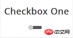
Style 1
Style 2
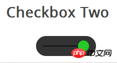 ##This check box style is the same as the style, But the difference is that this slider button changes color. When you click the slider button, it moves to the other side of the strip and changes the button's color.
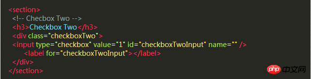
HTML code and style one are exactly the same.
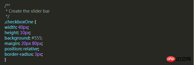
 This DIV will become a strip larger than the style. The label will still be used as a slider. Use the following CSS to define it.
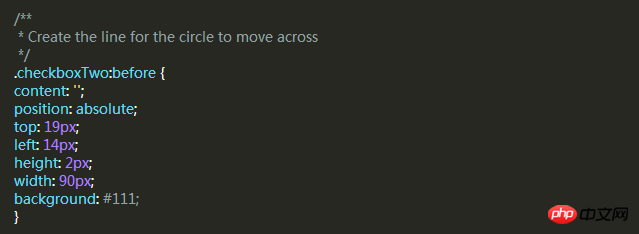
There is a black bar in the middle of this style, and the slider will slide left and right along it, but the DIV element has already been used, so we need to create a new element using the :before pseudo-class.
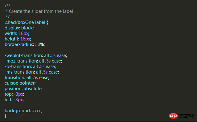
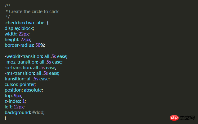
 #Same as style 1, next we write a CSS style for the label and use it as a slider.
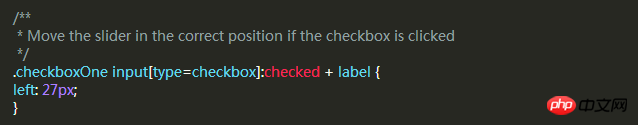
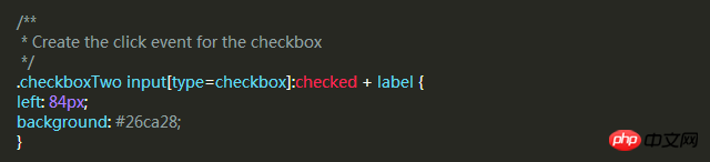
 I want to achieve a selected state similar to Style 1, and change the left and background attributes of the label when selected.
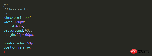
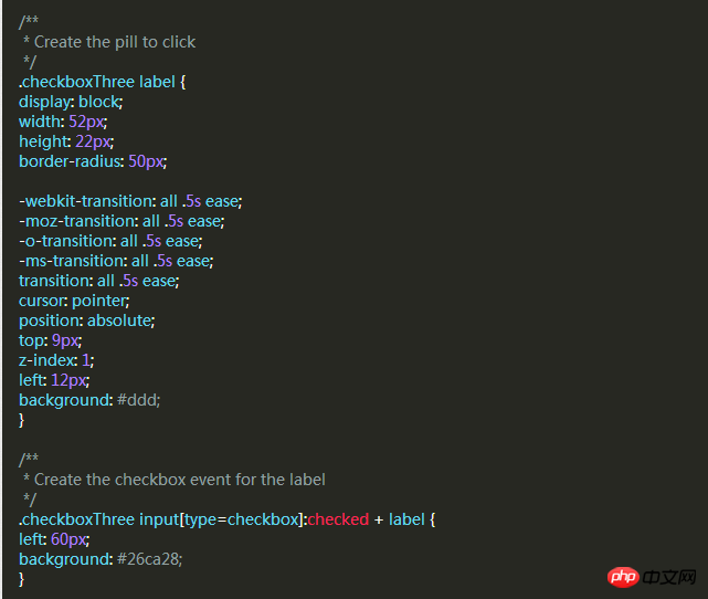
Style Three
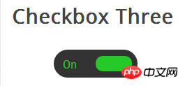 The style of this check box is more complicated than Style Two , it will slide left and right like the previous example, and when the selected and unselected state is changed, the slider slides to the other side and the corresponding text is displayed in the original position.
First, we write the HTML code, which is the same as before.
 Then, we use the same way to use the div as the slider. The following code will create a black rounded strip where we can place the slider and text. in.
 When the slider is unselected, the slider will be on the left and "OFF" is displayed on the right. When clicked, the slider moves to the right. "ON" is displayed on the left.
Same as before, let's add a slider style that will move to the other side and change color when clicked.
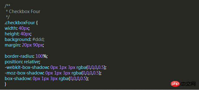
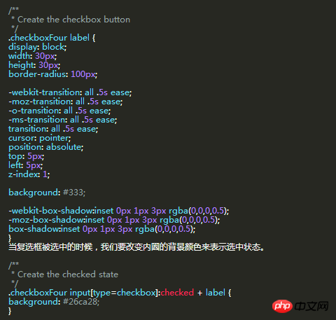
Style 4
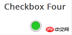
The same HTML code as before.

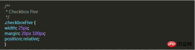
Style Five
 ## The style of this checkbox is a little different. It looks only slightly better than the browser's default checkbox style, but the difference is that we can define its style according to our own needs.
In the previous example, we used div as the sliding strip or outer circle of the checkbox, but this time we don’t need it. We can use the div element to set the complex The area of the marquee.
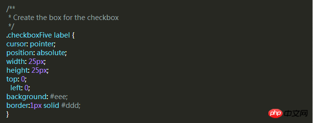
 The label label is used for the Click event and the box style of the check box we want to define.
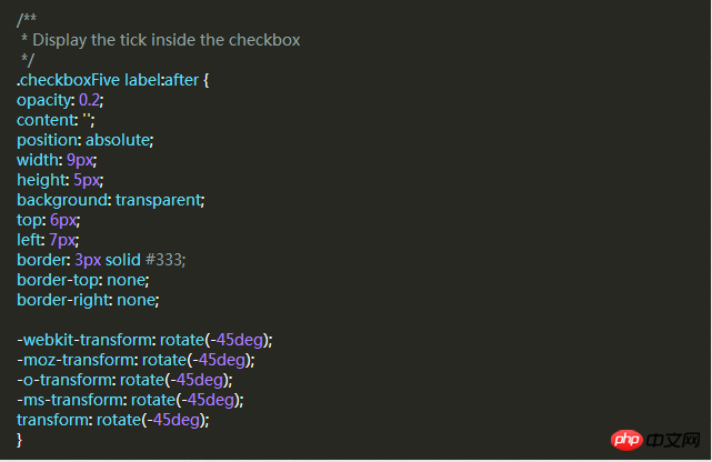
 Next, we have to create the check mark in the box. For this, we can use the :after pseudo-class to create a new element. In order to achieve this style, We can create a 5px x 9px rectangle and add a border to it. At this time, after we remove the top and right borders, it will look like a letter L. Then we can use the CSS transform property to rotate it so it looks like a check mark.
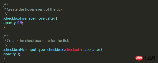
 In the CSS above, we have set its transparency to 0.2, so you will see the checkbox has a semi-transparent tick. You can make it darker on hover and make it opaque when selected.
 This will create a new checkbox style for you.
The above is the detailed content of Example tutorial of setting up Checkbox with pure CSS. For more information, please follow other related articles on the PHP Chinese website!