
Home >Web Front-end >HTML Tutorial >Example sharing of flexible layout using flexbox
Example sharing of flexible layout using flexbox

- 零下一度Original
- 2017-07-02 09:39:102297browse
FlexBox is referred to as "flexible box". In addition to being used to implement flexible layout, it can also be used to center content and change the order of source code in tags. First of all, IE9 and below browsers do not support FlexBox.
.flex{
 display:flex;
 flex:1;
 justify-content:space-between;
}
The relatively new syntax is used here. However, if you want to support Android browsers (operating systems of v4 and below) and IE10, the final code must be written like this:
.flex {
    display: -webkit-box;
    display: -webkit-flex;
    display: -ms-flexbox;
    display: flex;
    -webkit-box-flex: 1;
    -webkit-flex: 1;
    -ms-flex: 1;
    flex: 1;
    -webkit-box-pack: justify;
    -webkit-justify-content: space-between;
    -ms-flex-pack: justify;
    justify-content: space-between;
}
None of these codes are missing, because in recent years browsers have continued to launch new features with experimental features, and these experimental features must be added with a "manufacturer prefix". Each browser manufacturer has its own prefix. For example, -ms- is Microsoft, -webkit- is WebKit, - moz- is Mozilla. Therefore, each new feature must be written several times to be effective in all browsers. The first is with the prefixes of each manufacturer, and the last one is ## OK is what W3C standard stipulates. The following are all abbreviated modes.
# The main attributes in flex:
1. Flex-direction: column is arranged vertically, column-reverse is arranged vertically in reverse order, row is arranged horizontally, row-reverse, and arranged in horizontal reverse order.
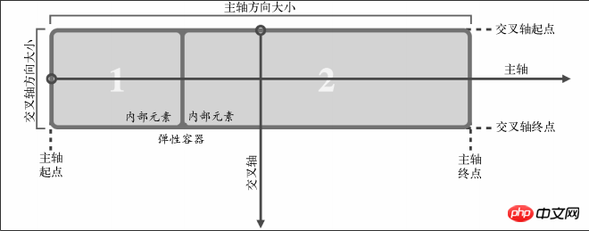
2. align-items: on the cross axis Align elements, center: center positioning. flex-start: Align from the starting edge of the parent element. flex-end: The opposite of flex-start. baseline: Aligns all items in the Flexbox element along the baseline. stretch: Make all items in Flexbox (without cross-axis) stretch to the same size as the parent element. ## 3. # 4. flex: 1 1 100px, including three attributes flex-grow, flex-shrink and flex-basis, the first attribute Refers to , relative to other flex items, the amount that the current flex item can stretch if space allows. The second attribute is the amount by which the current flex item can shrink relative to other flex items when there is insufficient space. The third attribute is which is the base value of the expansion item. Regarding the alignment of Flexbox, the most important thing is to understand the coordinate axis. There are two axes, the "main axis" and the "cross axis". What these two axes represent depends on the direction of the Flexbox arrangement. For example, if the direction of Flexbox is set to row, the main axis is the horizontal axis and the cross axis is the vertical axis. On the contrary, if the direction of Flexbox is
justify-content: Align elements on the main axis, flex-start, flex-end, center are similar to the above, without further explanation, space -between and space-around deal with the spacing between boxes, except that space-around has spacing on both sides and space-between has spacing in the middle.
#
5. align-self: Alignment of a single element, the attribute is consistent with the align-items attribute.
column, the main axis is the vertical axis, and the cross axis is the horizontal axis.
 ##
##
The above is the detailed content of Example sharing of flexible layout using flexbox. For more information, please follow other related articles on the PHP Chinese website!