align-content
Function:
will set the vertical arrangement of each item inside the free box.
Conditions:
The free box attribute display:flex; must be set to the parent element, and the arrangement mode is set to horizontal arrangement flex -direction:row; and set line wrapping, flex-wrap:wrap; so that the setting of this property will take effect.
Setting object:
This attribute works on the items inside her container and sets the parent element.
Value:
stretch: The default setting will stretch the space occupied by each item in the container, and the filling method is to add blank space below each item. The first item is arranged from the top of the container by default.

html>


<meta>
<title>
Align-content
</title>
<style>

#father{

    width:200px;
    display:flex;
    flex-direction:row;
    flex-wrap:wrap;
    align-content:strech;
    height:200px;
    background-color:grey;
}.son1{

      height:30px;
    width:100px;
    background-color:orange;
}.son2{

    height:30px;
    width:100px;
    background-color:red;
}.son3{

      height:30px;
    width:100px;
    background-color:#08a9b5;
}</style>


<p>

</p><p>
q
</p>

<p>
w
</p>

<p>
e
</p>
<p>
e
</p>
<p>
e
</p>
Center: This will remove the space between items and center all items vertically .
html>


<meta>
<title>
关于文档元素测试
</title>
<style>

#father{

    width:200px;
    display:flex;
    flex-direction:row;
    flex-wrap:wrap;
    align-content:center;
    height:200px;
    background-color:grey;
}.son1{

      height:30px;
    width:100px;
    background-color:orange;
}.son2{

    height:30px;
    width:100px;
    background-color:red;
}.son3{

      height:30px;
    width:100px;
    background-color:#08a9b5;
}.son4{

      height:30px;
    width:100px;
    background-color:#9ad1c3;
}.son5{

      height:30px;
    width:100px;
    background-color:rgb(21,123,126);
}</style>


<p>

</p><p>
q
</p>

<p>
w
</p>

<p>
e
</p>
<p>
e
</p>
<p>
e
</p>

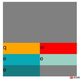
Flex-start: This will remove the white space between items and place the items on top of the container.
html>


<meta>
<title>
关于文档元素测试
</title>
<style>

#father{

    width:200px;
    display:flex;
    flex-direction:row;
    flex-wrap:wrap;
    align-content:flex-start;
    height:200px;
    background-color:grey;
}.son1{

      height:30px;
    width:100px;
    background-color:orange;
}.son2{

    height:30px;
    width:100px;
    background-color:red;
}.son3{

      height:30px;
    width:100px;
    background-color:#08a9b5;
}.son4{

      height:30px;
    width:100px;
    background-color:#9ad1c3;
}.son5{

      height:30px;
    width:100px;
    background-color:rgb(21,123,126);
}</style>


<p>

</p><p>
q
</p>

<p>
w
</p>

<p>
e
</p>
<p>
e
</p>
<p>
e
</p>

flex-end: This will remove the space between items and place the items at the bottom of the container.
align-content:flex-end;

space-between This will align the items at both ends vertically. That is, the top item is aligned with the top of the container, and the bottom item is aligned with the bottom of the container. Leave equal spacing between each item.
align-content:space-between;

Space-around: This will keep the same length of space at the top and bottom of each item, so that The spacing between items is twice the spacing of individual items.
align-content:space-around;

Inherit: Causes this attribute of the element to be inherited from its parent element.
initial: Make this attribute of the element the default initial value.
The above is the detailed content of Detailed explanation of align-content usage in css. For more information, please follow other related articles on the PHP Chinese website!
 Flexbox vs Grid: should I learn them both?May 10, 2025 am 12:01 AM
Yes,youshouldlearnbothFlexboxandGrid.1)Flexboxisidealforone-dimensional,flexiblelayoutslikenavigationmenus.2)Gridexcelsintwo-dimensional,complexdesignssuchasmagazinelayouts.3)Combiningbothenhanceslayoutflexibilityandresponsiveness,allowingforstructur
 Orbital Mechanics (or How I Optimized a CSS Keyframes Animation)May 09, 2025 am 09:57 AM
What does it look like to refactor your own code? John Rhea picks apart an old CSS animation he wrote and walks through the thought process of optimizing it.
 CSS Animations: Is it hard to create them?May 09, 2025 am 12:03 AM
CSSanimationsarenotinherentlyhardbutrequirepracticeandunderstandingofCSSpropertiesandtimingfunctions.1)Startwithsimpleanimationslikescalingabuttononhoverusingkeyframes.2)Useeasingfunctionslikecubic-bezierfornaturaleffects,suchasabounceanimation.3)For
 @keyframes CSS: The most used tricksMay 08, 2025 am 12:13 AM
@keyframesispopularduetoitsversatilityandpowerincreatingsmoothCSSanimations.Keytricksinclude:1)Definingsmoothtransitionsbetweenstates,2)Animatingmultiplepropertiessimultaneously,3)Usingvendorprefixesforbrowsercompatibility,4)CombiningwithJavaScriptfo
 CSS Counters: A Comprehensive Guide to Automatic NumberingMay 07, 2025 pm 03:45 PM
CSSCountersareusedtomanageautomaticnumberinginwebdesigns.1)Theycanbeusedfortablesofcontents,listitems,andcustomnumbering.2)Advancedusesincludenestednumberingsystems.3)Challengesincludebrowsercompatibilityandperformanceissues.4)Creativeusesinvolvecust
 Modern Scroll Shadows Using Scroll-Driven AnimationsMay 07, 2025 am 10:34 AM
Using scroll shadows, especially for mobile devices, is a subtle bit of UX that Chris has covered before. Geoff covered a newer approach that uses the animation-timeline property. Here’s yet another way.
 Revisiting Image MapsMay 07, 2025 am 09:40 AM
Let’s run through a quick refresher. Image maps date all the way back to HTML 3.2, where, first, server-side maps and then client-side maps defined clickable regions over an image using map and area elements.
 State of Devs: A Survey for Every DeveloperMay 07, 2025 am 09:30 AM
The State of Devs survey is now open to participation, and unlike previous surveys it covers everything except code: career, workplace, but also health, hobbies, and more.


Hot AI Tools

Undresser.AI Undress
AI-powered app for creating realistic nude photos

AI Clothes Remover
Online AI tool for removing clothes from photos.

Undress AI Tool
Undress images for free

Clothoff.io
AI clothes remover

Video Face Swap
Swap faces in any video effortlessly with our completely free AI face swap tool!

Hot Article

Hot Tools

Safe Exam Browser
Safe Exam Browser is a secure browser environment for taking online exams securely. This software turns any computer into a secure workstation. It controls access to any utility and prevents students from using unauthorized resources.

VSCode Windows 64-bit Download
A free and powerful IDE editor launched by Microsoft

SecLists
SecLists is the ultimate security tester's companion. It is a collection of various types of lists that are frequently used during security assessments, all in one place. SecLists helps make security testing more efficient and productive by conveniently providing all the lists a security tester might need. List types include usernames, passwords, URLs, fuzzing payloads, sensitive data patterns, web shells, and more. The tester can simply pull this repository onto a new test machine and he will have access to every type of list he needs.

WebStorm Mac version
Useful JavaScript development tools

SAP NetWeaver Server Adapter for Eclipse
Integrate Eclipse with SAP NetWeaver application server.


