Home >Web Front-end >CSS Tutorial >Detailed explanation of css float and clear
Detailed explanation of css float and clear
- 巴扎黑Original
- 2017-06-28 10:34:032075browse
<pre name="code" class="html">
<br>
1. The history of floating
Does everyone know? The earliest original intention of floating was to achieve the effect of text wrapping, similar to a picture in the upper left corner, and then it is surrounded by text. I believe everyone has seen this scene! However, since floating has been derived, there are too many places where we need to use it. The most commonly used one is the implementation of navigation, and there are other applications, such as fixed on one side, adaptive on the other side, etc. (This is discussed below. There will be examples), and floating will be introduced in several aspects below.
2. The impact of floating
## I believe that the float attribute is a must for front-end engineers to cut drawings. A prepared style effect, if you haven’t used it, haha! ! ! This article is not directed at you. While everyone enjoys using it, have you ever thought about the problems it will cause? Yes, floating is a double-edged sword. It's great to use it to achieve the desired effect, but if you use it improperly, you will suffer the consequences.
# First of all, everyone should know that any element with a float attribute that is not none will have its display changed to block, which means that the floating element is a block. Level element, no matter what it is!
Secondly, everyone must understand that floating will cause the collapse of the parent element. There is an official saying is BFC (block format context). As for why this is the case, You can check the relevant information. So how to solve this problem? Naturally, it is to float, that is, clear.
But clearing floats is not just about using a clear attribute. Because it involves browser compatibility issues, the standard method used is the following. Method:
.clearfix{*zoom:1;}
.clearfix:after{display: table;clear: both;content: '';}
It is enough to use these attributes for clear floating, and it is compatible with IE7+ and other W3C browsers. Let’s talk about zoom here. Attribute, this attribute is only effective in IE7 and below.
3. The effect of floating implementation
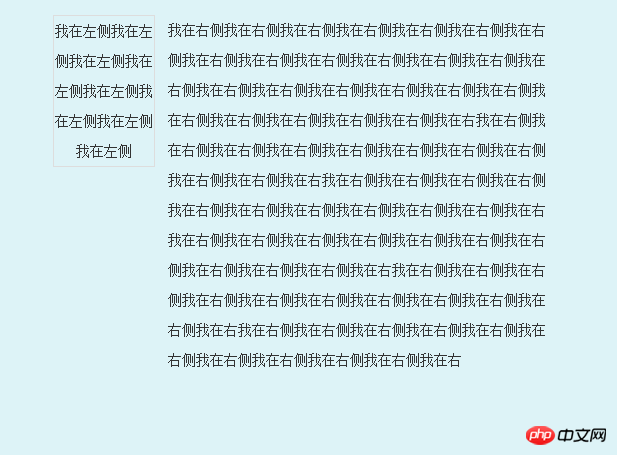
## First let’s talk about the fixed left side and adaptive right side The layout, code and renderings are as follows:
我在左侧我在左侧我在左侧我在左侧我在左侧我在左侧我在左侧我在左侧
我在右侧我在右侧我在右侧我在右侧我在右侧我在右侧我在右侧我在右侧我在右侧我在右侧我在右侧我在右侧我在右侧我在右侧我在右侧我在右侧我在右侧我在右侧我在右侧我在右侧我在右侧我在右侧我在右侧我在右侧我在右侧我在右我在右侧我在右侧我在右侧我在右侧我在右侧我在右侧我在右侧我在右侧我在右侧我在右侧我在右我在右侧我在右侧我在右侧我在右侧我在右侧我在右侧我在右侧我在右侧我在右侧我在右侧我在右我在右侧我在右侧我在右侧我在右侧我在右侧我在右
Renderings:
 <br>
<br>
There is another implementation method:
我在左侧我在左侧我在左侧我在左侧我
我在右侧我在右侧我在右侧我在右侧我在右侧我在右侧我在右侧我在右侧我在右侧我在右侧我在右侧我在右侧我在右侧我在右侧我在右侧我在右侧我在右侧我在右侧我在右侧我在右侧我在右侧我在右侧我在右侧我在右侧我在右侧我在右我在右侧我在右侧我在右侧我在右侧我在右侧我在右侧我在右侧我在右侧我在右侧我在右侧我在右我在右侧我在右侧我在右侧我在右侧我在右侧我在右侧我在右侧我在右侧我在右侧我在右侧我在右我在右侧我在右侧我在右侧我在右侧我在右侧我在右侧我在右侧我在右侧我在右侧我在右侧我在右我在右侧我在右侧我在右侧我在右侧我在右侧我在右侧我在右侧我在右侧我在右侧我在右侧我在右我在右侧我在右侧我在右侧我在右侧我在右侧我在右侧我在右侧我在右侧我在右侧我在右侧我在右
The second one is based on the left You can run it and take a look at the example of adaptive width on the right side.
<br>
<br>
<br>
<br>
<br>
<br>
<br>
<br>
<br>
<br>
The above is the detailed content of Detailed explanation of css float and clear. For more information, please follow other related articles on the PHP Chinese website!

