Home >Web Front-end >HTML Tutorial >HTML5+CSS3 static page project experience summary
HTML5+CSS3 static page project experience summary
- 巴扎黑Original
- 2017-06-27 09:07:074467browse
I have been studying front-end for a while. I have been reading theoretical knowledge in books, but there are very few practical projects. Senior brother often says that if you want to know how much strength you have and how much knowledge you have mastered, the best way is to practice. Practice will give you true knowledge. So I decided that during this holiday, I would mainly improve my coding level through the practice of projects and the assistance of theoretical knowledge. The first step is to do a few HTML5+CSS3 static page layout exercises, check for missing knowledge points, and summarize some errors encountered during practice. The design draft of the page was mainly found on the Internet. I also tried to cut the picture, measure the position, obtain the attributes of the content, etc., pretending that I was really completing a project.
The first page was found from the platform Design Master. The page design on this platform mainly recommends foreign designs and some web design tutorials. Recommendation pages are relatively concise and generous. Compared with the Chinese-style pages with explosive content, I also appreciate foreign designs.

## Design The page width on the manuscript is 1550 pixels, and the main body of the page is a 12-column grid layout of 960 pixels. The overall width of the design far exceeds the browser's viewport width, so when I was designing, because it was a static page and I did not use responsive design, I set all widths and heights in pixels. Static size. Use the div element to set the width to 960px, and set the margin attribute to 0px auto. This will ensure that the main content of the page is centered in the browser window, and you no longer need to worry about the total width of the page.
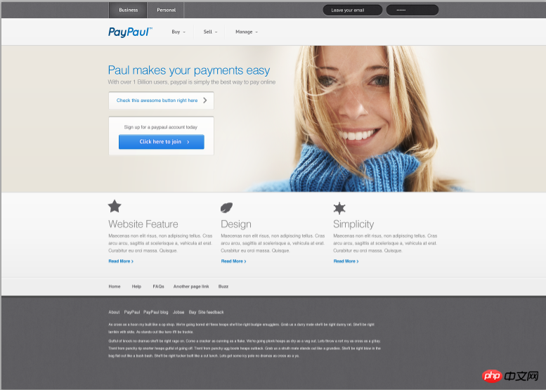
My restored picture is:
1. Header part
 The above is the completed picture of the header. First, the two navigations are divided into two parts. The first line uses nav tags to insert links and two input boxes. The input boxes are processed using border-radius to make them rounded corners, but unfortunately there are jagged edges. Not particularly tactful. The vertical lines on both sides of the link are set with colored borders. The navigation of the next row is to use an unordered list and set the float property to left to make it float to the left. The logo image is the result of cutting the design drawing. The flaw is that there is a small triangle in the movie after linking as a mark of secondary links. I am lazy
<header> <nav class="firstnav"><div class="headerlimit"> <a href="#" class="firstnav1">Business</a><a href="#" class="firstnav2">Personal</a><input type="text" name="email" placeholder=" Leave your email" class="inputcase1" /><input type="text" name="omit" palaceholder="……" class="inputcase2" /></div><nav class="secondnav"> <div class="headerlimit"> <img src="images/Logo.png" /><div class="headnav"><ul><li><a href="#">Buy</a></li><li><a href="#">Sell</a></li><li><a href="#">Manage</a></li></ul></div></div></nav> </header>
.headnav {width: 280px;padding-left: 170px;margin-top: -70px;
}.headerlimit ul {list-style-type: none;padding-left: 0px;
}.headerlimit li a{text-decoration: none;border-left: 1px solid #fff;border-right: 1px solid #ebebeb;width: 90px;text-align: center;line-height: 25px;color: #68676a;float: left;font-family: PTSans;font-size: 14px;
}
二、Banner部分

<section class="banner"><div class="backimg"><div class="bannercontent"> <div class="bannerintr"> <h1>Paul makes your payments easy</h1> <p>With over 1 Billion users, paypal is simply the best way to pay</p> </div> <div class="button1"> <a href="#"> <p>Check this awesome button right here</p> </a> </div> <div class="button2"> <p>Sign up for a paypaul account today</p> <button><a href="#">Click here to join</a></button></div></div></div></section>
.bannercontent {width: 960px;margin: 0px auto;position: absolute;left: 10px;top: 25px;
}.backimg {width: 1055px;height: 415px;margin-left: 195px;background-image: url(../images/banner.png);position: relative;
}
因为三个模块的布局是一模一样的,所以只要使用同一个class属性就能保证样式相同。图片和文字都处理都比较简单,没有特别需要指出的了,因此代码也省略了。
四、Footer部分

在footer部分,导航栏的部分同样是使用无序列表的方式,要注意的是,在设置的时候发现,因为无序列表中设置了向左浮动,因此会影响后面的两个段落在浏览器中的显示,需要使用clear: both; 清除两个段落的浮动,才能使得两个段落在导航栏的下方。问题产生和清除浮动的部分CSS代码如下:
.footernav li a{color: #fff;font-size: 12px;margin-right: 15px;margin-top: 35px;float: left;
}.footercontent {width: 960px;margin: 0px auto;padding: 25px 0px;clear: both;
}
Of course, you will also encounter some problems when implementing this static page according to the design draft, such as knowing the size and size of each element. It is a very troublesome operation such as the spacing between spaces, the size and color attributes of fonts, etc.(Tucao). Of course, the real problem you encounter is not this, but something that you think should look like this. As a result, it will look different when displayed in the browser. This is the source of headaches. Therefore, during the implementation process, we also recorded some problems encountered and tried to find out the reasons and solutions.
1. When text and images appear on the same line or in the same div element, the browser will run on different lines.
After querying the information, three solutions were given:
①In CSS, set vertical-align for the div: middle; attribute. This div contains pictures and text, so that the elements in the div can be vertically aligned in the center.
② When the picture is a background picture, set the picture using background-img and modify the padding of the text so that it can be on the same line.
③Place the image and text in two divs and set the margin value. This is the method I use, which is a little more troublesome than the first method.
2. Inline elements do not support margin and padding attribute values in the upper and lower directions. You need to use line-height to modify them.
3. Elements often have some extra margins inexplicably. This is actually the default effect of the browser. These effects need to be cleared manually before setting the CSS style. For example, the unordered list ul will have extra left margin.
The above is the detailed content of HTML5+CSS3 static page project experience summary. For more information, please follow other related articles on the PHP Chinese website!

