Home >Web Front-end >HTML Tutorial >Problems and bad habits encountered in html development
Problems and bad habits encountered in html development
- PHP中文网Original
- 2017-06-20 10:08:101927browse
I have recently seen a lot of problems and bad habits in HTML development on the Internet, so I would like to summarize them.
1. Top and bottom spacing
During development, you will find that the top and bottom spacing between the two p tags you set is 20px, but you actually measured it. You will find that it will be 4~8px longer, why is this! If you are an experienced driver, I think I don’t need to say more,
# Because the design draft only measures the spacing between words, in fact, you write the p tag to check For the next element, the p table label will have a blank space, probably about 2px above and below. In this case, when you add your
, the top margin or bottom margin will be a little more when you measure it.
8b05045a5be5764f313ed5b9168a17e6
100db36a723c770d327fc0aef2ce13b1
93f0f5c25f18dab9d176bd4f6de5d30e
1fc2df4564f5324148703df3b6ed50c1
b2386ffb911b14667cb8f0f91ea547a76e916e0f7d1e588d4f442bf645aedb2f
080b747a20f9163200dd0a7d304ba388
p:nth-child(1){
margin-bottom: 20px;
}
531ac245ce3e4fe3d50054a55f265927
9c3bca370b5104690d9ef395f2c5f8d1
6c04bd5ca3fcae76e30b72ad730ca86d
01ffcd5d1a840d2341909ced6bafa76cp194b3e26ee717c64999d7867364b1b4a3
e388a4556c0f65e1904146cc1a846beep294b3e26ee717c64999d7867364b1b4a3
36cc49f0c466276486e50c850b7e4956
73a6ac4ed44ffec12cee46588e518a5e
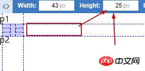
## Above us is a 20px lower margin. Now let’s measure it;
ps: If you have [FQ Tool], you might as well download a Page Ruler from the Google Browser Mall. I personally think it is a very useful measurement web page. Tool of.
It was found that the space without 20 was successfully changed to 25. This is the blank space of the p tag.
2. Wrong nesting
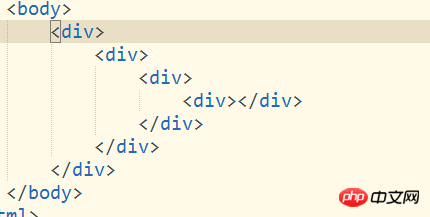
This kind of nesting, when there is content written in it, cannot be seen on one screen At the end of the day, you will be annoyed by nesting errors for a while. The best solution? I think it’s better to comment. A good comment habit allows you to find your own problems faster and is conducive to team development.
 Do you find something wrong when you do this? Isn't it more convenient when you modify it?
3. Who should write form or table first? Of course, this problem will only happen to novices
<table><form><tr><td>..... </td></tr></form></table>Correct:
<form><table><tr><td>..... </td></tr></table></form>
按我个人的理解来说,把form写在table中太别扭了。因为table是一个完整的格式,所以说用from来包裹table。
四、省略img alt 属性
当你在网速不佳或图片无法显示的时候,他的作用就来了。你可以带有你图片的描述,让用户在没看到的前提下,也明白这是什么。
五、大量使用转义标签 如: ; >..........
因为在每个浏览器如 : 默认宽度是不等的,所以当你使用大量 ; 时换个浏览器他就变了。所以说现在这莫多好用的方式为啥还用如此
lo的转义标签, 其实还有比较实用的如:©; © 版权商标等等;
六、错误的提示方式。
当你给了用户错误的提示时,你说收集的数据也将会出现很大的偏差,如:“请输入地址” ,这个地址你是要家庭地址呢!还是现住地址呢!还又是公司地址呢!所以明确的提示很重要。
七、页面中包含太多刷新的步骤。
通过ajax局部刷新,来减少页面的重复加载。增强用户的体验。
八、偏爱于一款浏览器,由于浏览器内核不同,他支持的效果也不同,当你偏爱于一款浏览器时,你在别的浏览器你会崩溃的 。
ps:当然IE除外 IE 低版本太可怕,都这个年代了坚决抵制 IE 低版本,当然这只是个人看法,毕竟有数据支持用 IE 低版本用户是有还是又不算少的用户群
有的比如:国企采购 windows 自带 IE 而且国企为了安全买回来后没有升级那一说。当外包到一个国企而且进门不让带手机的,到时候你就明白了。
The above is the detailed content of Problems and bad habits encountered in html development. For more information, please follow other related articles on the PHP Chinese website!

