


Source of the article:
1. Foreword
Flexbox is a CSS3 box model. As the name suggests, it is a flexible box. Why has this attribute been used recently? What about getting red? The main reason is that the CSS3 specification has finally become popular (or IE has finally failed), and the development of mobile devices has promoted the rise of responsive layout. Flexbox, which has considerable flexibility in adaptive length and width, has taken advantage of this trend.
The first step is to look at the Flexbox box model. According to the W3C article, the flex box model is presented in the figure below. The difference from the general box model is that the Flexbox box model has a horizontal starting point. and end point (main start, main end), vertical start point and end point (cross start, cross end), horizontal axis and vertical axis (main axis, cross axis), and then the element has horizontal size and vertical size (main size, cross size ), these are very important layout planning.

Let’s first take a look at what attributes Flexbox has. You can also refer to MDN’s use of CSS flexible boxes
-
display
flex-direction
justify-content
align-items
align-self
align-content
flex-wrap
order
flex
2. Property introduction
A. display
display is the CSS we are familiar with For Flexbox, there are two more ways to set attributes. The default is "flex". Its layout method is almost similar to block. It will force line breaks, but the child elements that set display: flex have more Flexible settings.
Another way is "inline-flex", which is almost the same as inline-block. In the sense, a display:flex element covers the display:inline attribute, and the rear element There will be no line breaks.
Doing this defines the element as a flex container and its child elements as flex items. The value flex makes the flex container a block-level element. The value inline-flex makes the flex container a single, indivisible inline-level element.


B, flex-direction
flex-direction represents the "arrangement direction" of Flexbox content elements, respectively. The following four types.
row: Default value, from left to right, top to bottom
row-reverse: opposite to row
column: from top to bottom, then left to right
column-reverse: opposite to column


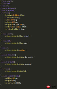
C, justify-content
justify-content determines the "horizontal alignment" position of the content element and the entire Flexbox. Recall what was said above The Flexbox box model has two endpoints: main start and main end. Justify-content is set in this way, and there are a total of five setting values:
flex-start: Default value, align the leftmost main start
flex-end: Align the leftmost main end
center: horizontally centered
space-between: distribute content elements evenly, the left and right elements will be aligned with main start and main end
space-around: Evenly distribute content elements, and the spacing is also evenly distributed


D, align-items
align-items is just the opposite of justify-content. align-items determines the "vertical alignment" position of the content element and the entire Flexbox. Recall the Flexbox box mentioned above The model has two endpoints, cross start and cross end. align-items and align-self are set in this way. There are a total of five setting values.
flex-start: Default value, align the top cross start
flex-end: Align the bottom cross end
center: vertically center
stretch: stretch all content elements to the height of Flexbox
baseline: Use the baseline of all content elements as the alignment standard


E, align-self
The setting of align-self is the same as align-items, but the purpose is different. The function of align-self is to overwrite the attributes that have been applied to align-items. If we follow our previous As written, because align-items is for child elements, it must be overridden with align-self. It will be clear if we directly use the previous example to modify it.
auto
is set to the align-items value of the parent element. If the element has no parent element, it is set to stretch.
flex-start
The flex element will be aligned to the beginning of the cross-axis.

flex-end
The flex element will be aligned to the end of the cross-axis.

center
The flex element will be aligned to the middle of the cross-axis. If the cross-size of the element Sizes larger than the flex container will overflow equally in both directions.

baseline
All flex elements will be aligned along the baseline.

stretch
The flex element will be based on the width and height of the container, according to the cross-size of its own margin box Stretch.

F, align-content
The align-items just mentioned are processed for elements with single-line content. If When encountering multi-line elements, you must use the align-content attribute. This attribute has a total of six settings. (Example: css-flexbox-demo6.html, W3C description)
flex-start: Default value, align the top cross start
flex-end: align the bottom cross end
center: vertically center
space-between: align the first line with The last line is aligned to the top and bottom respectively
space-around: evenly distribute spacing between each line
stretch: all content elements are stretched

G、flex-wrap
I saw a flex-wrap in the example just now attribute, this attribute is responsible for letting the content elements wrap. Because when we set the display of the parent element to flex or inline-flex, the child element will elastically fill the parent element in a single line, so it is necessary Use flex-wrap to wrap lines. There are three settings. (Example: css-flexbox-demo7.html)
nowrap: default value, single line
wrap: multiple lines
wrap-reverse: Multiple lines, but the content elements are reversed


flex-grow: Number, no unit, when The flex-basis length of the child element is "smaller" than the length allocated to the parent element. The corresponding "stretch" ratio is allocated according to the number. The default value is 1. If it is set to 0, there will be no elastic change. It cannot is a negative value.
flex-shrink: Number, unitless, when the flex-basis length of the child element is "larger" than the length allocated to it in the parent element, the corresponding " "Compression" ratio distribution, the default value is 1, if set to 0, there will be no elastic change, and it cannot be a negative value.
flex-basis: The basic size of the child element, as the size comparison basis of the parent element, the default value is 0, and because the default value is 0, when this attribute is not set, The flex-grow attribute will be used directly. flex-basis can also be set to auto. If set to auto, it means that the child elements are based on their own basic size. .
The three attributes can be set separately, or they can be set together using a flex. The following example shows the same Flexbox. At different widths, the child elements will be presented in different sizes.
HTML code:

CSS code:


The above is the detailed content of How to use CSS3 Flexbox?. For more information, please follow other related articles on the PHP Chinese website!

 Deconstructing H5 Code: Tags, Elements, and AttributesApr 18, 2025 am 12:06 AM
HTML5 code consists of tags, elements and attributes: 1. The tag defines the content type and is surrounded by angle brackets, such as. 2. Elements are composed of start tags, contents and end tags, such as contents. 3. Attributes define key-value pairs in the start tag, enhance functions, such as. These are the basic units for building web structure.
 Understanding H5 Code: The Fundamentals of HTML5Apr 17, 2025 am 12:08 AM
HTML5 is a key technology for building modern web pages, providing many new elements and features. 1. HTML5 introduces semantic elements such as, , etc., which enhances web page structure and SEO. 2. Support multimedia elements and embed media without plug-ins. 3. Forms enhance new input types and verification properties, simplifying the verification process. 4. Offer offline and local storage functions to improve web page performance and user experience.
 H5 Code: Best Practices for Web DevelopersApr 16, 2025 am 12:14 AM
Best practices for H5 code include: 1. Use correct DOCTYPE declarations and character encoding; 2. Use semantic tags; 3. Reduce HTTP requests; 4. Use asynchronous loading; 5. Optimize images. These practices can improve the efficiency, maintainability and user experience of web pages.
 H5: The Evolution of Web Standards and TechnologiesApr 15, 2025 am 12:12 AM
Web standards and technologies have evolved from HTML4, CSS2 and simple JavaScript to date and have undergone significant developments. 1) HTML5 introduces APIs such as Canvas and WebStorage, which enhances the complexity and interactivity of web applications. 2) CSS3 adds animation and transition functions to make the page more effective. 3) JavaScript improves development efficiency and code readability through modern syntax of Node.js and ES6, such as arrow functions and classes. These changes have promoted the development of performance optimization and best practices of web applications.
 Is H5 a Shorthand for HTML5? Exploring the DetailsApr 14, 2025 am 12:05 AM
H5 is not just the abbreviation of HTML5, it represents a wider modern web development technology ecosystem: 1. H5 includes HTML5, CSS3, JavaScript and related APIs and technologies; 2. It provides a richer, interactive and smooth user experience, and can run seamlessly on multiple devices; 3. Using the H5 technology stack, you can create responsive web pages and complex interactive functions.
 H5 and HTML5: Commonly Used Terms in Web DevelopmentApr 13, 2025 am 12:01 AM
H5 and HTML5 refer to the same thing, namely HTML5. HTML5 is the fifth version of HTML, bringing new features such as semantic tags, multimedia support, canvas and graphics, offline storage and local storage, improving the expressiveness and interactivity of web pages.
 What Does H5 Refer To? Exploring the ContextApr 12, 2025 am 12:03 AM
H5referstoHTML5,apivotaltechnologyinwebdevelopment.1)HTML5introducesnewelementsandAPIsforrich,dynamicwebapplications.2)Itsupportsmultimediawithoutplugins,enhancinguserexperienceacrossdevices.3)SemanticelementsimprovecontentstructureandSEO.4)H5'srespo
 H5: Tools, Frameworks, and Best PracticesApr 11, 2025 am 12:11 AM
The tools and frameworks that need to be mastered in H5 development include Vue.js, React and Webpack. 1.Vue.js is suitable for building user interfaces and supports component development. 2.React optimizes page rendering through virtual DOM, suitable for complex applications. 3.Webpack is used for module packaging and optimize resource loading.


Hot AI Tools

Undresser.AI Undress
AI-powered app for creating realistic nude photos

AI Clothes Remover
Online AI tool for removing clothes from photos.

Undress AI Tool
Undress images for free

Clothoff.io
AI clothes remover

AI Hentai Generator
Generate AI Hentai for free.

Hot Article
Hot Tools

WebStorm Mac version
Useful JavaScript development tools

Atom editor mac version download
The most popular open source editor

DVWA
Damn Vulnerable Web App (DVWA) is a PHP/MySQL web application that is very vulnerable. Its main goals are to be an aid for security professionals to test their skills and tools in a legal environment, to help web developers better understand the process of securing web applications, and to help teachers/students teach/learn in a classroom environment Web application security. The goal of DVWA is to practice some of the most common web vulnerabilities through a simple and straightforward interface, with varying degrees of difficulty. Please note that this software

SublimeText3 English version
Recommended: Win version, supports code prompts!

SublimeText3 Mac version
God-level code editing software (SublimeText3)

