


1.HTML5Basics
Document Type
nbsp;HTML PUBLIC >nbsp;html>
Use video and audio tags play video and audio

 <video>
         <source></source>
         <source></source>
     </video>
2.flexible box
box-sizing :border-box/content-box(Default value)
3. Rounded border
Border-raduis:Upper left corner, upper right corner, lower right corner, lower left corner.

##CSS’s syntax is changing with each passing day, making many things that could not be done before. Now it can be done very easily. Let’s talk about a few relatively new and powerful CSS functions:
- clip-path
- shape-outside
- shape means graphics, and CSS shapes means CSS graphics, which means using CSS to generate various shapes (circles, rectangles, ellipses, polygons and other geometric shapes).
Before CSS3, all we could do were rectangles, boxes, and boxes.
CSS3
After CSS3 came out, we have a broader space for display. Through
- border-radius
- border
- transform
- gradient gradient
- we can create a lot of geometric shapes.
Except for the most common rectangles and circles (
border-radius), here are some other geometric shapes:
//01圆角边的css #circle{
width: 300px;
height: 300px;
border: 1px solid red;
border-radius: 10px;
box-shadow: 5px 5px 5px green;
}<div>我是圆角边的div</div>//02圆形的css加图片#circleshape{
width: 300px;
height: 300px;
border: 1px solid red;
border-radius: 150px;
background: url("img/001.jpg") 0px 0px no-repeat;
background-size: cover;
opacity: 0.7;
transition: all 5s;
}
#circleshape:hover{
transform: rotate(300deg) scale(1.5);
transition: all 5s linear;
}<div>我是圆形的div</div>//03半圆形的CSS #halfcircle{
width: 300px;
height: 150px;
border: 1px solid red;
border-radius: 150px 150px 0px 0px;
background:linear-gradient(to top,pink,palegreen);
background:radial-gradient(palegoldenrod,palevioletred);
}<div>我是半圆形的div</div>//04四分之一圆形 #halfcircles{
width: 150px;
height: 150px;
border: 1px solid red;
border-radius: 150px 0px 0px 0px;
}<div>我是四分之一圆形的div</div>
#halfcircless{
width: 150px;
height: 150px;
border: 1px solid red;
border-radius: 0px 150px 0px 0px;
}<div>我是四分之一圆形的div</div>
#halfcirclesss{
width: 150px;
height: 150px;
border: 1px solid red;
border-radius: 0px 0px 0px 150px;
}<div>我是四分之一圆形的div</div>#halfcirclessss{
width: 150px;
height: 150px;
border: 1px solid red;
border-radius: 0px 0px 150px 0px;
}<div>我是四分之一圆形的div</div>
#halfcircl{
width: 300px;
height: 150px;
border: 1px solid red;
border-radius: 0px 0px 150px 150px;
}<div>我是半圆形的div</div>//05:三角形 .traingle {
width: 0;
height: 0;
border-left: 50px solid transparent;
border-right: 50px solid transparent;
border-bottom: 100px solid yellowgreen;
}<div>我的三角形,我是div</div>//06:切角:多重线性渐变实现切角。 .notching {
width: 40px;
height: 40px;
padding: 40px;
background: linear-gradient(135deg, transparent 15px, yellowgreen 0) top left,
linear-gradient(-135deg, transparent 15px, yellowgreen 0) top right,
linear-gradient(-45deg, transparent 15px, yellowgreen 0) bottom right,
linear-gradient(45deg, transparent 15px, yellowgreen 0) bottom left;
background-size: 50% 50%;
background-repeat: no-repeat;
}<div>我是切角,我是div</div>//07:椭圆形 .ellipse {
width: 120px;
height: 160px;
background-color: yellowgreen;
border-radius: 50% 50% 50% 50% / 60% 60% 40% 40%;
}<div>我是椭圆形,我是div</div>08:梯形:伪元素加旋转透视实现梯形
.trapezoid{
position: relative;
width: 60px;
padding: 60px;
}
.trapezoid::before{
content:"";
position: absolute;
top: 0; right: 0; bottom: 0; left: 0;
transform: perspective(20px) scaleY(1.3) rotateX(5deg);
transform-origin: bottom;
background: yellowgreen;
}<div>我是上面短的梯形,我是div</div>.trapezoids {
position: relative;
width: 60px;
border-top: 60px solid yellowgreen;
border-left: 40px solid transparent;
border-right: 40px solid transparent;
}<div>我是下面短的梯形,我是div</div>//09.五边形:梯形加上三角形,很容易就组合成一个五边形,这里需要借助一个伪元素实现:.pentagon {
position: relative;
width: 60px;
border-bottom: 60px solid yellowgreen;
border-left: 40px solid transparent;
border-right: 40px solid transparent;
}
.pentagon::before {
content:"";
position: absolute;
top: 60px;
left: -40px;
border-top: 60px solid yellowgreen;
border-left: 70px solid transparent;
border-right: 70px solid transparent;
}//10六边形看看上面的梯形,如果两个反方向且底边同样大小的梯形,叠加在一起,是不是就能得到一个六边形呢
.pentagon {
position: relative;
width: 60px;
border-bottom: 60px solid yellowgreen;
border-left: 40px solid transparent;
border-right: 40px solid transparent;
}
.pentagon::before {
content: "";
position: absolute;
width: 60px;
height: 0px;
top: 60px;
left: -40px;
border-top: 60px solid yellowgreen;
border-left: 40px solid transparent;
border-right: 40px solid transparent;
}//11:八边形六边形都解决了,八边形也不在话下,一个矩形加上两个梯形,可以合成一个八边形。
.octagon {
position: relative;
width: 40px;
height: 100px;
background: yellowgreen;
}
.octagon::before {
content: "";
height: 60px;
position: absolute;
top: 0;
left: 40px;
border-left: 30px solid yellowgreen;
border-top: 20px solid transparent;
border-bottom: 20px solid transparent;
}
.octagon::after {
content: "";
height: 60px;
position: absolute;
top: 0;
left: -30px;
border-right: 30px solid yellowgreen;
border-top: 20px solid transparent;
border-bottom: 20px solid transparent;
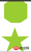
}//12:五角星好的,探索完多边形,我们继续探索X角星。
先来看看五角星,要怎么实现呢?当然是直接打出来啦 -- ★☆
.star {
margin: 50px 0;
position: relative;
width: 0;
border-right: 100px solid transparent;
border-bottom: 70px solid yellowgreen;
border-left: 100px solid transparent;
transform: rotate(35deg) scale(.6);
}
.star:before {
content: '';
position: absolute;
border-bottom: 80px solid yellowgreen;
border-left: 30px solid transparent;
border-right: 30px solid transparent;
top: -45px;
left: -65px;
transform: rotate(-35deg);
}
.star:after {
content: '';
position: absolute;
top: 3px;
left: -105px;
border-right: 100px solid transparent;
border-bottom: 70px solid yellowgreen;
border-left: 100px solid transparent;
transform: rotate(-70deg);
}//12:六角星六角星呢?想象一下,一个向上的三角形 ▲,叠加上一个向下的三角形 ▼,就可以得到一个六边形:
.sixstar {
position: relative;
width: 0;
border-left: 50px solid transparent;
border-right: 50px solid transparent;
border-bottom: 100px solid yellowgreen;
}
.sixstar:after {
content: "";
position: absolute;
border-left: 50px solid transparent;
border-right: 50px solid transparent;
border-top: 100px solid yellowgreen;
top: 30px;
left: -50px;
}//13:八角星八角星呢?八个角那么多呢。其实使用两个矩形进行旋转拼接就可以了。
.eightstar {
position: relative;
width: 100px;
height: 100px;
background-color: yellowgreen;
transform: rotate(30deg);
}
.eightstar::before {
content: "";
position: absolute;
top: 0;
left: 0;
width: 100px;
height: 100px;
transform: rotate(45deg);
background-color: yellowgreen;
}//14:十二角星好。最后多角星再来一个十二级角星。在八角星的基础上,再增加一个矩形,就能得到十二角啦。也就是要过第一个伪元素。
.twelvestar {
position: relative;
width: 100px;
height: 100px;
margin-bottom: 100px!important;
background-color: yellowgreen;
transform: rotate(30deg);
}
.twelvestar::before {
content: "";
position: absolute;
top: 0;
left: 0;
width: 100px;
height: 100px;
transform: rotate(30deg);
background-color: yellowgreen;
}
.twelvestar::after {
content: "";
position: absolute;
top: 0;
left: 0;
width: 100px;
height: 100px;
transform: rotate(60deg);
background-color: yellowgreen;
}


 #
#
The above is the detailed content of Examples of usage of CSS+HTML5. For more information, please follow other related articles on the PHP Chinese website!

 html5的div一行可以放两个吗Apr 25, 2022 pm 05:32 PM
html5的div元素默认一行不可以放两个。div是一个块级元素,一个元素会独占一行,两个div默认无法在同一行显示;但可以通过给div元素添加“display:inline;”样式,将其转为行内元素,就可以实现多个div在同一行显示了。
 html5中列表和表格的区别是什么Apr 28, 2022 pm 01:58 PM
html5中列表和表格的区别:1、表格主要是用于显示数据的,而列表主要是用于给数据进行布局;2、表格是使用table标签配合tr、td、th等标签进行定义的,列表是利用li标签配合ol、ul等标签进行定义的。
 html5怎么让头和尾固定不动Apr 25, 2022 pm 02:30 PM
固定方法:1、使用header标签定义文档头部内容,并添加“position:fixed;top:0;”样式让其固定不动;2、使用footer标签定义尾部内容,并添加“position: fixed;bottom: 0;”样式让其固定不动。
 HTML5中画布标签是什么May 18, 2022 pm 04:55 PM
HTML5中画布标签是“<canvas>”。canvas标签用于图形的绘制,它只是一个矩形的图形容器,绘制图形必须通过脚本(通常是JavaScript)来完成;开发者可利用多种js方法来在canvas中绘制路径、盒、圆、字符以及添加图像等。
 html5中不支持的标签有哪些Mar 17, 2022 pm 05:43 PM
html5中不支持的标签有:1、acronym,用于定义首字母缩写,可用abbr替代;2、basefont,可利用css样式替代;3、applet,可用object替代;4、dir,定义目录列表,可用ul替代;5、big,定义大号文本等等。
 html5废弃了哪个列表标签Jun 01, 2022 pm 06:32 PM
html5废弃了dir列表标签。dir标签被用来定义目录列表,一般和li标签配合使用,在dir标签对中通过li标签来设置列表项,语法“<dir><li>列表项值</li>...</dir>”。HTML5已经不支持dir,可使用ul标签取代。
 Html5怎么取消td边框May 18, 2022 pm 06:57 PM
3种取消方法:1、给td元素添加“border:none”无边框样式即可,语法“td{border:none}”。2、给td元素添加“border:0”样式,语法“td{border:0;}”,将td边框的宽度设置为0即可。3、给td元素添加“border:transparent”样式,语法“td{border:transparent;}”,将td边框的颜色设置为透明即可。
 html5是什么意思Apr 26, 2021 pm 03:02 PM
html5是指超文本标记语言(HTML)的第五次重大修改,即第5代HTML。HTML5是Web中核心语言HTML的规范,用户使用任何手段进行网页浏览时看到的内容原本都是HTML格式的,在浏览器中通过一些技术处理将其转换成为了可识别的信息。HTML5由不同的技术构成,其在互联网中得到了非常广泛的应用,提供更多增强网络应用的标准机。


Hot AI Tools

Undresser.AI Undress
AI-powered app for creating realistic nude photos

AI Clothes Remover
Online AI tool for removing clothes from photos.

Undress AI Tool
Undress images for free

Clothoff.io
AI clothes remover

AI Hentai Generator
Generate AI Hentai for free.

Hot Article
Hot Tools

MinGW - Minimalist GNU for Windows
This project is in the process of being migrated to osdn.net/projects/mingw, you can continue to follow us there. MinGW: A native Windows port of the GNU Compiler Collection (GCC), freely distributable import libraries and header files for building native Windows applications; includes extensions to the MSVC runtime to support C99 functionality. All MinGW software can run on 64-bit Windows platforms.

DVWA
Damn Vulnerable Web App (DVWA) is a PHP/MySQL web application that is very vulnerable. Its main goals are to be an aid for security professionals to test their skills and tools in a legal environment, to help web developers better understand the process of securing web applications, and to help teachers/students teach/learn in a classroom environment Web application security. The goal of DVWA is to practice some of the most common web vulnerabilities through a simple and straightforward interface, with varying degrees of difficulty. Please note that this software

SecLists
SecLists is the ultimate security tester's companion. It is a collection of various types of lists that are frequently used during security assessments, all in one place. SecLists helps make security testing more efficient and productive by conveniently providing all the lists a security tester might need. List types include usernames, passwords, URLs, fuzzing payloads, sensitive data patterns, web shells, and more. The tester can simply pull this repository onto a new test machine and he will have access to every type of list he needs.

WebStorm Mac version
Useful JavaScript development tools

SublimeText3 Linux new version
SublimeText3 Linux latest version

