
Home >Web Front-end >CSS Tutorial >CSS code sharing for special effects of mouse-up icon rotation
CSS code sharing for special effects of mouse-up icon rotation

- 零下一度Original
- 2017-06-19 10:25:401603browse
This article mainly introduces CSS to realize the mouse-up icon rotation effect. Friends who need it can refer to it
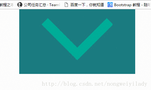
The mouse-up icon rotation effect is often used in corporate projects, especially the top navigation Column, for example:

#The next step is to use css to achieve the icon rotation effect when the mouse moves up.
<!DOCTYPE html>
<html>
<head lang="en">
    <meta charset="UTF-8">
    <title></title>
    <style>
        p,img,body{
            margin: 0;
            padding: 0;
        }
        .box{
            height: 150px;
            width:300px;
            background: #1b7b80;
            margin: 0 auto;
            padding: 20px;
        }
        .box:hover img{
            transform: rotate(180deg);
            -webkit-transform: rotate(180deg);
            -moz-transform: rotate(180deg);
            -o-transform: rotate(180deg);
            -ms-transform: rotate(180deg);
        }
        img{
            margin: 0 auto;
            display: block;
            transition: all 0.2s ease-in-out;
            -webkit-transition: all 0.2s ease-in-out;
            -moz-transition: all 0.2s ease-in-out;
            -o-transition: all 0.2s ease-in-out;
        }
    </style>
</head>
<body>
    <p class="box">
        <img src="img/down.png" alt=""/>
    </p>
</body>
</html>
A box is placed here, and a picture is placed in the box. In order to see it more clearly, a larger picture is placed here. The effect to be achieved now is that when the mouse moves over the .box box, the icon img will rotate 180 degrees. In
style, the key is the setting of img and .box:hover img. First, we need to set the transition attribute for img. The attributes here specify the animation method and duration. Then set the .box to rotate the img 180 degrees when the mouse moves up: hover:
transform: rotate(180deg);
The settings like -webkit- below are mainly for compatibility with various manufacturers set by your browser.
The result is as shown below:
The above is the detailed content of CSS code sharing for special effects of mouse-up icon rotation. For more information, please follow other related articles on the PHP Chinese website!