
Home >Web Front-end >HTML Tutorial >HTML implements an animated picture--Doraemon
HTML implements an animated picture--Doraemon

- 零下一度Original
- 2017-06-24 11:39:245795browse
I believe that everyone has a Doraemon in their childhood, a small belly filled with incredible Doraemon, a Doraemon who stays with you when you are helpless and sad. , a Doraemon who accompanies you to think wildly and eat Dorayaki with you~ Today we will draw a Doraemon in our hearts~
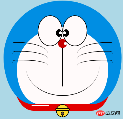
Define Doraemon's container
-
The same thing first defines a large container for Doraemon and determines its size and position.
<!-- 哆啦A梦大容器 --><div class="doa"></div>
/*哆啦A梦*/
  .doa{position: relative;top: 100px;}
Draw Doraemon’s head (including the face, the face includes eyes and nose)
The head contains several pieces Part: Doraemon’s face and nose. The face also includes two eyes. There are eyeballs and eye whites in the two eyes, so there will be several layers of DOM nesting. Of course, the basic graphics are composed of div+border -radius pieced together.
Just put the various parts of the drawn items into the corresponding positions.
-
Looking at the few pictures I drew earlier, you will know that border-radius is a very commonly used attribute. Almost every deformation of div is inseparable from it. In fact, the true face of border-radius It should be
border-radius: 300px 300px 300px 300px/300px 300px 300px 300px;sauce purple, we generally do not write the content after the slash, the slash section is the horizontal length, the slash is the vertical height, the front By default, if nothing is written after the bar, the horizontal and vertical sizes will be the same. I know what I said is not detailed enough. You can refer to my Xinshen’s blog When Will Autumn Moon Come? How much do you know about CSS3 border-radius? , guaranteeing that you will thoroughly understand border-radius under the guidance of an experienced driver in minutes. Why don’t you get on the bus quickly?<!-- 头 --> <div class="head"> <!-- 存放脸部的容器 --> <div class="face"> <!-- 左眼大圈儿 --> <div> <!-- 左眼眼珠(黑色部分) --> <div> <!-- 左眼眼白,黑色里面的白色部分 --> <div></div> </div> </div> <!-- 右眼大圈儿 --> <div> <!--右眼眼珠(黑色部分) --> <div> <!-- 右眼眼白,黑色里面的白色部分 --> <div></div> </div> </div> </div> <!-- 红鼻子部分 --> <div class="nose"> <!-- 红鼻子里面的白圈儿 --> <div></div> </div> <!-- 红鼻子下面的那根黑线,也属于鼻子部分 --> <div class="nose1"></div> </div> .head{ margin: 0 auto; /*头部定义大小并居中显示*/ width: 400px; height: 350px; background: #008ee3; /*头部定义背景颜色*/ position: relative; border-radius: 50% 50% 25% 25% / 55% 55% 45% 45%; /*头部定义四个方向圆角大小*/ } .face{ width: 310px; /*脸部定义大小*/ height: 260px; background: snow; /*脸部定义背景颜色*/ border-radius: 50% 50% 25% 25% / 55% 55% 45% 45%; /*脸部定义四个方向的圆角大小*/ position: relative; /*脸部定义位置,是相对于head的位置*/ top: 90px; left: 45px; } /*左眼眶*/ .face>div:first-child{ width: 80px; /*左眼框定义大小*/ height: 100px; border-radius: 50%; /*左眼框定义与圆角大小*/ border:2px #000 solid; /*定义外边框*/ background: snow; float: left; /*为了使左右两个眼睛能在一排显示*/ position: relative; /*位置是相对于face的位置*/ top:-40px; left: 71px; z-index: 50; } /*右眼眶,画法跟左眼一样*/ .face>div:last-child{ width: 80px; height: 100px; border-radius: 50%; border:2px #000 solid; background: snow; float: left; position: relative; top:-40px; left: 71px; z-index: 50; } /*左眼珠1*/ .face>div:first-child div{ width: 20px; /*定义眼珠的大小*/ height: 25px; background: #000; border-radius: 50%; position: absolute; /*定义眼珠的位置,相对于眼眶的位置*/ top: 45px; left: 60px; } /*左瞳孔*/ .face>div:first-child div div{ width: 10px; /*定义黑色瞳孔的大小*/ height: 10px; background: #ffffff; border-radius: 50%; position: absolute; /*定义黑色瞳孔的位置,相对于眼珠的位置*/ top: 7px; left: 10px; } /*右眼珠和左眼珠画法一样*/ .face>div:last-child div{ width: 20px; height: 25px; background: #000; border-radius: 50%; position: absolute; top: 45px; } /*右瞳孔和左瞳孔的画法一样*/ .face>div:last-child div div{ width: 10px; height: 10px; background: #ffffff; border-radius: 50%; position: absolute; top: 7px; } .nose{ width: 30px; /*定义红鼻子的大小*/ height: 30px; border-radius: 50%; background: #c70000; position: absolute; top: 130px; left: 50%; margin-left: -15px; z-index: 10; } .nose div{ width: 10px; /*定义红鼻子里面白色圈圈的大小*/ height: 10px; border-radius: 50%; position: absolute; background: #ffffff; top: 10px; margin-left: 20px; z-index: 10; } .nose1{ width: 2px; /*定义红鼻子下面的那一条黑线*/ height: 130px; background: #000; position: absolute; top: 160px; left: 50%; margin-left: -1px; z-index: 10; }
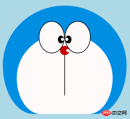 Doraemon’s head.png
Drawing Doraemon’s mouth
-
The mouth should be very simple. At a glance, you can tell that it is realized with border + border-radius.
<div class="mouth"></div>
.mouth{      width: 250px;   /*定义嘴巴的大小*/      height: 200px;      border-radius: 50%;      background: snow;      border-bottom: 2px #000 solid;      margin: -230px auto;      position: relative;  /*定义嘴巴的位置*/
  }
Doraemon’s mouth.png
Draw Doraemon’s beard part
-
The beard part was actually introduced in the previous article when drawing html to create animation [Serial 3]-Kitten Smiley Animation when drawing beards, so I won’t go into details here. , the basic idea is the same.
<!-- 胡须 -->
  <div class="beard">
  <!-- 左边胡须部分 -->
      <div class="left">
      <!-- 第一根胡须 -->
          <div></div>
          <!-- 第二根胡须 -->
          <div></div>
          <!-- 第三根胡须 -->
          <div></div>
      </div>
      <div class="right">
          <div></div>
          <div></div>
          <div></div>
      </div>
      <!-- 脖子部分的小白条部分 -->
      <span></span>
  </div>/*胡须样式*/.beard .left div:first-child{      width: 120px;      height: 40px;      border-top: 2px #000 solid;      border-radius: 10% 90% 10% 90% / 10% 90% 10% 90%;      position: absolute;      left: 50%;      top: 140px;      margin-left: -170px;      z-index: 100;
  }  .beard .left div:nth-child(2){      width: 120px;      height: 40px;      border-top: 2px #000 solid;      border-radius: 10% 90% 10% 90% / 30% 70% 40% 60%;      position: absolute;      left: 50%;      top: 170px;      margin-left: -170px;      z-index: 100;
  }  .beard .left div:last-child{      width: 120px;      height: 40px;      border-top: 2px #000 solid;      border-radius: 10% 90% 10% 90% / 40% 60% 10% 90%;      position: absolute;      left: 50%;      top: 200px;      margin-left: -170px;      z-index: 100;
  }  .beard .right div:first-child{      width: 120px;      height: 40px;      border-top: 2px #000 solid;      border-radius: 90% 10% 90% 10% / 90% 10% 90% 10%;      position: absolute;      left: 50%;      top: 140px;      margin-left: 50px;      z-index: 100;
  }  .beard .right div:nth-child(2){      width: 120px;      height: 40px;      border-top: 2px #000 solid;      border-radius: 90% 10% 90% 10% / 70% 30% 60% 40%;      position: absolute;      left: 50%;      top: 170px;      margin-left: 50px;      z-index: 100;
  }  .beard .right div:last-child{      width: 120px;      height: 40px;      border-top: 2px #000 solid;      border-radius: 90% 10% 90% 10% / 60% 40% 90% 10%;      position: absolute;      left: 50%;      top: 200px;      margin-left: 50px;      z-index: 100;
  }  .beard span{      display: block;      width: 60px;      height: 3.5px;      background: #ffffff;      border-radius: 4px;      position: absolute;      top: 352px;      left: 50%;      margin-left: -105px;
  }
Doraemon’s beard.png
Draw Doraemon’s neck part (neck part Including the bell)
The neck is the shape after the basic div is transformed, and the excess part can be hidden under the head.
-
The bell part is composed of very simple basic graphics.
<!-- 脖 -->
  <div class="neck">
  <!-- 铃铛的圆形 -->
      <div></div>
      <!-- 铃铛的小圆角矩形 -->
      <div></div>
      <!-- 铃铛的小圆形 -->
      <div></div>
      <!-- 铃铛的小竖线 -->
      <div></div>
  </div>
.neck{      width: 330px;      height: 200px;      border-radius: 50% 50% 20% 20% / 50% 50% 50% 50%;      background: #e30000;      margin: 80px auto;      z-index: 100;
  }  .neck div:first-child{      border: 2px #000 solid;      border-radius: 50%;      width: 40px;      height: 40px;      background: #ffdd2e;      position: absolute;      top: 350px;      left: 50%;      margin-left: -22px;      transition: all 1s;
  }  .neck div:nth-child(2){      border: 2px #000 solid;      width: 44px;      height: 5px;      background: #ffdd2e;      position: absolute;      left: 50%;      margin-left: -24px;      top: 363px;      border-radius: 5px;      transition: all 1s;
  }  .neck div:nth-child(3){      width: 8px;      height: 8px;      border: 2px #000 solid;      position: absolute;      background: #6c5844;      border-radius: 50%;      left: 50%;      margin-left: -6px;      top: 375px;      transition: all 1s;
  }  .neck div:nth-child(4){      width: 2px;      height: 8px;      background: #000;      position: absolute;      left: 50%;      margin-left: -1px;      top: 385px;      transition: all 1s;
  }
Doraemon’s neck.png
Complete Doraemon’s dynamic effect
Doraemon is more cute when he moves, right? Then let’s make it move (transition attribute).
Move the mouse to the eye area and move the left eyeball to the left.
Move the mouse to the mouth and the facial expression changes.
-
Move the mouse to the bell part, and the bell will become larger.
/*眼睛动效*/.head:hover .face>div:first-child div{      left: 0px;      transition: all 1s;
  }  .head:hover .face>div:first-child div div{      left: 0px;      transition: all 1s;
  }/*嘴巴动效,嘴巴的dom容器下面要加了个空的div容器*/.mouth div:first-child{      width: 82px;      height: 2px;      background: #000;      position: absolute;      z-index: 1000;      top: -25px;      left: 6px;      display: none;
  }  .mouth div:nth-child(2){      width: 82px;      height: 2px;      background: #000;      position: absolute;      z-index: 1000;      top: -25px;      left: 90px;      display: none;
  }  .mouth:hover{      border-radius: 0;      width: 180px;      height: 200px;
  }  .mouth:hover div:first-child,.mouth:hover div:nth-child(2){      display: block;
  }/*铃铛动效*/.neck:hover div:first-child{      width: 60px;      height: 60px;      left: 50%;      margin-left: -30px;
  }  .neck:hover div:nth-child(2){      width: 66px;      height: 7.5px;      left: 50%;      margin-left: -33px;
  }  .neck:hover div:nth-child(3){      width: 12px;      height: 12px;      left: 50%;      margin-left: -6px;      top: 385px;
  }  .neck:hover div:nth-child(4){      width: 2px;      height: 12px;      left: 50%;      margin-left: 1px;      top: 400px;
  }
Doraemon animation.gif
The above is the detailed content of HTML implements an animated picture--Doraemon. For more information, please follow other related articles on the PHP Chinese website!