


Use CSS and jQuery to implement it, try to look the same as the original effect.

Final rendering
In this tutorial, I will use CSS, HTML and jQuery to create an approximate Apple TV parallax effect. If you Reading this, I assume you have a basic understanding of the above three techniques.
Without further ado, let’s start the first part.
HTML page
Our page structure is as follows:
<p class="poster">  <p class="shine"></p>
  <p class="layer-1"></p>
  <p class="layer-2"></p>
  <p class="layer-3"></p>
  <p class="layer-4"></p>
  <p class="layer-5"></p>
</p>
First, we need a style class .poster p, in this p contains 5 layers of other styles p. On top of these five layers p there is a shine p to add some sparkle.
CSS Part
First, add the following code to ensure that the height of the body part of the web page is the entire page height:
body, html { height: 100%; min-height: 100%; } and then body Some background gradient colors:
body { background: linear-gradient(to bottom, #f6f7fc 0%,#d5e1e8 40%); } In order to give .poster a 3D rotation effect, the parent container needs to set perspective and transformation effects. As we can see, the parent container of p is body itself, so add the following CSS code:
body {    background: linear-gradient(to bottom, #f6f7fc 0%,#d5e1e8 40%);    transform-style: preserve-3d;    transform: perspective(800px);
}
Now set the style and size of the card so that it fits on the page Center, add some rounded corners and shadow effects:
.poster {    width: 320px;    height: 500px;    position: absolute;    top: 50%; left: 50%;    margin: -250px 0 0 -160px;    border-radius: 5px;    box-shadow: 0 45px 100px rgba(0, 0, 0, 0.4);    overflow:hidden;
}
In order to center the poster, you need to set the value of position to absolute, top:50% , 'left:50%', the upper margin value is a negative number that is half the height of p, and the left margin value is p A negative number that is half the width. What needs to be remembered is that the center of .poster is also the center of the entire page.

Shadow effect
We can use the following CSS selector to select all layers:
p[class *= 'layer-']
.poster has been designed, let’s see the effect.
So, CSS selects all class names that contain "layer-" p.
Now, set the position value of all layers to absolute, <a href="http://www.php.cn/wiki/899.html" target="_blank">background-repeat</a> to the no-repeat, <a href="http://www.php.cn/wiki/896.html" target="_blank">background-position</a> is top left, and the size of the layer background is 100% width and automatic height.
p[class*="layer-"] {    position: absolute;    top: -10px; left: -10px;    right: -10px; bottom: -10px;    background-size: 100% auto;    background-repeat: no-repeat;    background-position: 0 0;    transition:0.1s;
}
noticed that the values of top,left,right,bottom are all -10px, the purpose is to make The size of the layer is 20px larger than poster, so that when inspecting the effects of each layer, the edges of the layer will not be visible.
The following is to add a background to each layer:
.layer-1 {    background-image: url('http://designmodo.com/demo/apple-tv-parallax/images/1.png');
}.layer-2 {    background-image: url('http://designmodo.com/demo/apple-tv-parallax/images/2.png');
}.layer-3 {    top: 0; bottom: 0;    left: 0; right: 0;    background-image: url('http://designmodo.com/demo/apple-tv-parallax/images/3.png');
}.layer-4 {    background-image: url('http://designmodo.com/demo/apple-tv-parallax/images/4.png');
}.layer-5 {    background-image: url('http://designmodo.com/demo/apple-tv-parallax/images/5.png');
}
In the layer-3 part, the layer will not move, so the size does not need to be too large.

Complete the static effect
JavaScript part
Before you start, please make sure you have introduced the jQuery library, otherwise an error will be reported of.
The logic of the parallax effect is like this. Whenever the mouse moves, according to the position of the cursor, .poster's transforms: translateY,rotate,rotateY attributes will be changed. The farther the cursor is from the upper left corner of the page, the more obvious the animation effect will be.
The formula is similar to this: offsetX=0.5-the position/width of the cursor from the top of the page.
In order to have a different value for each element, multiply the value returned by each cursor formula by a custom value, return the HTML code and add to each layer element that will have animation. data-offset=Number attribute.
<p data-offset="15" class="poster">
    <p class="shine"></p>
    <p data-offset="-2" class="layer-1"></p>
    <p class="layer-2"></p>
    <p data-offset="1" class="layer-3"></p>
    <p data-offset="3" class="layer-4"></p>
    <p data-offset="10" class="layer-5"></p>
</p>
The rules for each .layers are the same, but we apply them to the translateY and translateX properties.
data-offset The larger the value of the attribute, the more obvious the animation effect will be. You can change these values to experience it.
For the sake of code readability, we assign .poster to the $poster variable in JavaScript, and .shine to $ shine variable, $layer variable represents all layers, w,h represents the width and height of the page.
var $poster = $('.poster'),$shine = $('.shine'),$layer = $('p[class*="layer-"]’);
现在,需要考虑下当光标移动的时候获取到光标位置的问题。我们可以用 $(window) 的 mousemove 事件来实现,这个事件会返回一个JavaScript对象,含有我们需要的位置信息和其他一些我们暂时还用不到的变量。
$(window).on('mousemove', function(e) {    var w=e.currentTarget.innerWidth,h=e.currentTarget.innerHeight;    var offsetX = 0.5 - e.pageX / w, /* where e.pageX is our cursor X coordinate */
    offsetY = 0.5 - e.pageY / h,
    offsetPoster = $poster.data('offset'), /* custom value for animation depth */
    transformPoster = 'translateY(' + -offsetX * offsetPoster + 'px) rotateX(' + (-offsetY * offsetPoster) + 'deg) rotateY(' + (offsetX * (offsetPoster * 2)) + 'deg)';    /* apply transform to $poster */
    $poster.css('transform', transformPoster);    /* parallax foreach layer */    /* loop thought each layer */    /* get custom parallax value */    /* apply transform */
    $layer.each(function() {        var $this = $(this);        var offsetLayer = $this.data('offset') || 0; /* get custom parallax value, if element docent have data-offset, then its 0 */        var transformLayer = 'translateX(' + offsetX * offsetLayer + 'px) translateY(' + offsetY * offsetLayer + 'px)';

        $this.css('transform', transformLayer);
    });
});下一步,就是用上面解释的公式来计算offsetY和offsetX的值,然后就是把视差效果应用到.posert和每一个海报层。
非常酷啊,现在我们就有了一个有视差效果的小部件了。

基本完成
但是还没完,海报上的光泽部分还没设置
现在回到CSS部分,给.shine p 绝对定位,添加一个渐变颜色效果,设置z-index属性值为100,让它在所有层的上面。
.shine {    position: absolute;    top: 0; left: 0; right: 0; bottom: 0;    background: linear-gradient(90deg, rgba(255,255,255,.5) 0%,rgba(255,255,255,0) 60%);    z-index: 100;
}
已经有了一个漂亮的闪光层在海报上,但是为了达到更逼真的效果,光照应该随着光标的移动而变化。

更逼真些
我们怎么做呢?可能你还记得无聊的初三数学课,当你想着你在学一些你从来都不会用到的公式的时候,我们现在就用到了。
所以,倾斜的角度应该等于光标与海报中心形成三角形的角度的相反值。(还记得吧,海报的中心就是整个页面的中心啊,也就是页面宽度和高度的二分之一)
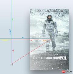
角度示意图
首先,找到光标与页面中心形成的三角形的直角边,光标与中心连线后作出一个直角三角形。
然后用 Math.atan2() 函数得到中心点的角度值。注意这个函数的返回值使用弧度值来表示的,所以我们得在CSS中转换成角的度数,用以下公式:
弧度值*180/pi = 角度值
var $poster = $('.poster');    var $shine = $('.shine');    var $layer = $('p[class *= "layer-"]');

    $poster.data("offset",15);

    $(window).on('mousemove', function(e) {        var w=e.currentTarget.innerWidth,h=e.currentTarget.innerHeight;        var offsetX = 0.5 - e.pageX / w, /* where e.pageX is our cursor X coordinate */
        offsetY = 0.5 - e.pageY / h,
        offsetPoster = $poster.data('offset'), /* custom value for animation depth */
        transformPoster = 'translateY(' + -offsetX * offsetPoster + 'px) rotateX(' + (-offsetY * offsetPoster) + 'deg) rotateY(' + (offsetX * (offsetPoster * 2)) + 'deg)';

        dy = e.pageY - h / 2,
        dx = e.pageX - w / 2,
        theta = Math.atan2(dy,dx), /* get angle in radians */
        angle = theta * 180 / Math.PI; /* convert rad in degrees */        /* apply transform to $poster */
        $poster.css('transform', transformPoster);        /* parallax foreach layer */        /* loop thought each layer */        /* get custom parallax value */        /* apply transform */
        $layer.each(function() {            var $this = $(this);            var offsetLayer = $this.data('offset') || 0; /* get custom parallax value, if element docent have data-offset, then its 0 */            var transformLayer = 'translateX(' + offsetX * offsetLayer + 'px) translateY(' + offsetY * offsetLayer + 'px)';

            $this.css('transform', transformLayer);
        });
    });
你会发现角度值的范围是从-180到180度,以下代码修复这个问题让角度值从0-360度:
if (angle < 0) {    angle = angle + 360;
}
现在角度有了,就可以随着光标的移动来动态改变渐变颜色的角度值:
<code class="lsl">$shine.css('background', 'linear-gradient(' + (angle - <span class="hljs-number">90) + 'deg, rgba(<span class="hljs-number">255,<span class="hljs-number">255,<span class="hljs-number">255,' + e.pageY / h + ') <span class="hljs-number">0%,rgba(<span class="hljs-number">255,<span class="hljs-number">255,<span class="hljs-number">255,<span class="hljs-number">0) <span class="hljs-number">80%)');<br/><br/></span></span></span></span></span></span></span></span></span></span></code>
学习过程中遇到什么问题或者想获取学习资源的话,欢迎加入学习交流群
343599877,我们一起学前端!
注意 :减去90度的原因是 linear-gradient 属性的需要,如果你使用 -webkit-linear-gradient,-moz-linear-gradient属性就没有必要。
The above is the detailed content of An example of implementing a parallax effect using CSS3+ jQuery. For more information, please follow other related articles on the PHP Chinese website!

 jquery实现多少秒后隐藏图片Apr 20, 2022 pm 05:33 PM
实现方法:1、用“$("img").delay(毫秒数).fadeOut()”语句,delay()设置延迟秒数;2、用“setTimeout(function(){ $("img").hide(); },毫秒值);”语句,通过定时器来延迟。
 jquery怎么修改min-height样式Apr 20, 2022 pm 12:19 PM
修改方法:1、用css()设置新样式,语法“$(元素).css("min-height","新值")”;2、用attr(),通过设置style属性来添加新样式,语法“$(元素).attr("style","min-height:新值")”。
 axios与jquery的区别是什么Apr 20, 2022 pm 06:18 PM
区别:1、axios是一个异步请求框架,用于封装底层的XMLHttpRequest,而jquery是一个JavaScript库,只是顺便封装了dom操作;2、axios是基于承诺对象的,可以用承诺对象中的方法,而jquery不基于承诺对象。
 jquery怎么在body中增加元素Apr 22, 2022 am 11:13 AM
增加元素的方法:1、用append(),语法“$("body").append(新元素)”,可向body内部的末尾处增加元素;2、用prepend(),语法“$("body").prepend(新元素)”,可向body内部的开始处增加元素。
 jquery怎么删除div内所有子元素Apr 21, 2022 pm 07:08 PM
删除方法:1、用empty(),语法“$("div").empty();”,可删除所有子节点和内容;2、用children()和remove(),语法“$("div").children().remove();”,只删除子元素,不删除内容。
 jquery中apply()方法怎么用Apr 24, 2022 pm 05:35 PM
在jquery中,apply()方法用于改变this指向,使用另一个对象替换当前对象,是应用某一对象的一个方法,语法为“apply(thisobj,[argarray])”;参数argarray表示的是以数组的形式进行传递。
 jquery怎么去掉只读属性Apr 20, 2022 pm 07:55 PM
去掉方法:1、用“$(selector).removeAttr("readonly")”语句删除readonly属性;2、用“$(selector).attr("readonly",false)”将readonly属性的值设置为false。
 jquery on()有几个参数Apr 21, 2022 am 11:29 AM
on()方法有4个参数:1、第一个参数不可省略,规定要从被选元素添加的一个或多个事件或命名空间;2、第二个参数可省略,规定元素的事件处理程序;3、第三个参数可省略,规定传递到函数的额外数据;4、第四个参数可省略,规定当事件发生时运行的函数。


Hot AI Tools

Undresser.AI Undress
AI-powered app for creating realistic nude photos

AI Clothes Remover
Online AI tool for removing clothes from photos.

Undress AI Tool
Undress images for free

Clothoff.io
AI clothes remover

AI Hentai Generator
Generate AI Hentai for free.

Hot Article
Hot Tools

DVWA
Damn Vulnerable Web App (DVWA) is a PHP/MySQL web application that is very vulnerable. Its main goals are to be an aid for security professionals to test their skills and tools in a legal environment, to help web developers better understand the process of securing web applications, and to help teachers/students teach/learn in a classroom environment Web application security. The goal of DVWA is to practice some of the most common web vulnerabilities through a simple and straightforward interface, with varying degrees of difficulty. Please note that this software

SublimeText3 Mac version
God-level code editing software (SublimeText3)

PhpStorm Mac version
The latest (2018.2.1) professional PHP integrated development tool

Safe Exam Browser
Safe Exam Browser is a secure browser environment for taking online exams securely. This software turns any computer into a secure workstation. It controls access to any utility and prevents students from using unauthorized resources.

Zend Studio 13.0.1
Powerful PHP integrated development environment

