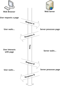
I have recently browsed a lot of website image cropping effects. Most of the methods are as shown in the picture below (borrowing a picture from Script Home). Select the appropriate position by changing the size of the cropping box. However, this article introduces another tailoring method. The cutting frame is determined by the developer. The size of the picture is determined by the user to select the appropriate position by scaling and dragging pictures. In this process As shown in the upper right. This method mainly has the following advantages: the width and height of the cutting frame is consistent with the height ratio of the actual use, preventing the display size of the picture deformation problem, and ensuring the original proportion of the picture. Cropping is more friendly. For example, to capture a very small part of a high-definition picture, we only need to enlarge the picture and drag it into the cropping box, while other methods require the cropping box to be adjusted very small, which is not conducive to After talking about the user operation, we should also talk about the shortcomings. The shortcoming is that the difficulty increases by an order of magnitude. . . . The main idea is to use two pictures and position them absolutely. One is placed inside the cropping frame and the other is placed outside the cropping frame and has a transparent effect. The overflow of the cropping frame is set to hidden to maintain absolute synchronization of the two pictures at all times.
1. 10 recommended articles about display size

#Introduction: Recently I have browsed the image cropping effects of many websites. Most of the methods are as shown in the picture below (borrowing a picture from Script House). Select the appropriate position by changing the size of the cropping box. . But this article introduces another cropping method. The cropping box is determined by the developer, and the image size is determined by the user. The appropriate position is selected by scaling and dragging the image, and the aspect ratio of the image is always maintained in the process. As shown in the picture above right. This approach mainly has the following advantages: the width and height of the cropping frame are consistent with the actual aspect ratio, preventing image deformation problems without limiting the display size of the image, ensuring the original proportion of the image, and passing...
2. How to write high-performance HTML web pages

##3.
Use css3 to implement background gradient method ##Introduction: Before you can do background gradient without knowing css , I always apply it to the web pages I create by PSing a picture with a background gradient. However, not long ago, I learned that CSS3 can also do background gradients. It has become much easier to create background gradient effects. Here are some methods of doing background gradients in CSS3.
4. How to write high-performance HTML web pages
##Introduction: How can you improve web page performance? Most developers will optimize through JavaScript and images, through server configuration, compressing files and merging files - even adjusting CSS (merging small images). Poor HTML is always ignored, even though it has always been the core language of the Internet. 
5. JavaScript image cropping sample code sharing without deformation (picture)
: Recently browsed the cutting effect of many websites. Most of the methods are shown in the figure below (borrowing a picture of a script home) to select the appropriate ones by changing the size of the tailor frame Location. But this article introduces another cropping method. The cropping box is determined by the developer, and the image size is determined by the user. The appropriate position is selected by scaling and dragging the image, and the aspect ratio of the image is always maintained in the process. As shown in the picture above right. This method mainly has the following advantages: the width of the cutting frame is consistent with the height ratio of the actual use of the place, and the display size of the picture deformation problem is not limited.
# 6. Use the picture button as the reset (reset) form button

7.
HTML to use custom pictures to achieve checkbox display displayed Method

This editor will bring you a custom picture in HTML Methods to be displayed with checkbox. The editor thinks it’s pretty good, so I’ll share it with you now and give it as a reference. Let’s follow the editor to take a look
8. Pure CSS3 Speech Bubbles with transparent background

Introduction: This is a Speech Bubbles special effect with a transparent background made using pure CSS3. This speech bubble uses two transparent png images as the background, and combines them into a speech bubble effect through simple CSS code.
9. Pure CSS3 blind-style switching carousel effect

Introduction: This is a blind-style switching carousel special effect made using pure CSS3. This special effect is made using background images. When the carousel is switched, a set of div elements are used to create the blinds effect, which is very cool.
10. Building a website using web standards Day 8: Getting started with CSS layout

Introduction: The biggest difference between CSS layout and traditional table layout is that the original positioning uses tables, and controls the text layout section through the spacing of the tables or using colorless and transparent GIF images. Spacing;
[Related Q&A recommendations]:
android - Using the volley network to request images consumes too much traffic. Is there any way to reduce image consumption? Traffic
#php - How to filter out non-images?
node.js - I use node to write a website, and found that the image resources referenced in the style sheet will not be loaded.
javascript - Why now Why don’t many websites use delayed loading of images to optimize performance? Are there any serious disadvantages of delayed loading?
objective-c - How to use Baidu Map SDK to create the following effects on iOS?
The above is the detailed content of 10 recommended articles about pictures. For more information, please follow other related articles on the PHP Chinese website!
 Replace String Characters in JavaScriptMar 11, 2025 am 12:07 AM
Detailed explanation of JavaScript string replacement method and FAQ This article will explore two ways to replace string characters in JavaScript: internal JavaScript code and internal HTML for web pages. Replace string inside JavaScript code The most direct way is to use the replace() method: str = str.replace("find","replace"); This method replaces only the first match. To replace all matches, use a regular expression and add the global flag g: str = str.replace(/fi
 Build Your Own AJAX Web ApplicationsMar 09, 2025 am 12:11 AM
So here you are, ready to learn all about this thing called AJAX. But, what exactly is it? The term AJAX refers to a loose grouping of technologies that are used to create dynamic, interactive web content. The term AJAX, originally coined by Jesse J
 How do I create and publish my own JavaScript libraries?Mar 18, 2025 pm 03:12 PM
Article discusses creating, publishing, and maintaining JavaScript libraries, focusing on planning, development, testing, documentation, and promotion strategies.
 10 jQuery Fun and Games PluginsMar 08, 2025 am 12:42 AM
10 fun jQuery game plugins to make your website more attractive and enhance user stickiness! While Flash is still the best software for developing casual web games, jQuery can also create surprising effects, and while not comparable to pure action Flash games, in some cases you can also have unexpected fun in your browser. jQuery tic toe game The "Hello world" of game programming now has a jQuery version. Source code jQuery Crazy Word Composition Game This is a fill-in-the-blank game, and it can produce some weird results due to not knowing the context of the word. Source code jQuery mine sweeping game
 jQuery Parallax Tutorial - Animated Header BackgroundMar 08, 2025 am 12:39 AM
This tutorial demonstrates how to create a captivating parallax background effect using jQuery. We'll build a header banner with layered images that create a stunning visual depth. The updated plugin works with jQuery 1.6.4 and later. Download the
 Auto Refresh Div Content Using jQuery and AJAXMar 08, 2025 am 12:58 AM
This article demonstrates how to automatically refresh a div's content every 5 seconds using jQuery and AJAX. The example fetches and displays the latest blog posts from an RSS feed, along with the last refresh timestamp. A loading image is optiona
 Getting Started With Matter.js: IntroductionMar 08, 2025 am 12:53 AM
Matter.js is a 2D rigid body physics engine written in JavaScript. This library can help you easily simulate 2D physics in your browser. It provides many features, such as the ability to create rigid bodies and assign physical properties such as mass, area, or density. You can also simulate different types of collisions and forces, such as gravity friction. Matter.js supports all mainstream browsers. Additionally, it is suitable for mobile devices as it detects touches and is responsive. All of these features make it worth your time to learn how to use the engine, as this makes it easy to create a physics-based 2D game or simulation. In this tutorial, I will cover the basics of this library, including its installation and usage, and provide a
 How do I optimize JavaScript code for performance in the browser?Mar 18, 2025 pm 03:14 PM
The article discusses strategies for optimizing JavaScript performance in browsers, focusing on reducing execution time and minimizing impact on page load speed.


Hot AI Tools

Undresser.AI Undress
AI-powered app for creating realistic nude photos

AI Clothes Remover
Online AI tool for removing clothes from photos.

Undress AI Tool
Undress images for free

Clothoff.io
AI clothes remover

AI Hentai Generator
Generate AI Hentai for free.

Hot Article

Hot Tools

SecLists
SecLists is the ultimate security tester's companion. It is a collection of various types of lists that are frequently used during security assessments, all in one place. SecLists helps make security testing more efficient and productive by conveniently providing all the lists a security tester might need. List types include usernames, passwords, URLs, fuzzing payloads, sensitive data patterns, web shells, and more. The tester can simply pull this repository onto a new test machine and he will have access to every type of list he needs.

MinGW - Minimalist GNU for Windows
This project is in the process of being migrated to osdn.net/projects/mingw, you can continue to follow us there. MinGW: A native Windows port of the GNU Compiler Collection (GCC), freely distributable import libraries and header files for building native Windows applications; includes extensions to the MSVC runtime to support C99 functionality. All MinGW software can run on 64-bit Windows platforms.

SublimeText3 Mac version
God-level code editing software (SublimeText3)

SAP NetWeaver Server Adapter for Eclipse
Integrate Eclipse with SAP NetWeaver application server.

Zend Studio 13.0.1
Powerful PHP integrated development environment


